Decorating & Design
20+ Stunning Kitchen Islands From The H&H Archives
Updated on August 20, 2024
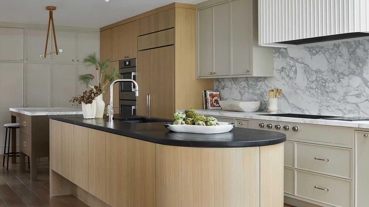
Kitchen islands offer more than just a space to meal prep and cook. Often considered the heart of the home, they’re a place to eat casual meals, entertain, store kitchen accessories and even accommodate a work or study environment. But beyond their practicality, kitchen islands have also become a go-to place for designers to show off their ingenuity. In a family home designed by Collective Studio, designers Jordy Fagan and Alana Firestone were very intentional about the design of not one, but two kitchen islands. “One feels like a piece of furniture and the other houses two dishwashers and is topped with soapstone. It also has an exaggerated toe kick because the homeowners wanted it to be a gathering spot,” says Jordy.
Scroll down for a look back at some of our best kitchen island design ideas from the House & Home archives!
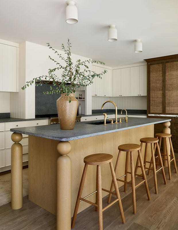
In this mid century-inspired kitchen, a white oak island with distinctive turned legs features an unlacquered brass faucet that will patinate over time and soapstone counters that look naturally aged.
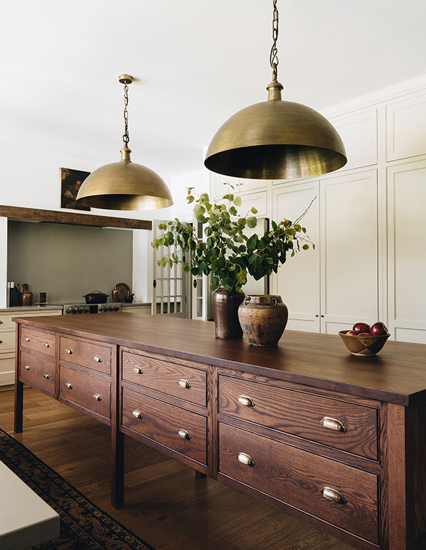
In this Modern Farmhouse kitchen, a custom island in red oak on tall legs with apothecary-style drawers and brass cup pulls, was designed to fit the space. “My children do everything at this island: homework, drawing, eating and playing games,” says the homeowner.
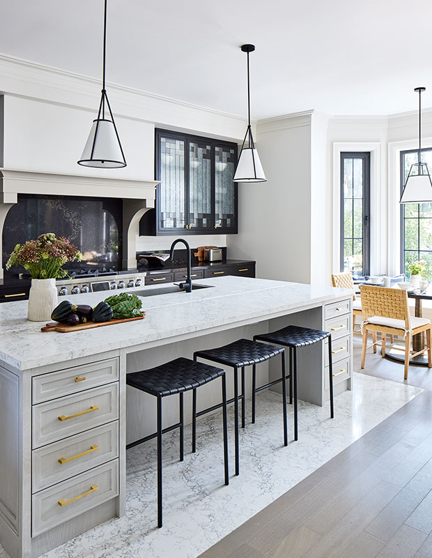
In this black and white kitchen designed by Brian Gluckstein, polished Caesarstone flooring helps define the kitchen island and elevates it.
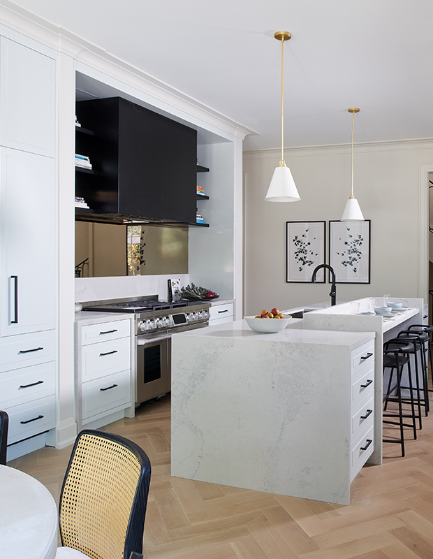
In another clever kitchen design by Brian, the island incorporates a bar-like ledge to keep water from splashing on food and laptops if the homeowners are seated at the stools.
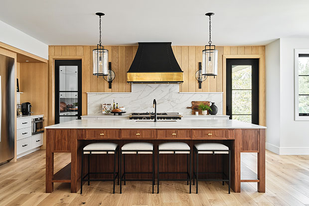
“We seem to be stepping away from painted islands and grey or all-white cabinets; we’re getting back to wood being a real feature in the kitchen,” says designer Sonya Kinkade of this showstopping wood kitchen. The island is bracketed by two display areas with shelving at the bottom.
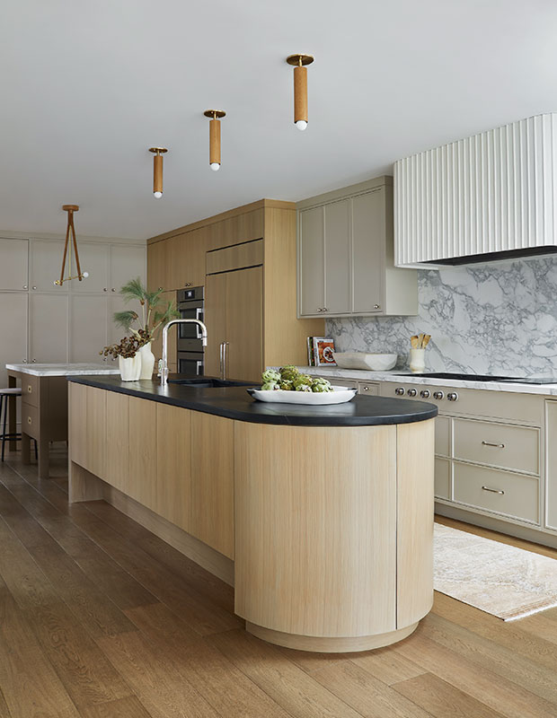
This standout white oak island by Collective Studio has a showstopping curved end, with an exaggerated toe kick to set it apart it from a second stone-topped island. A mix of lighting differentiates the spaces. “We thought a lot about where people would congregate. When we host, we like to put out snacks and charcuterie on the islands, and everyone helps themselves,” says one homeowner.
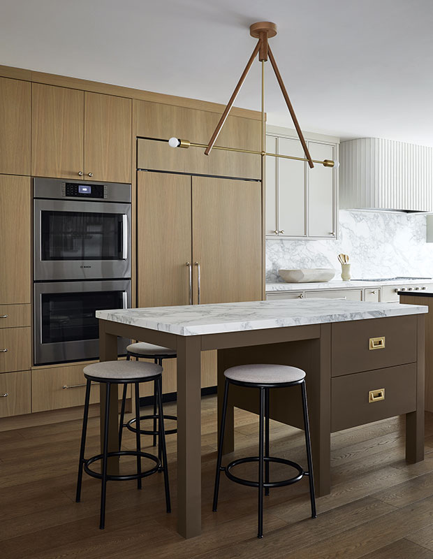
This furniture-like island is perfect for baking, snacking and conversation. “I didn’t want to have a house where I was alone in the kitchen while everyone else was in a formal living area. With the two islands, it’s easier to mingle while I’m cooking,” adds the homeowner.
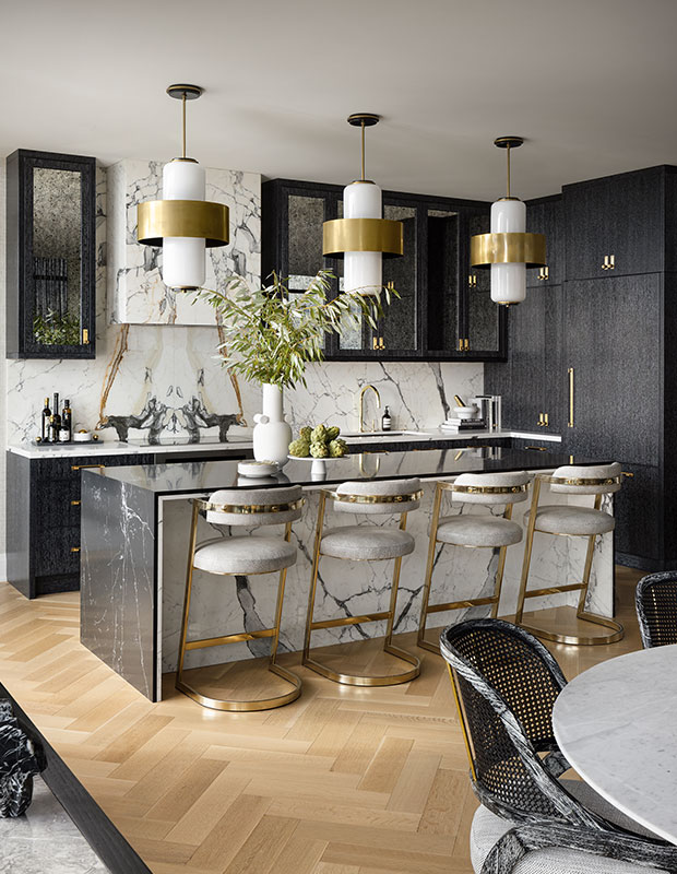
Curtis Elmy and Trevor Ciona designed their luxe two-tone kitchen with Calacatta Capri marble. “We always start the design in the kitchen because it tends to sets the tone,” says Trevor. The dark marble counter ties in with the black cabinets.
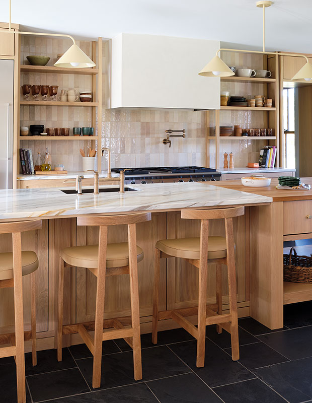
This multitasking warm oak kitchen island has areas for work and play. “There were two things we wanted to be able to do in the kitchen: to be comfy in sweatpants and to be able to host an elegant party, all without switching anything up,” says this homeowner. “This space can carry both things; it’s magic.”
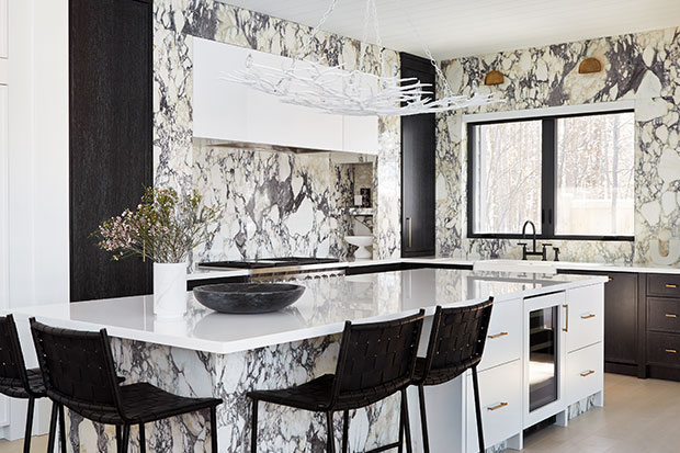
In a showstopping kitchen designed by Ali Budd, the kitchen island wows with heavily veined Calacatta Viola marble and a chandelier that resembles branches — a nod to the cottage’s woodland setting.
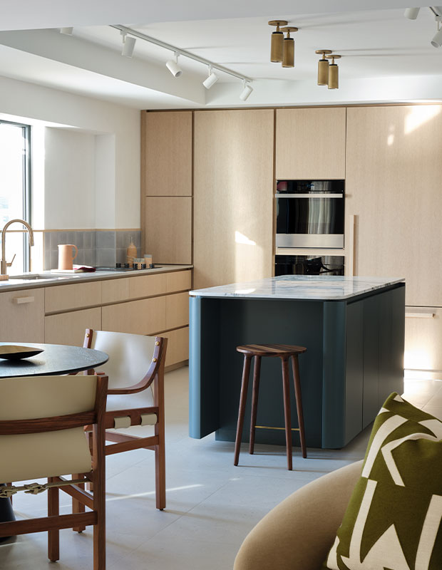
“The curved island and minimalist cabinets blend and give the feeling of something more open,” says designer Maxime Vandal of this updated kitchen. A stool tucks neatly into a niche at the end of the island.
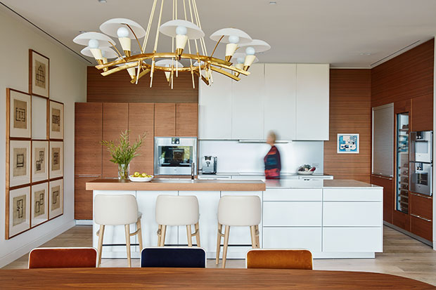
Designer Neil Jonsohn upgraded this sleek white kitchen by adding a wood surface to the island to create a separation between prep space and casual dining.
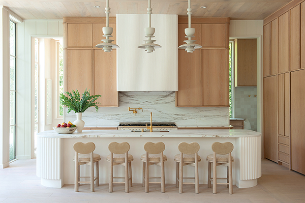
The centerpiece of this kitchen is a rounded island with hand-fluted plaster details. A row of pendants continues the curvy motif and stools with heart-shaped backs are a touch of whimsy.
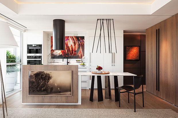
In his compact condo, Fenwick Bonnell designed a dining-height island that extends into a table with chairs. “I knew I didn’t want stools, but I also didn’t want a height transition between the dining table and island,” he says. “It was a bit of an experiment, but now I really like the way it feels.” Fenwick had the TV mounted to a panel applied to the island facing, turning it into a multifunctional piece.
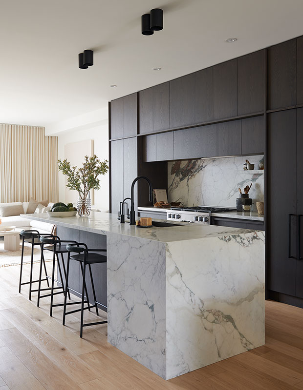
“The first thing you see in the house is that marble,” says designer Veronica Martin of the double-waterfall-edge island in her kitchen.
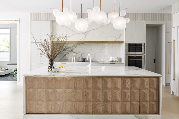
The kitchen island is the centrepiece of this Art Deco-inspired house designed by Eva Healy. Bevelled wood panels carved by a CNC machine were set into the island facing and became an statement moment. Above the island, ethereal lighting looks like it simply floats. Eva commissioned seven separate pendants and then combined them like puzzle pieces to form a glimmering cloud.
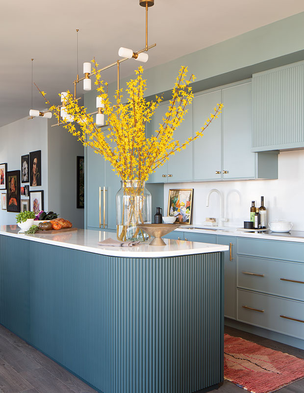
“I always knew I wanted to do a two-tone teal kitchen for these homeowners,” says designer Cori Halpern. The fluted detail on the curved island adds beautiful texture and shows off the curved contour.
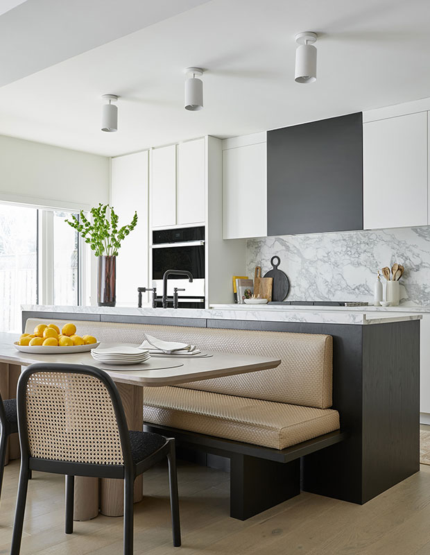
To make room for a kitchen table in their clients’ kitchen, Collective Studio designed a banquette that backs the island. “If you look closely, we added a mitered lip on the counter which is a clever way to avoid spills on the banquette,” says Alana.
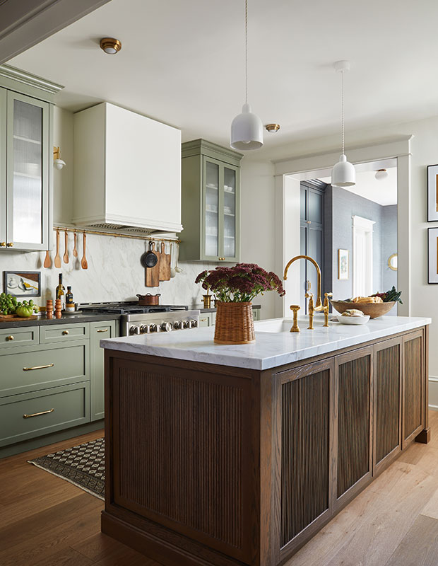
Inspired by Britain’s deVOL Kitchens, Olivia Botrie contrasted her green cabinets painted in Farrow & Ball’s Treron hue with a wood island that wows with reeded Shaker doors. Her overall design goal was to create a kitchen that felt lived in and warm. “Like it had been here forever,” she says.
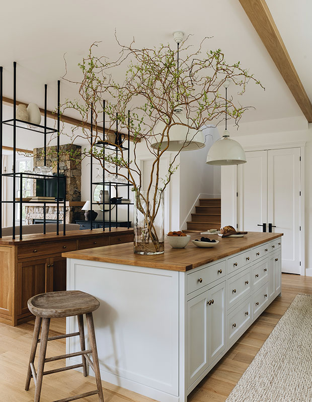
The cottage kitchen boasts not one, but two islands. “We integrated a second island as a bar area that has open shelving on top,” says designer Laurence Pons Lavigne. “It creates separation from the living room without closing off the space.” Designer Mélanie Cherrier adds: “We wanted that vintage look, so we stained the white oak counter three times with a special treatment to add a tactile, textured effect.”
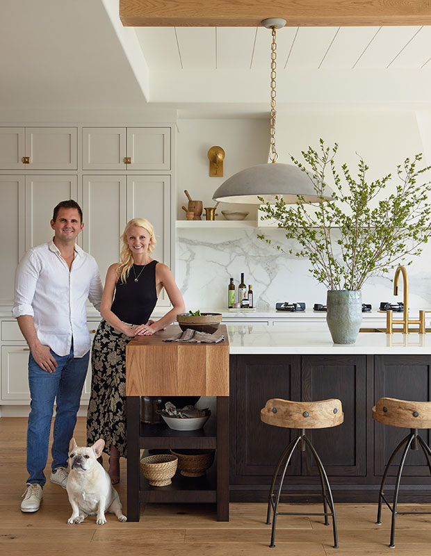
Leave it to homeowners Sarah and Jason MacDonald, owners of Lighthouse Cabinetry to design a kitchen island that makes an impression. Their English-style modern farmhouse kitchen features face frame cabinets and a substantial chopping block, perfect for cooking and entertaining.
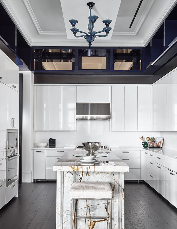
In this Parisian-inspired condo, a marble-clad island topped by a sapphire Murano glass chandelier is a major design moment.
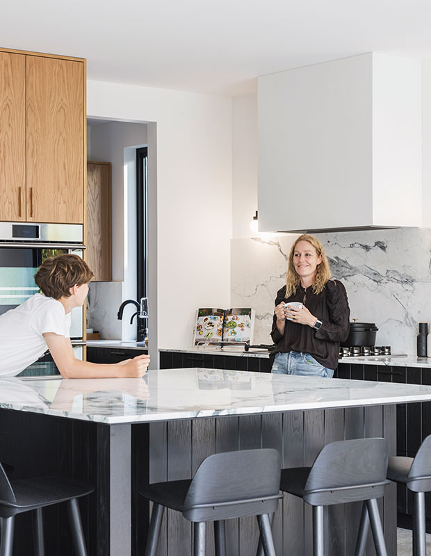
This square kitchen island accommodates a seating arrangement of three and three. “The shape allows the dining table more breathing room,” says designer Christi Rivard of Bidgood It also avoids the need for a counter seam that a longer island would require. “Seaming can be so unfortunate, especially when you splurge on natural stone,” says creative director Kyla Bidgood of the singular marble slab flecked with blue, green and grey.


