

Decorating & Design
June 4, 2018
Makeover: A Beige Bungalow Gets Color & Contrast
When Alex K Bowman first saw this 1970s bungalow in Salt Lake City, Utah, it was a dreary tapioca pudding color top to bottom. “Our number-one challenge was de-beiging everything,” says Alex, who last year moved from Boston to Salt Lake City to open Kirby Kelly Studio with his partner Justin Kelly Beene. On the positive side, the 3,000-square-foot house only needed a cosmetic makeover.
The abode’s arched windows, found in a certain sunny state’s iconic Spanish dwellings, inspired the design direction. “We went with a modern California aesthetic,” says Alex. At the end of the four-month renovation, the home sold the very first day it hit the market. Here’s an inside look at the dramatic makeover.

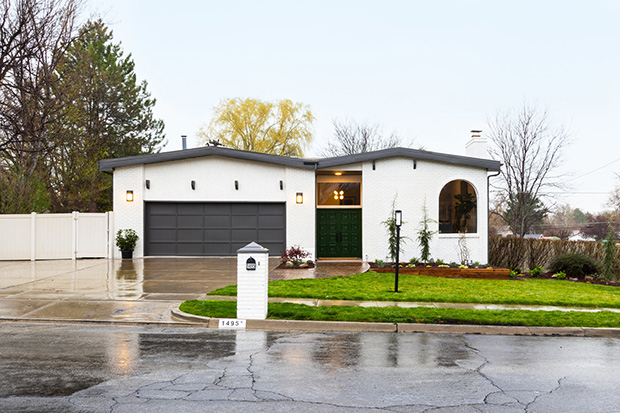
“To unify the mixture of stucco and brick, we painted everything the same color, which helped pull it together,” says Alex. Super high-gloss green paint (Behr’s Marquee Chard) brought the original carved-wood double doors to life, and the garage got a new dark grey patina (Behr’s Intellectual).
Slide the arrow to see the before and after!

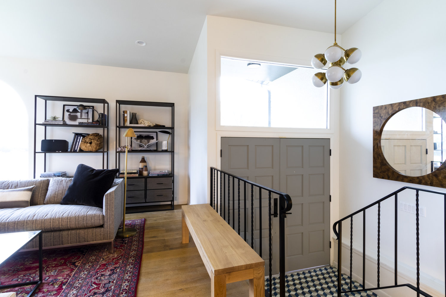
Clever changes made for a seriously improved entranceway. The floor pops thanks to the gorgeous tumbling-block encaustic tile. The doors were painted grey to match. A fun bulbous chandelier from Williams-Sonoma Home replaced a dated fixture, and the wrought iron railings were revived with semi-gloss black paint.
Slide the arrow to see the before and after!
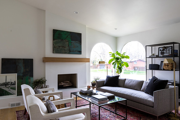
The cottagey fireplace got its walking papers when the designers removed all 2,000 pounds of rough-cut stone. “We added an extended hearth along the bottom to serve as a a secondary seating surface,” says Alex. To freshen up the fireplace, they applied a smooth plaster coat over it and installed a custom white oak mantel to coordinate with the floors.
Slide the arrow to see the before and after!

Furnishing a space well isn’t about how many pieces you can stuff into it, but rather using the right pieces. This duo of Duke chairs with cutout arms and tapered legs show off their best side. They’re from Mitchell Gold + Bob Williams.
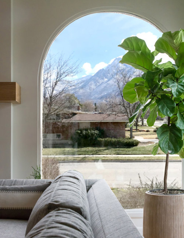
The amazing arched windows drove the entire project’s California aesthetic. The designers removed the fusty opaque drapery treatment to frame the mountain views. A fiddle leaf fig plant catches some rays.
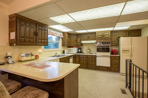
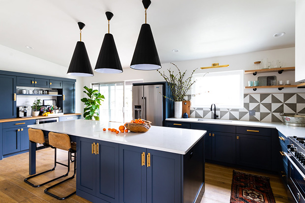
Carpeting is never a good idea in a kitchen, so Alex replaced it with oak flooring. The new kitchen is a rhapsody of blue and brass. “The blue is Pratt and Lambert’s Lava,” says Alex. Carrara quartz countertops are not only gorgeous, but also durable. Three large Jonathan Adler pendant lights offer a punctuation of dark color.
Slide the arrow to see the before and after!
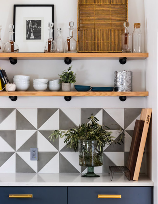
“We’re obsessed with the encaustic cement tiles,” says Bowman. “This is a pinwheel pattern in grey and white.” Wood shelves, instead of upper cabinets, are ideal for casually displaying wares.
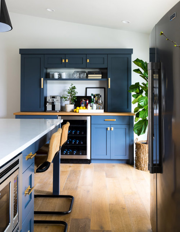
Creating a beverage center, as opposed to a home bar, made more sense in teetotaling Utah. The glam hardware brilliantly highlights the cabinetry. “I chose those specifically because of their unusual and interesting brass plate. A solid brass plate gives it heft — I hadn’t seen that before,” says Alex.
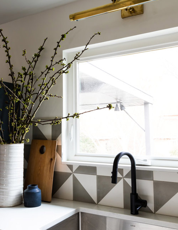
A matte-black faucet is an edgy alternative to silver. The mix of metals is a motif in the home found in the shelving brackets in the kitchen and the shelving units in the great room; the mix makes for a more interesting space.
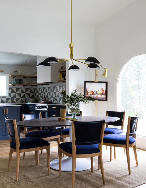
Removing a wall between the kitchen and dining area opened up the space between the rooms, immensely improving the flow. “When we demoed the ceiling, we found out it was a fully finished vaulted ceiling underneath, so that was a real exciting surprise,” says Alex. A sculptural multi-armed chandelier draws the eye upwards.
Slide the arrow to see the before and after!
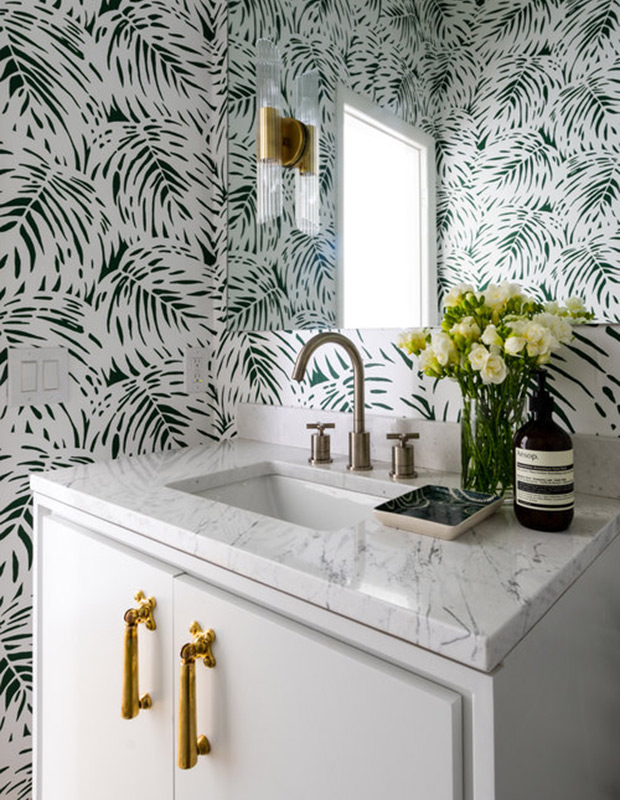
A leafy Serena & Lily wallpaper makes for big impact in the powder room. Brass accents and a marble-topped custom vanity feel luxurious, as does the sconces that are mounted directly onto the mirror.
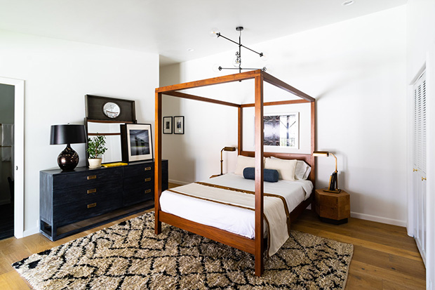
A canopy bed from West Elm, and a linear chandelier, plays up the ceiling height in the principal bedroom. The bed’s clean lines are modern and dramatic. The super shaggy rug invites texture and contrast. A handsome campaign dresser from Vanguard Furniture fits the feel in the room.
Slide the arrow to see the before and after!
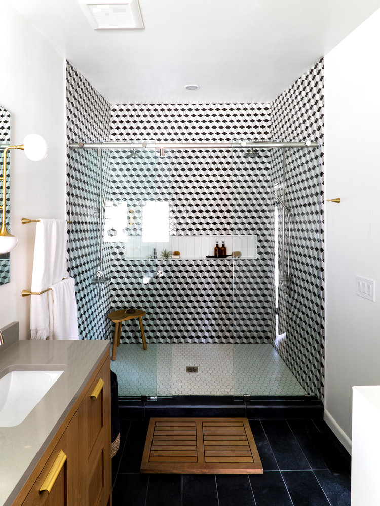
The exciting ensuite bathroom is all about those tiles. “The largest change in there — besides removing the carpet and step-up tub — was creating this two-person walk-in shower with the tumbling blocks of tiles going all the way to the ceiling,” says Alex.
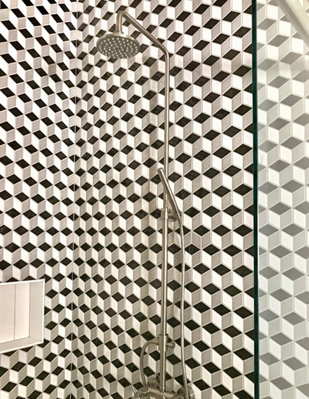
A close-up of the captivating tile in the principal bathroom. A recessed linear nook holds shower essentials. Patterned tile was used throughout the home to create dynamic talking points.

An exterior vanity in the bedroom was demolished then incorporated into this space to make way for the new principal bathroom. The handsome new loo features a custom waffled-wood vanity, brushed nickel faucets and, of course, more brass.