Homes
Makeover: See How Clever Tweaks Transformed This Bungalow
Updated on July 19, 2018
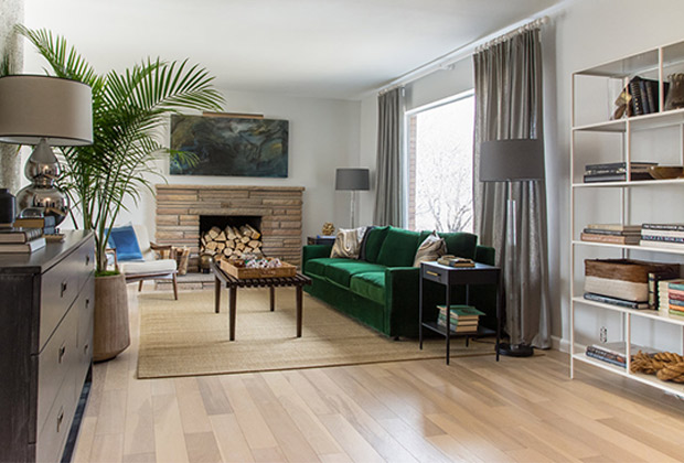
In older houses, most designers wield the sledgehammer pretty quickly — the vintage elements are usually in rough shape. Not so with Alex K Bowman of Kirby Kelly Studio. “It had such a wonderful flow throughout the main level. That’s rare in a vintage home!” says Alex, who lucked out on several fronts with a charming 1950s bungalow in Salt Lake City.
Still, while he retained some original elements, the kitchen, two bathrooms and other areas of this 2,300-square-foot abode, needed a facelift. Here’s how the designer transported a 1950s home into the 21st century.
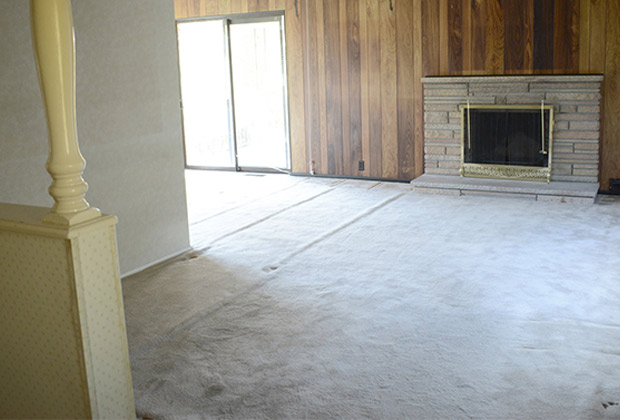

“The fireplace is original,” says Alex. “It’s a great mid-century hand-chipped stone fireplace, so we left that intact.” The plush green velvet sofa from Room & Board plays up the Mad Men-era vintage bungalow look. Doubling up on the panels of Ikea drapery make them feel fuller.
Slide the arrow to see the before and after!
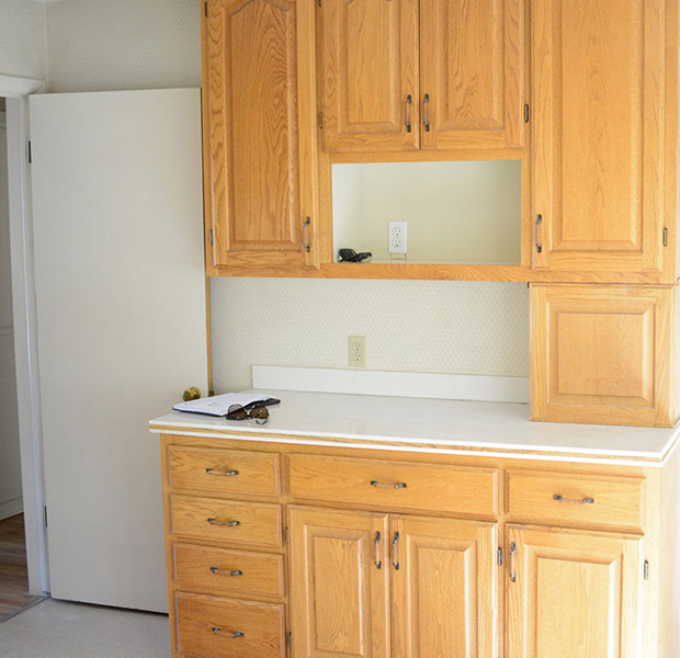
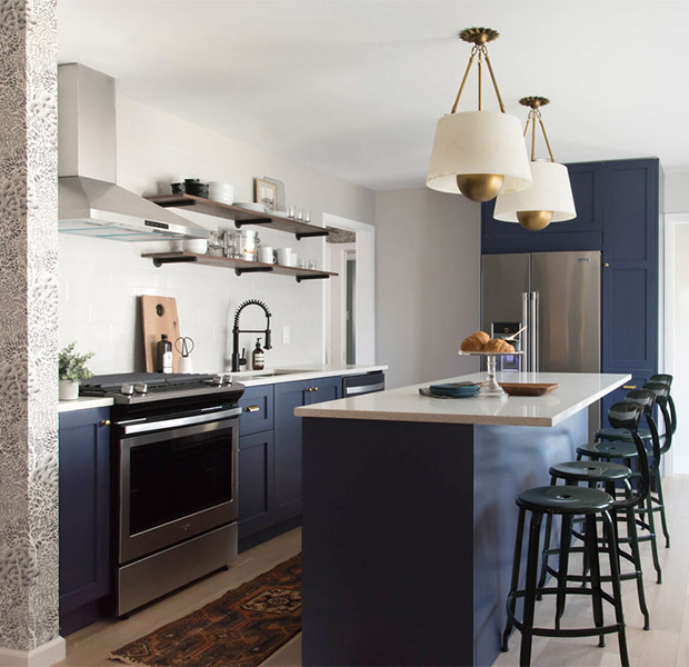
Golden oak cabinets, once de rigueur in the 1990s, got the boot. Alex replaced them with a Shaker-style Ikea kitchen using door fronts from Semihandmade. “We painted them in the dark navy blue. We’re big fans of navy,” he says. “It’s a fun way to add color.” Whimsical pendants from Robert Abbey have alabaster shades and enormous golden globes that bounce around the light.
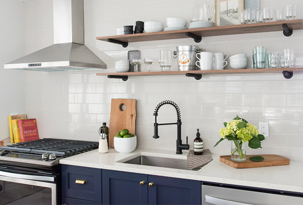
For a modern touch, Alex chose extra-long subway tile in an ultra-light grey. The faucet was a considered addition. “I think every room needs a little black,” he says. “Hardware and metal finishes are such an easy way to bring that in.”
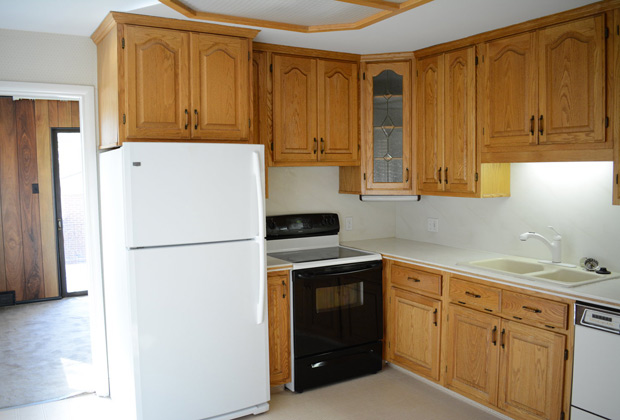
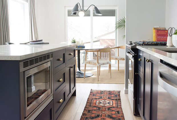
Alex removed the wall between the rooms to flood it with light and to improve the flow. A tulip table dining set hits a ’50s note, and an earthy runner cozies up white oak floors that replaced linoleum.
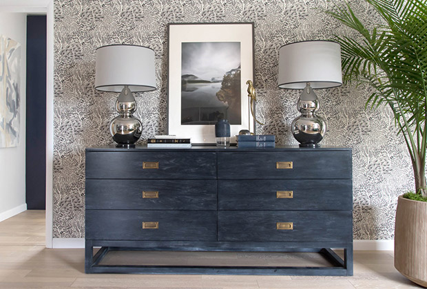
A clever use of wallpaper covers a wall in the living room as an elegant way to anchor the campaign dresser and enliven the space. “The chinoiserie wallpaper is by Dwell Studio,” says Alex. “It’s an updated print in black and white, so it feels more modern.” An over-sized palm has punch.
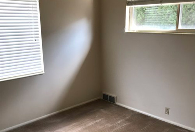
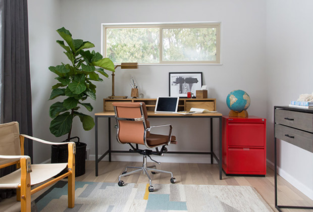
Alex created an inviting home office in one of the bedrooms. He replaced the drab brown carpeting with white oak floors, and painted the room a fresh, light grey. Mixing up the furnishings makes the space feel cheery — hello, bright red filing cabinet, peachy chair and pastel-block rug!
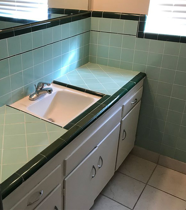
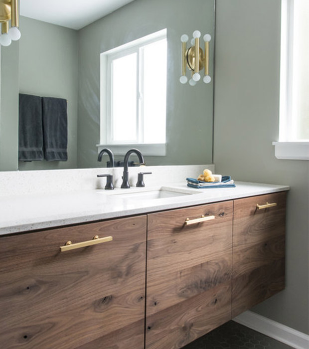
Too much teal tile felt sad in one of the bathrooms. And office blinds were just plain strange. In came a new walnut vanity with hefty brass hardware to mimic the tubular sconces mounted on the mirror. Grey hexagon floor tile is a welcome change.
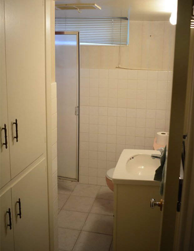
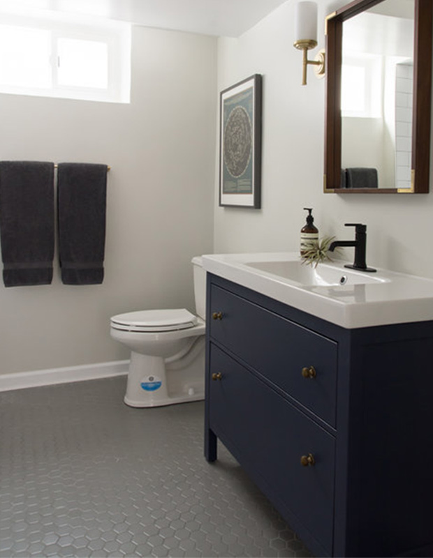
Small changes tremendously improved this bathroom, the larger of the two. An Ikea vanity is clean-lined and modern. The black faucet grounds the space, and breaks up the palette, so it doesn’t feel too matchy-matchy (read: boring) against the brass sconces. A mirror frame edged in brass adds a touch of glam.


