

Decorating & Design
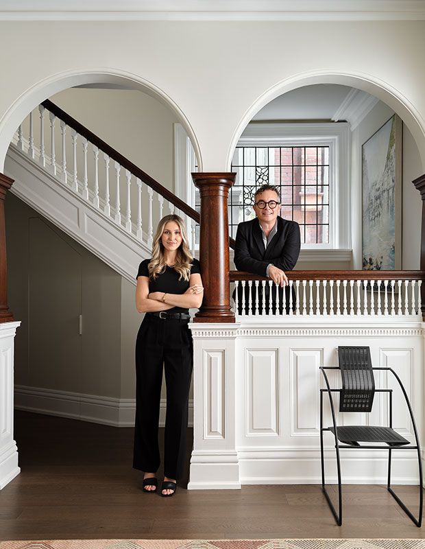
The Best of Tommy Smythe, H&H’s 2025 Designer of the Year
Updated on October 1, 2025
Congratulations to our H&H Designer of the Year for 2025, Tommy Smythe. He’s not only been a longtime H&H contributor and columnist, but we have featured his projects in H&H more than 15 times over the last 20 years. Tommy’s endless enthusiasm and curiosity about design results in spaces that are as witty and memorable as his Instagram feed. He started out on Sarah Richardson’s popular HGTV shows, but Tommy has more than carved out his own career. In 2020, he launched his own firm, TOM Design Collective, with designers Lindsay Mens and Kate Stuart.
Tommy has made a point of being inclusive, sharing the spotlight with his fellow designers and giving them equal billing. TOM interiors are classic but never stuffy, and stand the test of time brilliantly. His bold use of accent colour (particularly red) is perfectly in keeping with a personality and design eye that’s cheeky and smart. “Given free rein, this is what you’ll get from me: strong colours, bold gestures and traditional references,” says Tommy. “I like that old proverb ‘buy the best and you only cry once.'” Here, are some of the best homes he designed throughout the years.
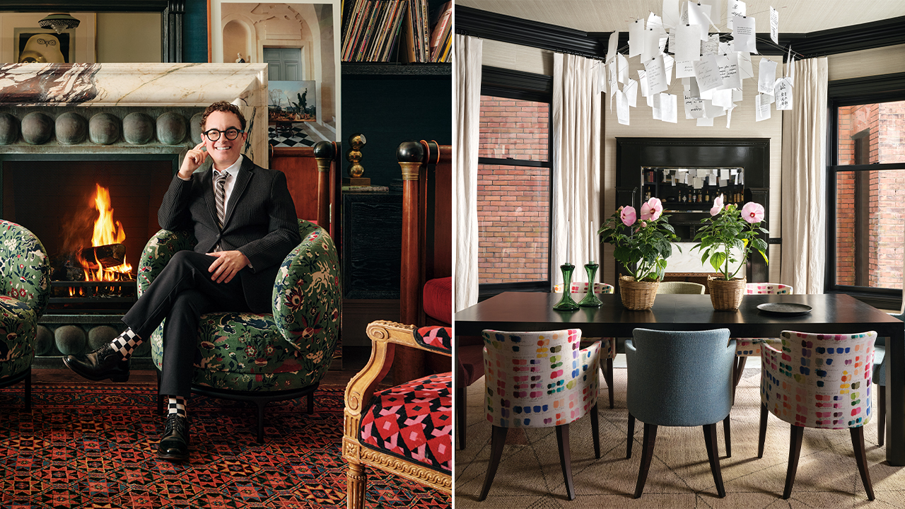
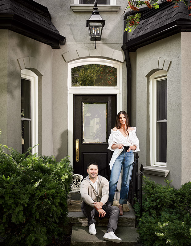
Tommy is our November cover star, posing in the home of clients Katherine and Zane Mersky. He’s ensconced in Jaime Hayon chairs in front of a dramatic, mirrored fireplace with a verdigris copper and marble surround.
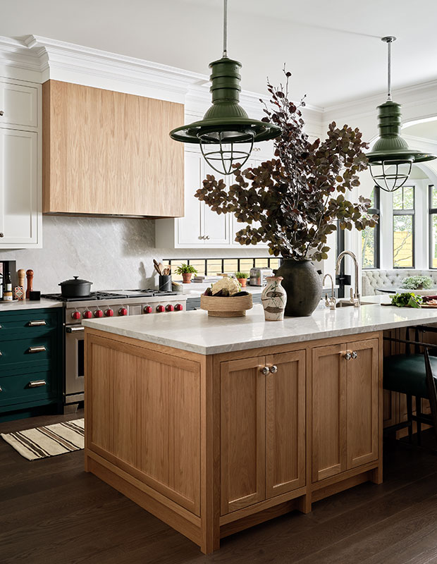
A Toronto Kitchen Becomes An Inviting Family Hub
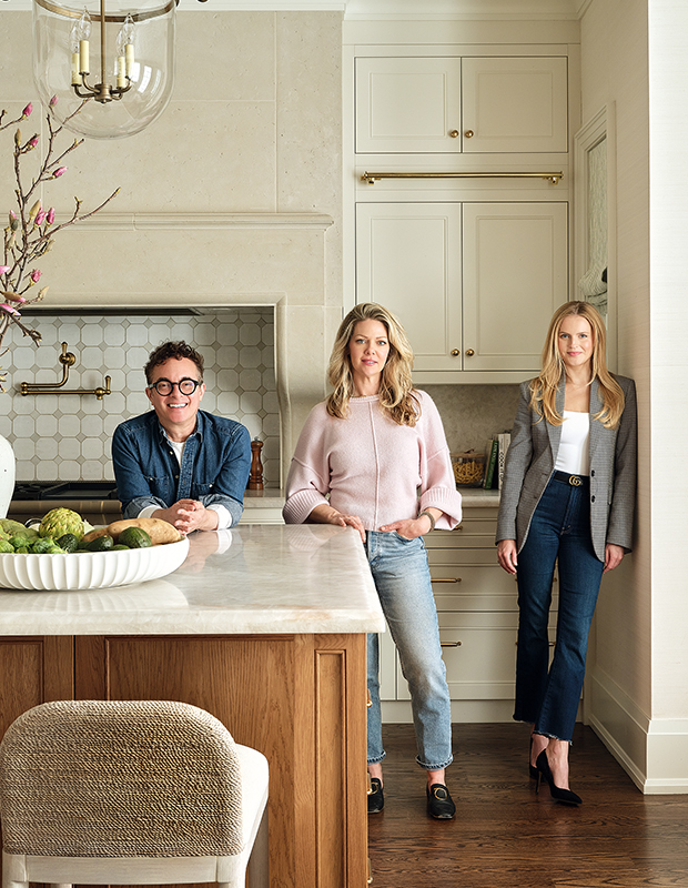
Tommy Smythe, Lindsay Mens, and Ashley Ylanko of TOM Design Collective revamped the mid-town Toronto home of Beth Watt, which features exposed beams, cream cabinets and millwork, plush seating and hits of green and limestone.

Custom arched built-ins on either side of the living room fireplace balance the heft of the vent hood in the kitchen. The elegant living room is perfect for entertaining or for when Beth’s two adult kids were home from school abroad.
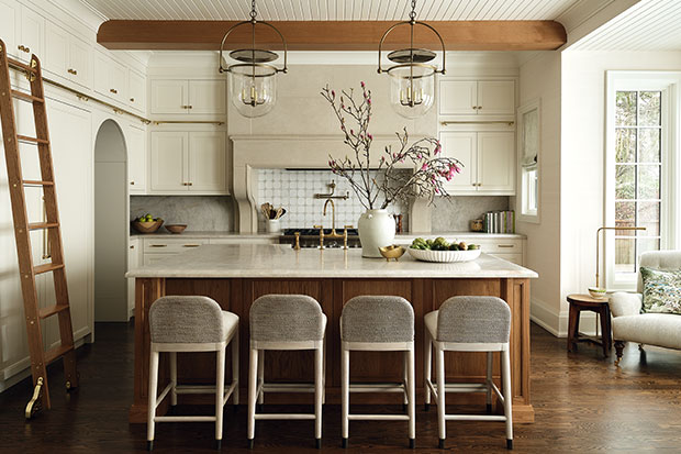
Cabinets painted in Benjamin Moore’s Swiss Coffee are punctuated by wood elements, which add warmth. Homeowner Beth Watt says “love the organic feel of neutral kitchens with warm wood accents. I wanted something cosy but also bright.”
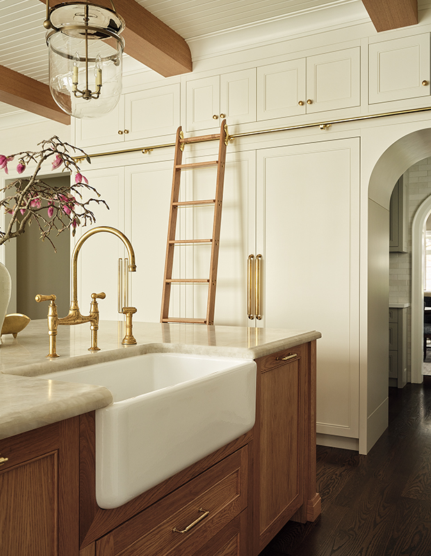
The ladder is elegant and functional; an apron sink adds a dose of farmhouse style. “I suggested the ladder because Beth and I are both really short! ” says Tommy. “It’s beautiful and practical for reaching high shelves. We also created a butler’s pantry for overflow and her collection of seasonal dishes — she goes all out for holidays.”
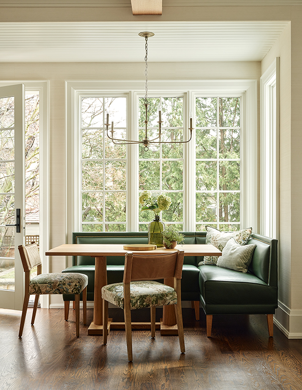
The banquette was on Beth’s wish list and she uses it for casual meals and hangouts. “Beth has a beautiful garden, which you have a great view of from this room, so we used the garden’s colours and textures to inspire the design,” notes Lindsey Mens. “Pops of green appear in the chair upholstery and banquette fabric, with lots of nods to the backyard colour palette throughout the rooms.”
A Toronto Victorian Is Reimagined
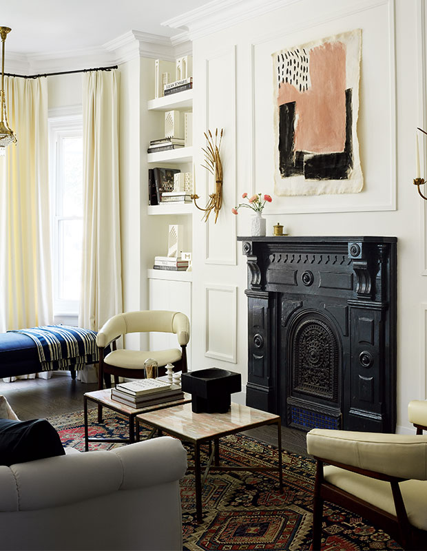
Associate designer Haley Dermenjian and Tommy reimagined this 125-year-old 4,420 square-foot Toronto Victorian home. “It’s so important to me that a home reflects the people who live there,” he says. “I wanted to give my clients room so that, over time, they can fill the bookshelves, add more art and put a rug here or there. We’ve given this house another 200 years.”
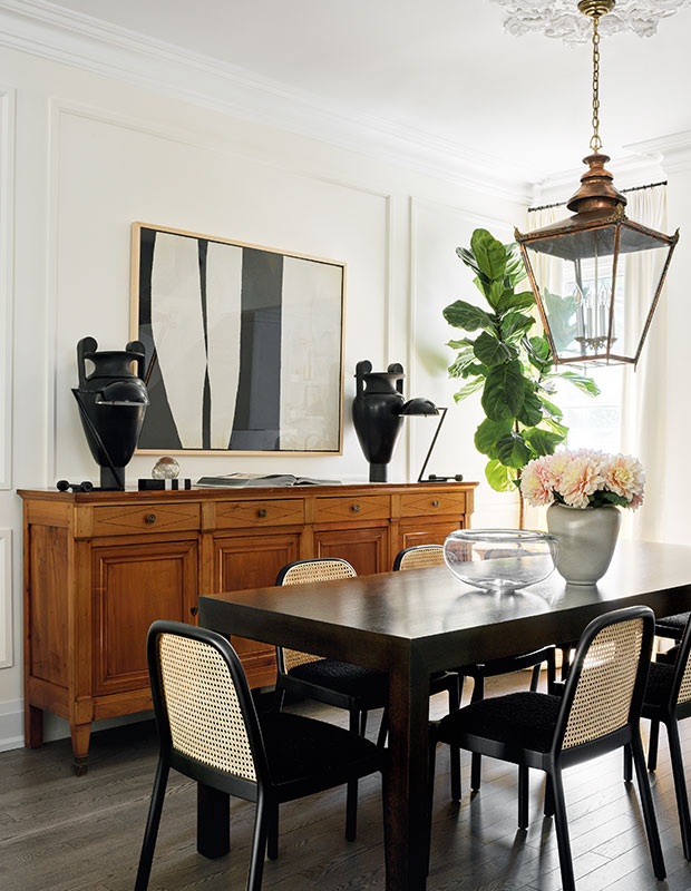
“I always like a little punk with my pretty,” says Tommy, noting details like the custom graphic drapes in the living room and the Ingo Maurer chandeliers in the dining room made from sheets of paper covered in playful bursts of text and drawings.
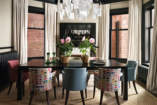
The dining room chairs are upholstered in a mix of fabrics. “We love the colour and whimsy they bring to an otherwise masculine-feeling space,” says one client.

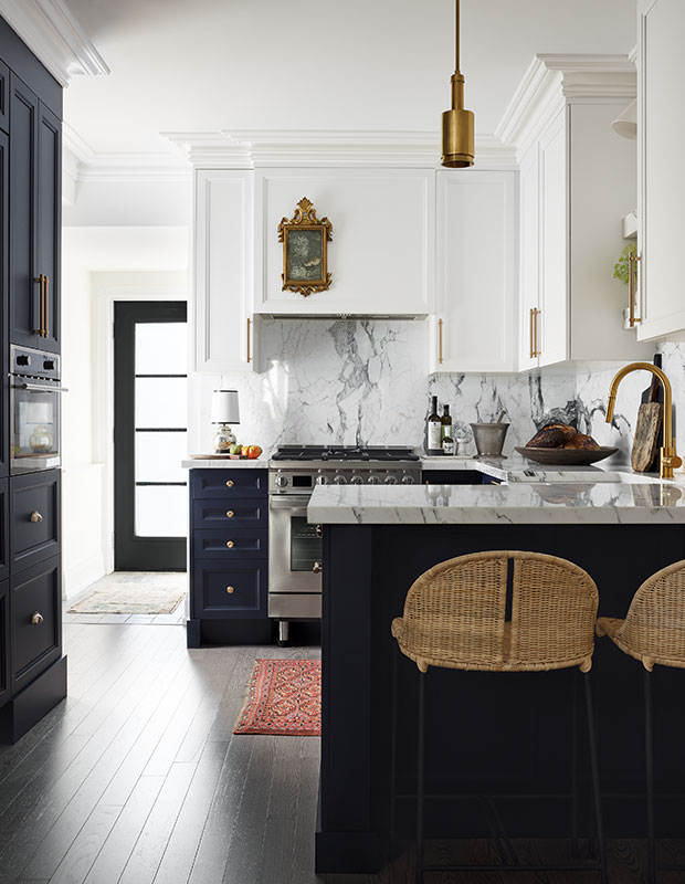
A new 300-square-foot addition on the back of the house extends the kitchen and adjoining a new family room. “You wouldn’t build a room that big in the Victorian era and not have a fireplace,” says Tommy.
Tommy combined oak vent hood cladding, beautifully veined stone, and painted uppers and lowers in contrasting shades for an eclectic mix. “Large kitchens can feel like an airport terminal if everything is white,” says Tommy.
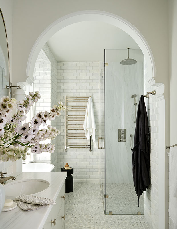
A shapely arch adds an era-appropriate touch in the principal ensuite.
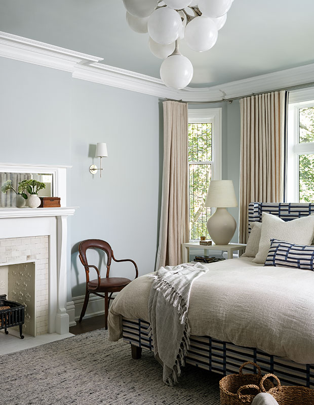
Farrow & Ball’s Skylight is a serene backdrop in the principal bedroom.
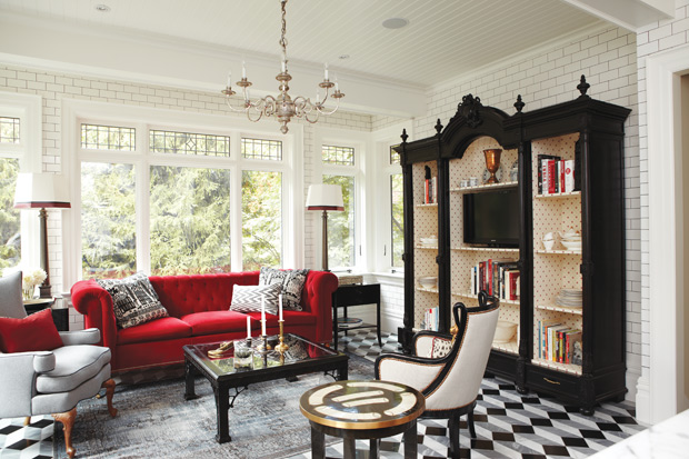
A Fashion Stylist’s Eclectic Rowhouse
Erica Wark wanted to bring her sense of style to her new rowhouse. She and husband Corey Laurysen had purchased the 2,000-square-foot, four-bedroom house located in Toronto’s Fashion District. Tommy and Erica are longtime pals who met doing media appearances. “Erica understands style, colour, form, shape and all the things that inform the work I do, so we had a terrific rapport,” says Tommy.
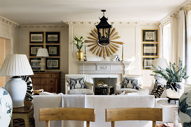
Pieces in the living room span decades, from the jaunty, mid-century-era chaise longue to the 1980s cocktail tables used side by side as a coffee table. And then there’s contemporary art living its best life above a Victorian fireplace. “It all hangs together nicely,” says Tommy. “Eclecticism is the hardest way to decorate, but it’s the most successful.”
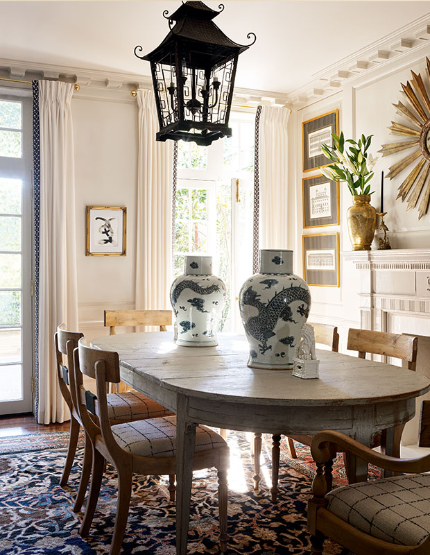
A ceiling medallion in the dining room, architectural wall paneling and a mix of antique lighting throughout also bring grace back to the space. “Tommy is known for putting a lantern over everything,” says Lindsay with a laugh. Elegant and commanding, the copper fixture is a perfect fit for the dining room.
Because the kitchen is visible from the foyer, Erica didn’t want an eyesore of broken-up stainless steel appliances. “It has a furniture feel; the fridge looks like a giant armoire,” she says. “In a rowhouse, there’s not a huge amount of space for a kitchen. The panel-ready cabinets make it look so much cleaner and more sleek.”
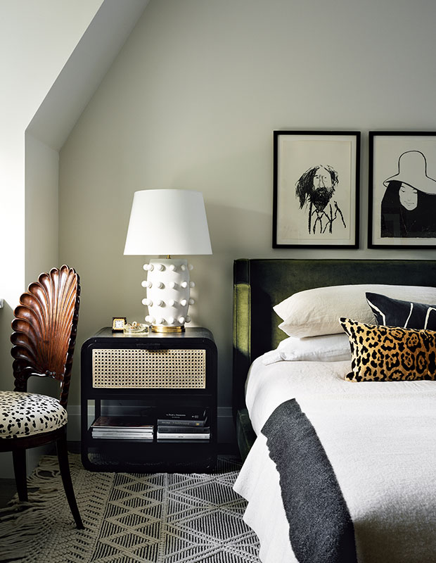
In the principal bedroom, a scalloped chair with a spotted seat is fun with the textured Kelly Wearstler table lamp and leopard-print accent pillow.
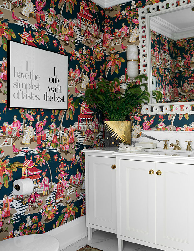
Being in Erica’s orbit has clearly had an effect on Corey: he chose the wild wallpaper in the powder room.
A Charming Charleston Classic
In this circa-1970s home in Charleston, Tommy was tasked to highlight the home’s historical charm. He wanted to stay true to the city’s history and furnish with antiques while keeping the space light and bright. Black lanterns, a Tommy Smythe signature, are a counterpoint to the living room’s pale putty palette.
The owners often work at the Gustavian dining table; the chairs are local finds that were bleached to update them. Antique ginger jars balance the scale of the chunky lantern.
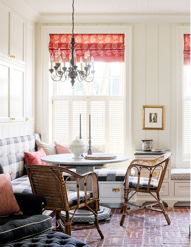
The original dining room was combined with the kitchen to create a charming eat-in banquette area.
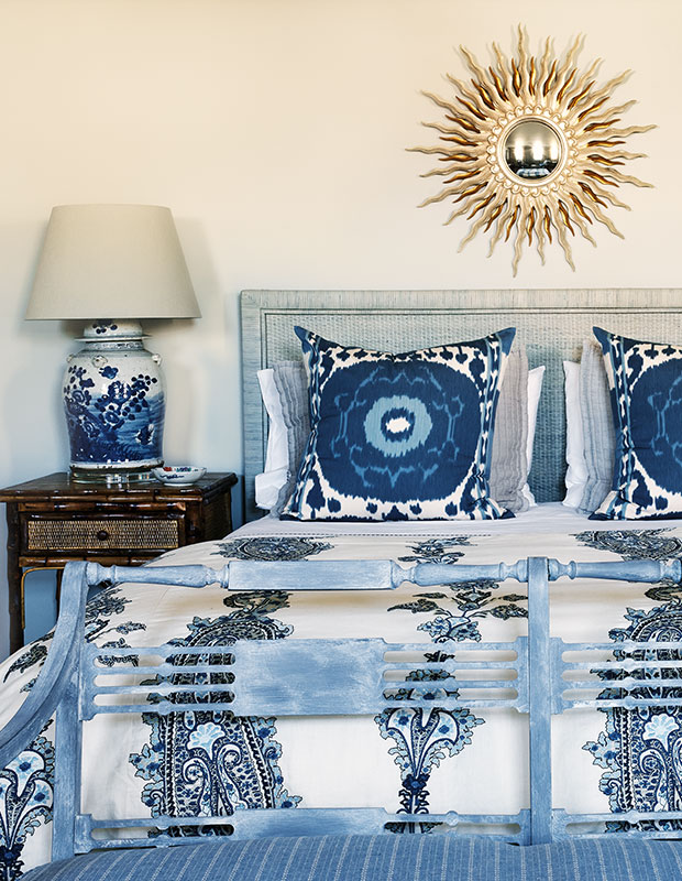
Ikat accent pillows and block print–style bed linens are a bold look in this guest room.

The fresh combination of aquamarine, marble grey and soft lilac hues reflects Charleston’s seaport heritage and location.
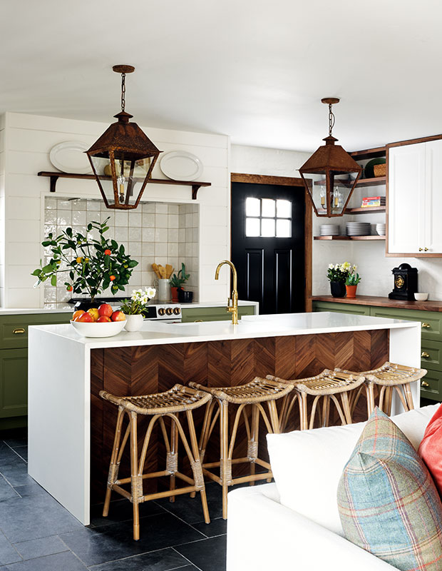
A Welcoming Urban Farmhouse Kitchen
This homeowner’s busy life was not helped by her stress-inducing kitchen. In a collaborative effort, Tommy, Trish Johnston and Brian McCourt all stepped in to update the dysfunctional galley kitchen. Two lantern pendants brighten the kitchen – a splurge, but just right for illuminating the island where homeowner Jennifer bakes cookies with her grandkids.
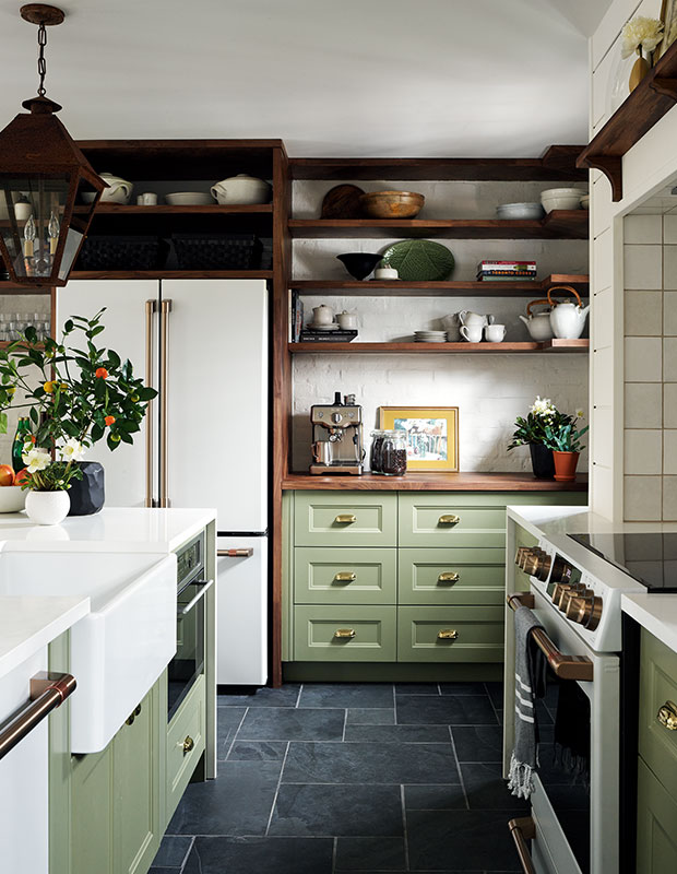
Preserving the home’s rustic country vibe meant installing a hearth-style vent hood, French inlayed slate floors strong enough to withstand the wear and tear of daily traffic, and matte white appliances that felt “friendlier than stainless steel,” says Tommy.
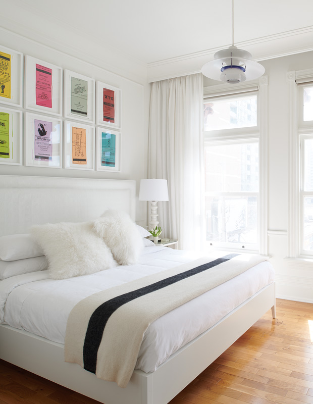
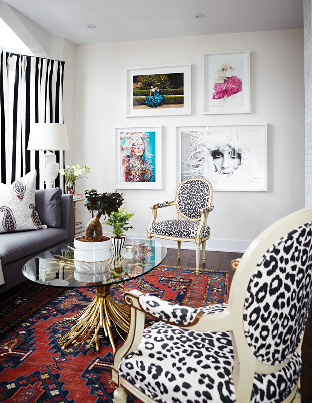
A Personality-Packed Hotel Suite
Tommy redesigned a pint-size hotel room (room 303, the Lucky Stryke room) in Toronto’s Gladstone Hotel with sophisticated style and a spotlight on art. “I photographed these bar, nightclub and restaurant matchbooks that nod to Toronto’s queer history, drew them and coloured them vividly so they’d stand out in the space,” he says.
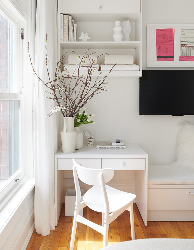
“As a frequent flyer and longtime lodger, I know the value of a designated desk area,” says Tommy. “When designing a modestly sized space the best way to include a work surface is to build it in.”
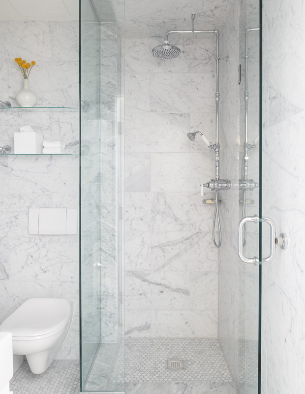
“To maximize space in the shower, I employed a little trick you should steal if you’re doing your own itty-bitty bath reno: a completely external shower system needs less wall depth and doesn’t skimp on bells and whistles,” says Tommy. “This made-in-Canada example has temperature control, handheld components and a rain showerhead, all on a very attractive frame.”
A Former Fashion Editor’s Pad
Holt Renfrew’s Lisa Tant turned to Tommy to refashion her dated condo into a lively reflection of her personal style. “I wanted to give Lisa’s home a nod to French fashion without feeling overtly themed,” says the designer. “The wheat sheaf, a favourite motif of Yves Saint Laurent, takes the form of a gilt cocktail table here.”
“The main footprint of Lisa’s kitchen stayed more or less the same, but I did make a few critical adjustments to create a more user-friendly plan and upscale look,” he says. Tommy replaced the original dated floor tile with a prefinished walnut hardwood, which runs through the condo. Tommy customized the cabinets to allow for an undermounted flatscreen, which blends into the all-black side of the island.
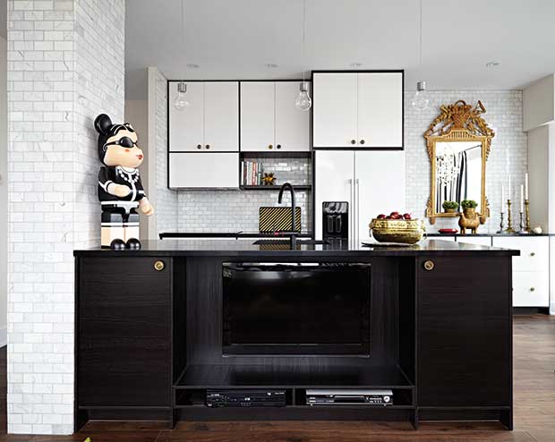
A Bold & Bright Historic Home
Tommy revived this stunning Toronto family home but kept a heritage feel. Full-height subway tile makes a statement in the kitchen’s sitting area, used by the homeowners for casual time with their two children. The inside of the Victorian armoire was wallpapered in a delicate Albert Hadley print to make it appear less heavy and more youthful.
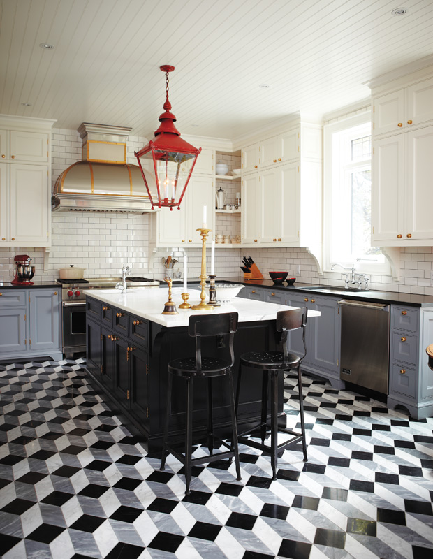
The kitchen cabinets are a mix of colours, while the counters pair marble and honed granite. An oversized lantern (a Tommy trademark) gets a new life with red paint. “They wanted a house that was modern, youthful and colorful but classic enough that they wouldn’t have to redo it — maybe ever,” he says. “The permanent installations are all based on timeless influences.”
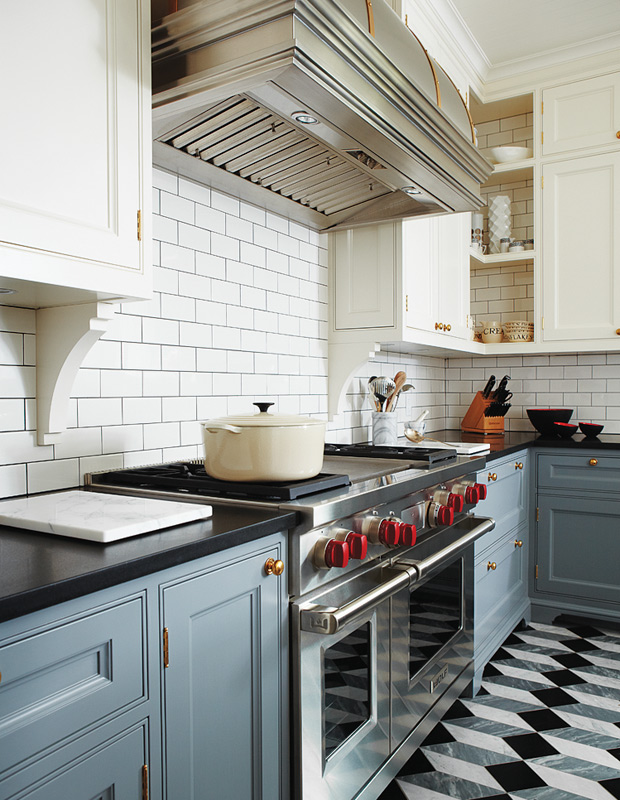
Even the range’s red knobs tie in with the kitchen’s scheme.
The principal bedroom is awash in calming grays. Tommy chose the vintage glass light fixture for its strong shape, which reminded him of a headdress.
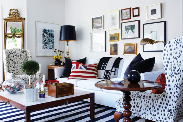
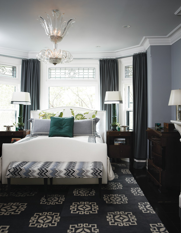
A Colorful & Eclectic Apartment
White walls are a crisp foil to aged antiques and darker finishes in an early apartment occupied by Tommy. “This is the first really white living room I’ve ever done,” admits Tommy, whose past homes were distinguished by dark, dramatic walls. Since the sofa is also neutral, it blends in and doesn’t overpower the small space. “White is also the perfect backdrop for layering in strong colors, which I chose to give the room a youthful, happy feel.”
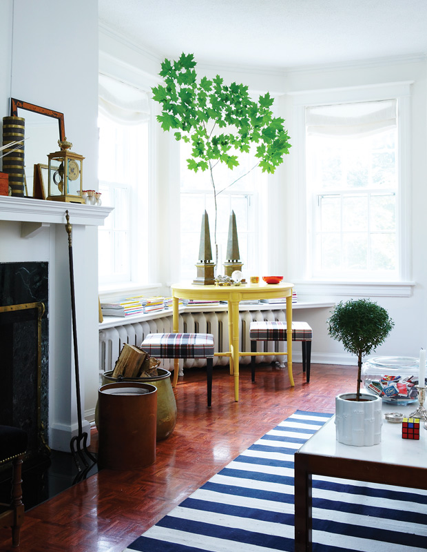
To create a dining area in his compact abode, Tommy set up a cheerful yellow table and low tartan stools in front of a bay window. When not in use, this bright surface displayed pretty curios and fresh-cut foliage.
The bedroom is a marked departure in style from the rest of his one-bedroom apartment. “The living room is fun and energetic, but I wanted this room to be serene,” he says. He painted the walls a soft gray-green to achieve that effect.
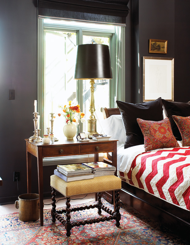
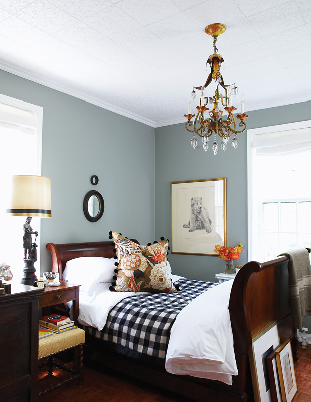
A Bold City Retreat
Tommy turned this petite, 180-square-foot apartment into a chic gentleman’s retreat using a sophisticated palette and vintage pieces. An antique writing desk does triple-duty, serving as a dining table, nightstand and desk. “It’s the best thing I own,” he says. “It’s not some piece of convertible modern furniture, but it does the trick for everything.”
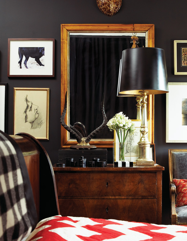
Tommy often doesn’t get home until the sun goes down, so he decorated his former apartment to suit a night owl. “I wanted a nighttime space, so I didn’t do bright and white,” he says. The dusky palette sets off the wood tones of his antiques, such as the Biedermeier chest of drawers and English sleigh bed.
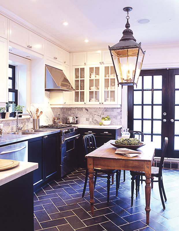
The first time we spotted Tommy’s signature lantern was in his carriage house-inspired kitchen in this 2004 story. “”I remember what a big moment that was for me,” says Tommy. “It was the first time I was shown as a designer with my own point of view. That kitchen went viral — before things went viral — and was republished many times.”