

Decorating & Design
April 11, 2018
See Stunning Spaces By House & Home’s Masters Of Decorating With Color
There’s an art to decorating with color, and these designers and homeowners have mastered it. Never ones to shy away from a saturated paint color or a daring riot of pattern, these vibrant personalities let the color wheel lead their way. We’re celebrating their fearless approach to decorating by sharing the brilliant spaces they’ve designed from the pages of House & Home. Click through to get inspired.

Given homeowners Brad MacArthur and Jude Allison’s creative brio — Brad is a singer and furniture-maker, Jude a visual artist — it’s not surprising that their home is saturated with color and filled with treasured finds.
“Color has always captivated me,” says Jude, who quickly painted over the century home’s muddy hues after moving in. “For a lot of people, it’s overwhelming and possibly even garish, but I can’t live without it.”

A rich mustard hue frames the doorways in the living room, while a tin ceiling adds a hit of texture overhead. When asked how to start decorating a room, Jude’s answer was simple: “Most rooms will give you a sense of what they need, which is rooted in the size of the space, scale (or lack of) architectural details, texture of surfaces, flow and natural light. Consider how the space will be used, and how you might make the mundane special.”
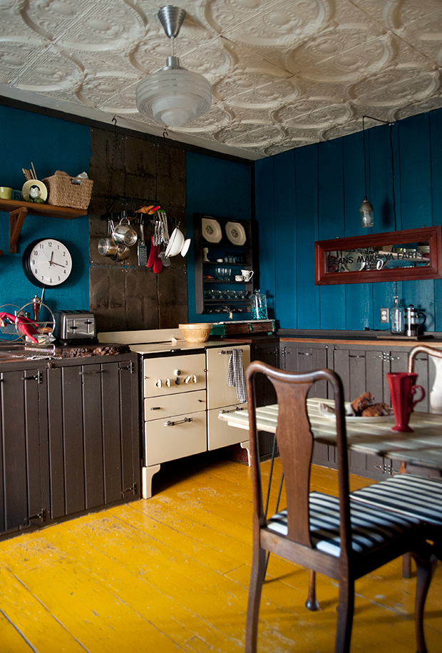
Deep blue walls envelop the kitchen, while hardwood painted in a cheery yellow shade keeps the room from feeling too dark. The couple salvaged the 1927 stove from a dumpster in Toronto.
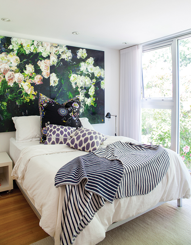
When you’re an artist, it’s hard not to crave color. Case in point: artist Bobbie Burgers’ own Vancouver home.
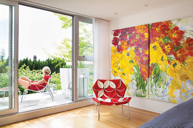
Known for her large-scale floral paintings — like this vibrant piece in the principal bedroom — Bobbie’s art both inspires and anchors her decorating, providing color, texture and pattern to white walls and minimalist furniture.
For Bobbie, it’s important to keep shaking things up: “It’s not about matching or being in style; I play around with things like the flowers, pillows, throws and artwork about once a year.”
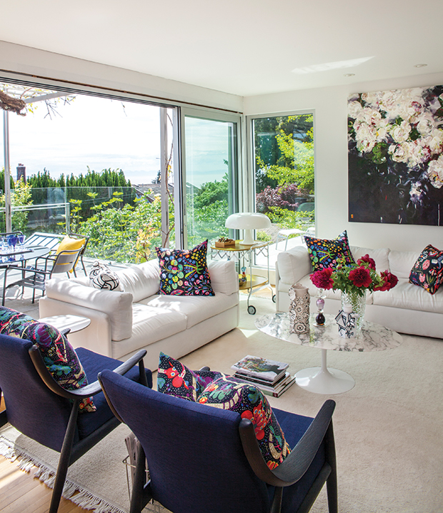
Floral-patterned pillows are the perfect complement for the painting’s bold palette in the living room. The teak chairs were a lucky curbside find that Bobbie had reupholstered in a royal blue for an extra punch of color.
A moody artwork by Bobbie acts as a headboard in daughter Isabella’s room. Floor-to-ceiling windows and simple white bedsheets keep the room feeling bright and calm.
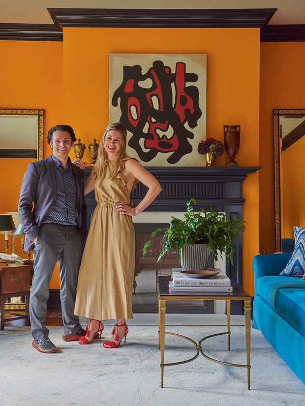
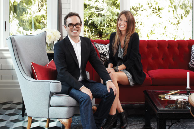
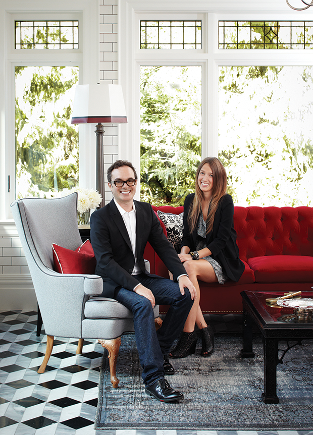
When homeowner Lindsay traded her city apartment for this four-bedroom, four-bathroom Arts & Crafts–style home in Pound Ridge, New York, she knew exactly who to call to take her home from bland to brilliant. Designer Garrow Kedigian is known for his use of color, and in him, Lindsay found the perfect design lead.
“The house was a white, sterile box,” says Lindsay. Every time I opened the front door — and granted, I was very pregnant — I felt ill.” Now the home couldn’t be more opposite: each room has interest and intrigue, and of course, color. Above, Lindsay and Garrow stand in her lively living room, which pairs tangerine walls with a bright blue sofa.
Tour Garrow Kedigian’s home on H&H TV.
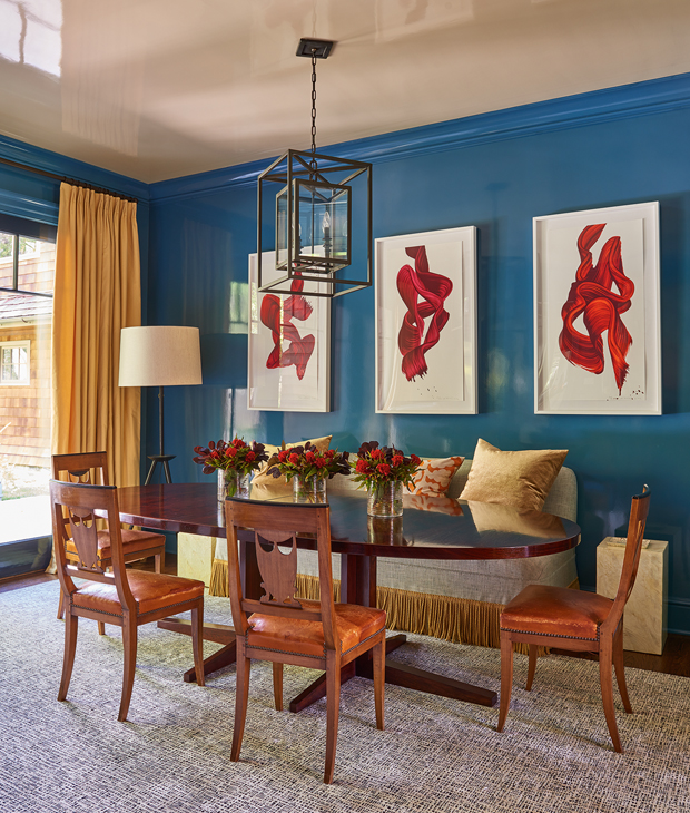
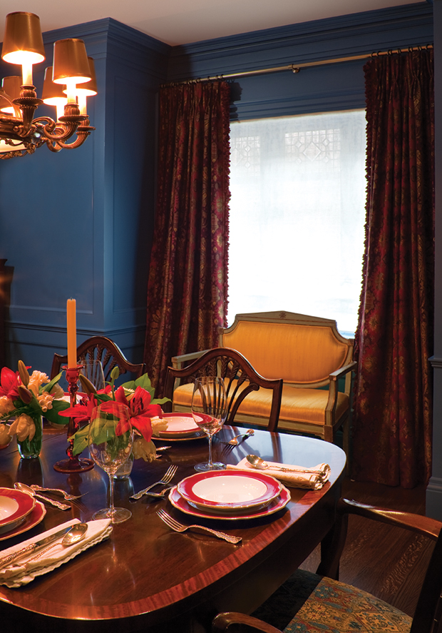
High-gloss blue walls set the scene for a dramatic, statement-making dining room, while red and yellow accents add warmth and ground the space. “Whenever you want to repeat a color in a room, never repeat the exact color or fabric,” says Garrow. “Choose something slightly off but still harmonious.”
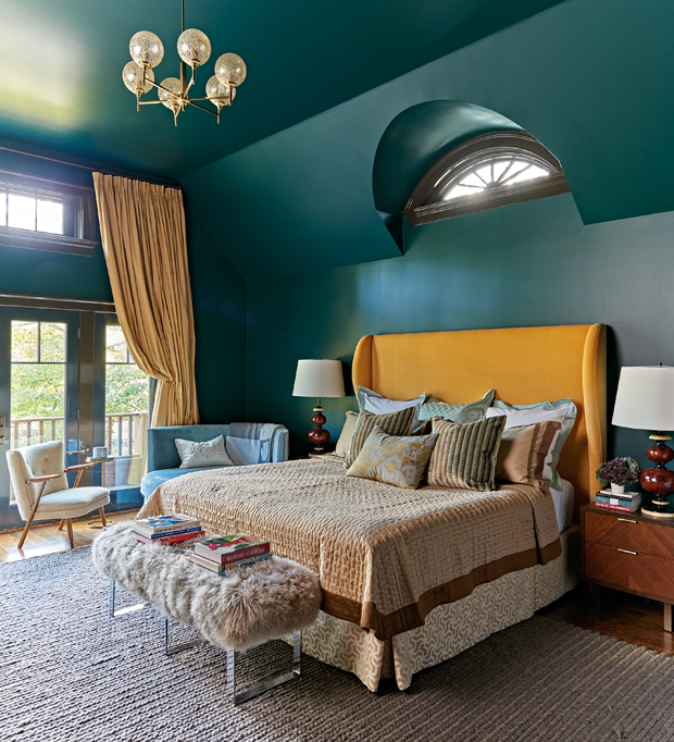
Because of the principal bedroom’s high ceilings, Garrow painted every surface a dark green shade that envelops the space. Classic accents paired with mid-century modern furniture give the space a New York-meets-Paris feel.

When the owners of this 250-square-foot bunkie asked designer James Davie to decorate, he knew exactly where to look for inspiration. “You embrace the environment and the view out the windows and go with that,” he says. James offset custom designs with big-box store steals and vintage pieces to keep the project on budget and ensure it was ready for sandy feet, wet bathing suits and sticky s’mores fingers.
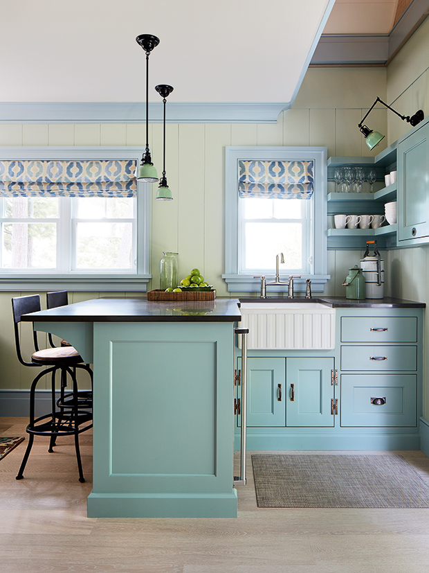
James embraced a soothing palette of blues, browns and greens to reflect the bunkie’s lakeside locale. To tell a more complex paint story in the kitchen, James painted the window trim, baseboards and crown molding a light blue, and paired it with a deeper blue on the cabinets and shelves.
After a decade of living in New York with his partner, Mark Hendricks, James toured over a dozen homes in search of the perfect historical abode in Toronto. This circa-1876 heritage home ticked all the boxes: “This house wasn’t like any other, it had such unique features. The double lot, the stone façade, the mansard roof and sweet little side porch — I was looking for an untouched historic home and knew this was a place I could work wonders with.”
The couple embarked on a two-year renovation to turn it into their dream space, awash with bold color and filled with statement-making pieces.
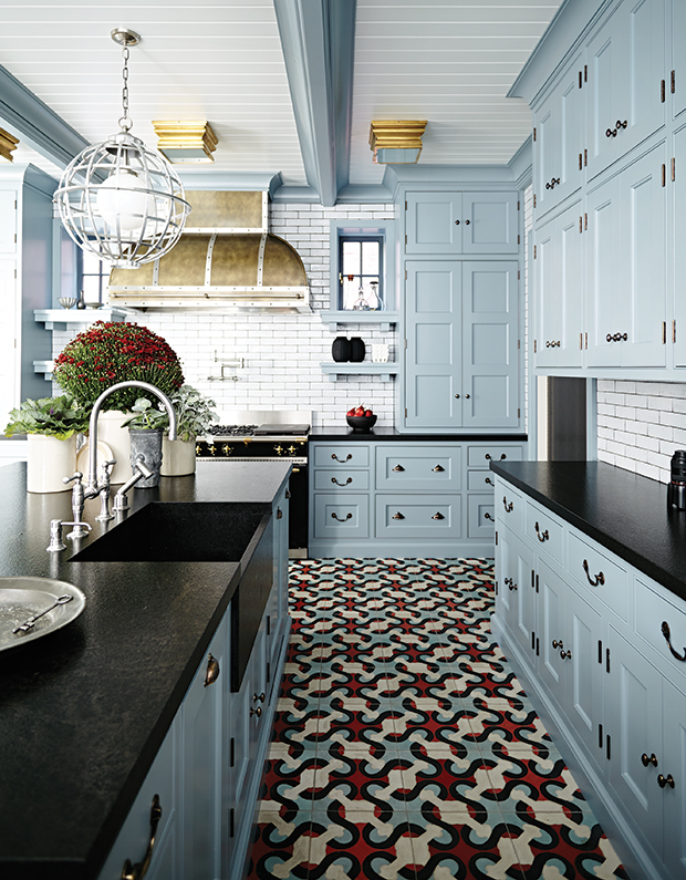
Striking cement floor tiles add a fun element underfoot and keep the kitchen’s traditional design from feeling too serious. “I knew our kitchen would be a collection of all my favorite things. It’s the spare-no-expense room.”
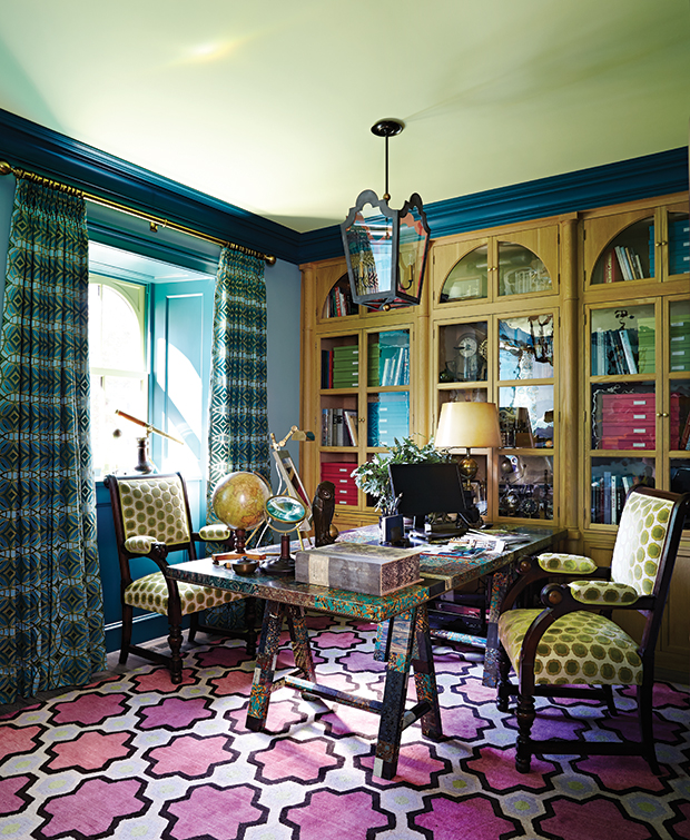
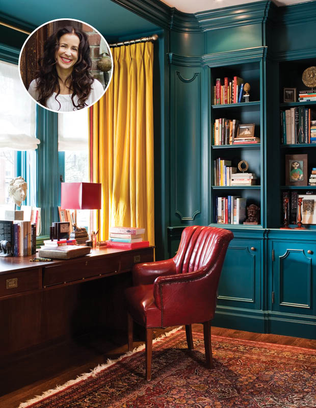
A custom-made desk, finished with a collage of book-binding paper, was the jumping off point that inspired the office’s vibrant color scheme. A bright pink rug demands attention, while a cool, lime-green wall keeps the room feeling airy. Simple oak built-ins add natural texture.
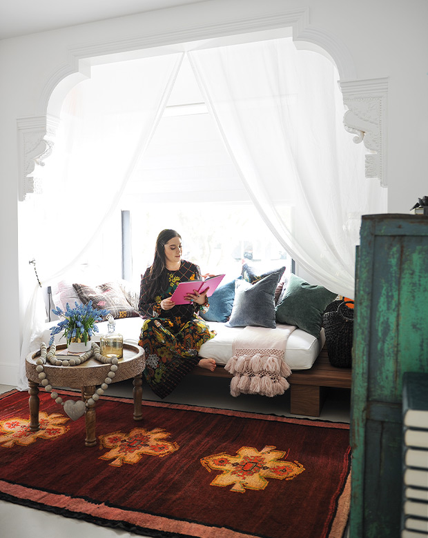
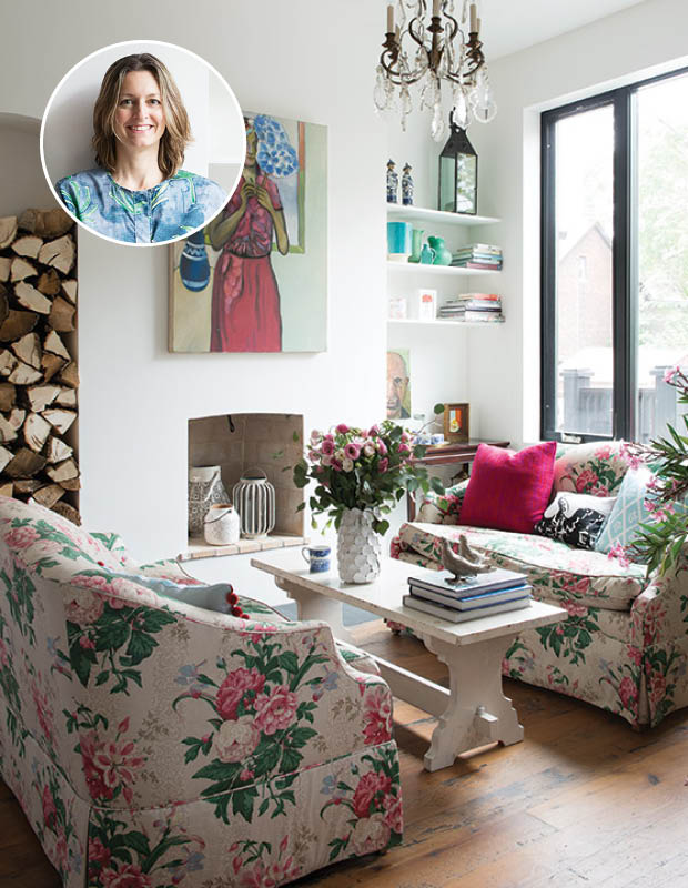
While some might struggle to put their personal design stamp in a small space, artist and homeowner Sara Shafran embraced the challenge. Working with Erica Schmidt and Ivan Quintana of Medina Design House, Sara transformed her Vancouver loft into a gallery. “My goal was to merge my work and my life. I wanted to use the space as an exhibition space for emerging and contemporary artists, Canadian and international — a place to screen films and host dinners or lectures relating to the show.”
An avid yoga enthusiast, Sara transformed a guest bedroom into a meditation room. A rich rug grounds the otherwise airy space.
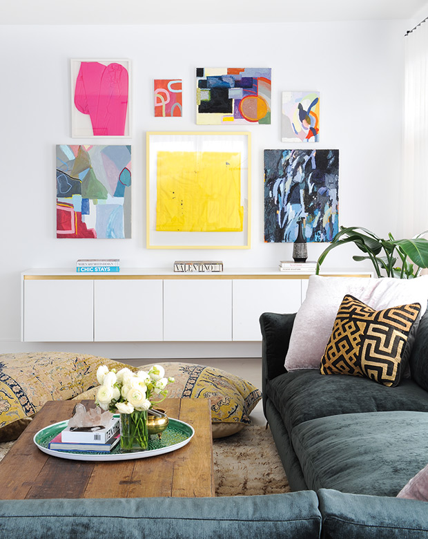
Taking a cue from art galleries, Sara painted the walls a crisp white to let vibrant paintings steal the show. In her living room, a colorful grouping of her own artwork has pride of place over a custom floating console.
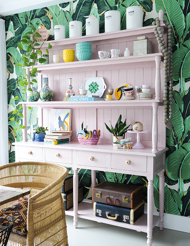
A hutch done in millennial pink anchors the dining area and hints at Sara’s sense of color. Woven end chairs and iconic Martinique wallpaper impart a breezy, tropical vibe.
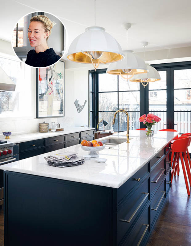
Homeowners Genevieve Makinson and James Aitken proved you don’t have to play by the rules when decorating a heritage home. Their approach to decorating? “For me, it’s about letting go of fear,” says Genevieve. “My look is eclectic and James is more traditional, so there’s a mesh of styles.”
The kitchen’s deep blue cabinetry pays homage to James’ favorite color, while gold accents and a quartet of bright red stools punctuate the space.
“I incorporate color through paint, wallpaper, furniture and flowers — flowers make anything brighter,” says Genevieve, when asked how she decorates with color. In the living room, white walls provide a clean envelope for unique art, color-blocked book spines, and a mix of vintage and graphic furniture.
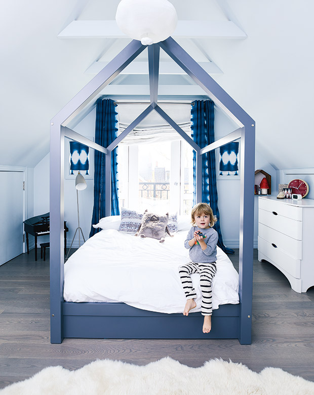
A custom canopy bed painted in an attractive blue-purple hue is the highlight of son Pete’s room. Genevieve opted for tie-dye drapes for a fun, psychedelic touch.
Designer Theresa Casey embraces the rainbow: “Color is the easiest way to transform your space — you can have a wall come forward or recede. Sometimes a small room doesn’t have a lot of light, and you add a beautiful eggplant purple, et violà, your space is cozy and warm.”
Historic color enchants in this library, where the millwork is saturated in a cerulean blue. A red wing chair and rich yellow drapes pair perfectly with the hue.
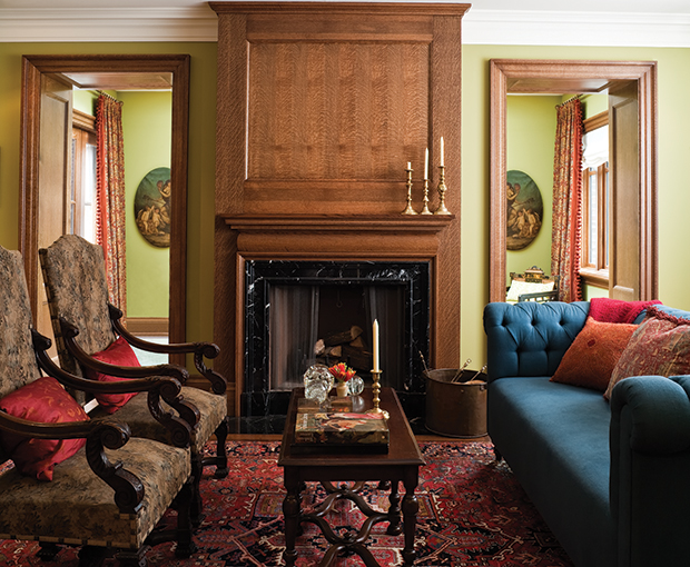
A smattering of red and orange pillows and a sapphire blue sofa pop against this living room’s fresh apple-green walls.
While the home’s color palette may be intense, it doesn’t feel overwhelming. “Sometimes you go into a room and feel like you need sunglasses; that means there’s too much color,” says Theresa. “There’s more to using color than intuition. You have to know the principals.”
In the dining room, traditional hues — such as the mustard in the settee — impart warmth.
The homeowners of this Victorian home wanted a house that was modern, youthful and colorful but classic enough that the design would stand the test of time. Enter designer Tommy Smythe, who worked with the couple to decorate the house over the span of a few years. “Given free reign, this is what you’ll get from me: strong colors, bold gestures and traditional references.”
Tommy is pictured with project manager Jenny Dames above.
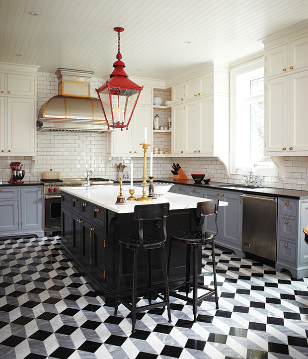
The kitchen cabinets are a mix of colors, while the counters pair light marble and dark granite. An oversized lantern painted fire-engine red is the heart of the room. “I just love a black, white and grey scheme with a bit of red thrown in.”
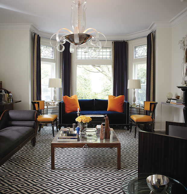
Tommy contrasted deep blues with bright oranges in the living room. Solid color on the sofa, drapes, pillows and chairs allowed for a patterned rug underfoot.
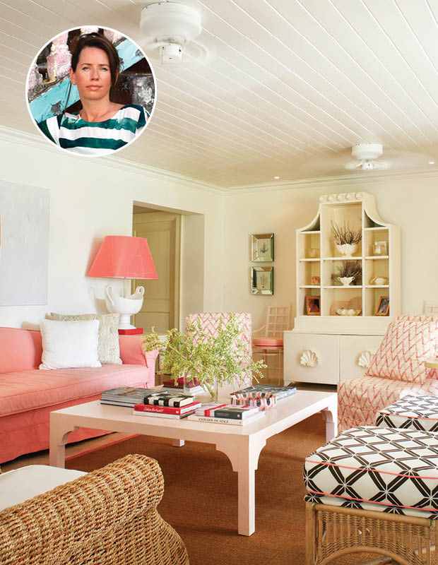
Designer Colette van den Thillart’s Barbados beach house is breezy and bright, with a glamorous pink palette and plenty of objects found on the beach. “I work all over the world, and no matter where I land, the first thing I do is get out to the markets. I find out if there are any houses I can get into, to look at colors, lights, architectural details — to pick up on the vibe, really. I wanted this house to be a glam shack — the romantic idea of the room on the beach… but a bit more glamorous than that!”
A punchy coral slipcover sofa is the star of the living room, while the jute rug tempers the pink and keeps the room from feeling too feminine.
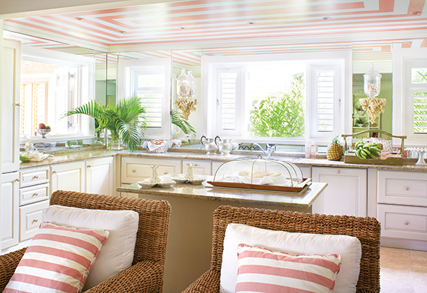
A pink-and-white striped ceiling in a high-gloss finish is a talking point in the kitchen. “My children laugh at me, because on the left is a walk-up window, so when I first did the ceiling, the girls would come up all the time and pretend to order ice cream!”
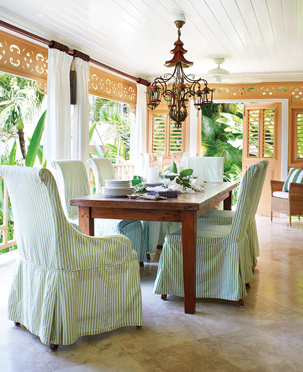
When Colette first bought the home, a lot of the rooms felt dark and uninviting. To enhance the indoor-outdoor living feel, Colette refreshed each space to reflect the home’s beachside locale. In the dining room, green-striped slipcovers and teak furniture play up the greenery outside.
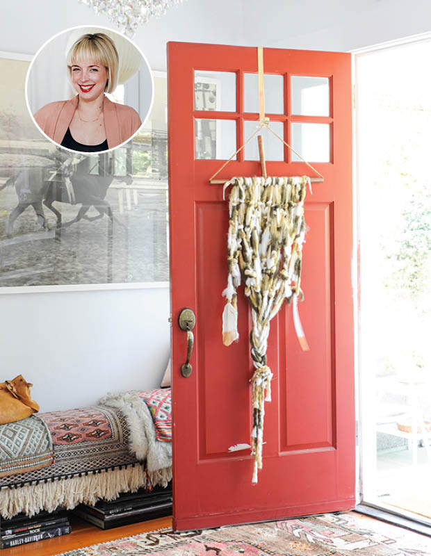
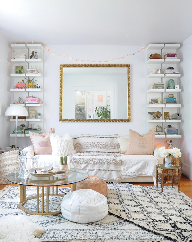
For designer Jennifer Scott, it was important to fill her house with family heirlooms and special things she’s collected. “I love making my style work here,” she says. “It’s bohemian with a bit of rock ‘n’ roll. And I have a huge affection for all things Moroccan. Shortly after I moved in with my daughter Sienna, I took a trip there… I came home with many rugs, vintage wedding blankets and textiles, which I use to anchor every room.”
A cheerful red-pink front door perks up a macramé wall hanging.
To brighten the house and quiet the circa-1905 home’s more historical features, Jennifer painted everything white. “And I mean everything! The walls, trim, doors and ceilings are all the same color and even the same satin finish. Doing so immediately brightened the house and muted some of the stronger traditional elements, like the heavy moldings and trim.”
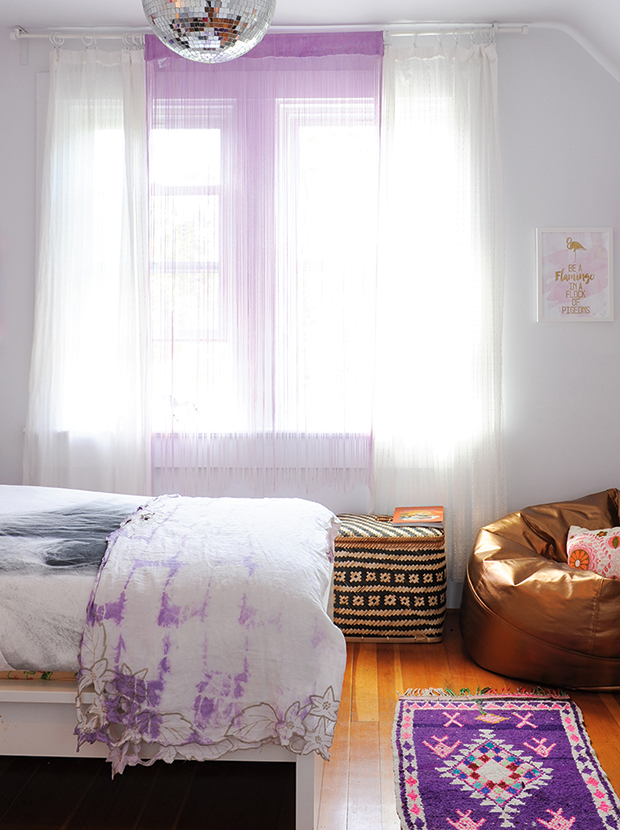
In Sienna’s room, purple-tinged drapes and linens streaked with plum nod to her favorite color, while a rich rug in a similar hue completes the look.
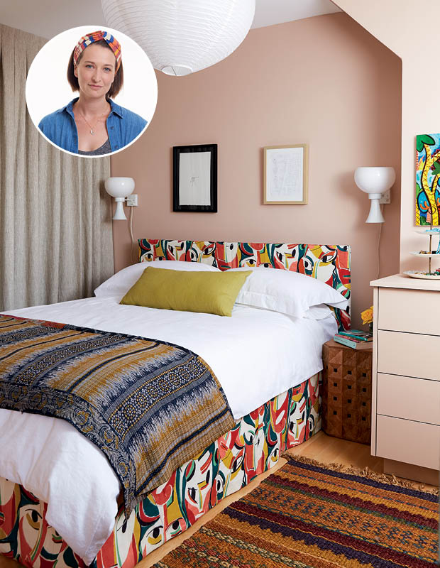
After H&H design editor Kai Ethier and husband André installed a skylight in their principal bedroom, the couple knew it was time to transform the bland white space into a haven of patterns and colors. Painted a soft, dusty pink and filled with artwork, the bedroom is now packed with personality.
One of the room’s most unique features includes a bold print on the bed that depicts traditional Japanese theater masks. “I love the colors and the drama of it,” says Kai.
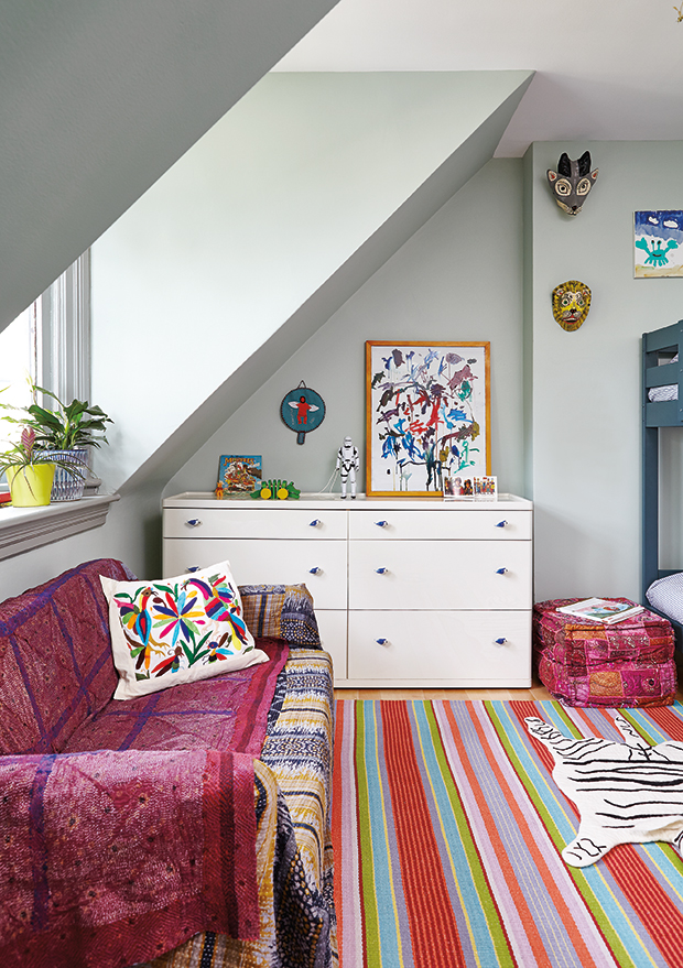
Kai created a fun yet sophisticated bedroom for both of her young kids, Louis and Frances, to share. A brightly striped rug, blankets from Mexico, and quirky animal motifs enliven the space.
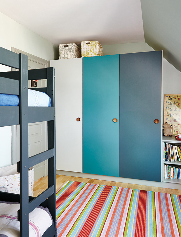
In the kids’ bedroom, closet doors done in graduating shades of blue break up the wide, flat surface, while walnut knobs introduce an artisanal feel.
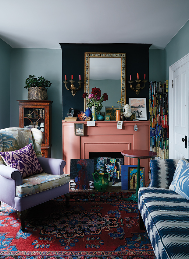
Kai’s color-filled living room is both dramatic and romantic. Murky blue walls, a coral mantel and black chimney breast feel rich and moody when paired together.
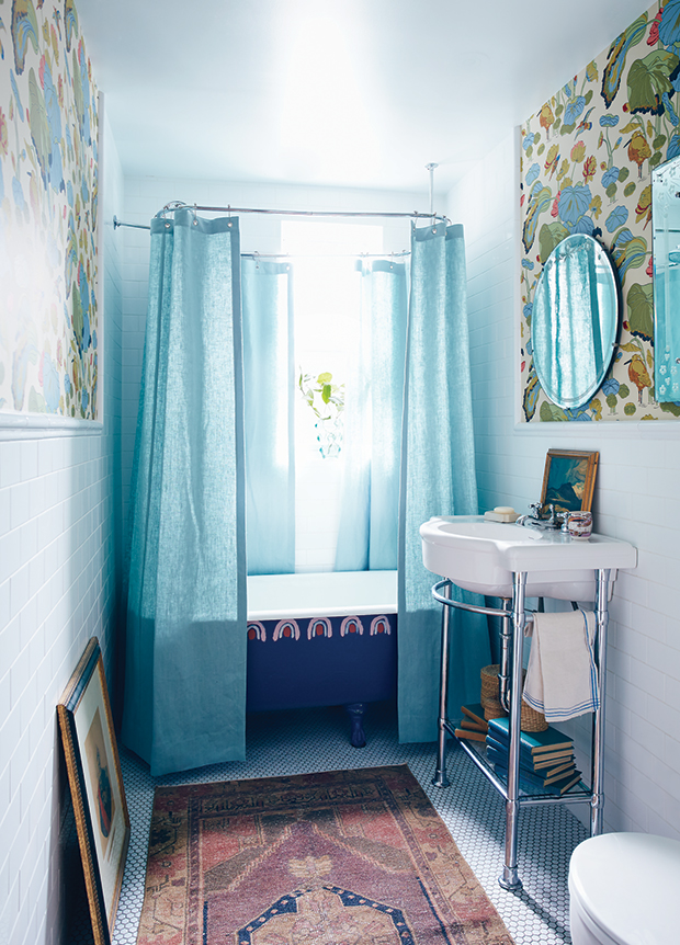
Hand-painted rainbows prove that even a bathtub can become a work of art. Creamy wallpaper and a red Turkish rug warm up the white tile and blue shower curtains.
Designer Katherine Newman is known for artfully layering patterns, textures and furnishings for a playful yet cohesive feel, and this home is no exception. Though it was built in 2011, this home has a sense of history. “I don’t have anything against new,” says Katherine, explaining that she was keen to sidestep of-the-moment design choices in favor of artful pieces in energetic colors.
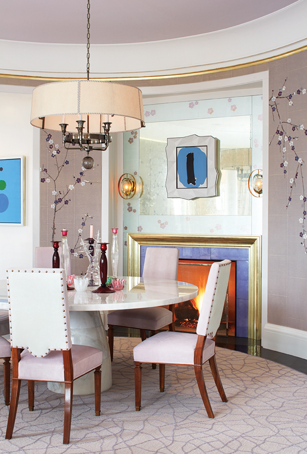
Femininity abounds in the formal dining room thanks to soft lilac walls and purple accents. A hand-painted cherry blossom wall treatment envelops the dining room in delicate pattern.
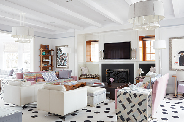
A graphic polka dot rug is the star of the living room. “It has a lot of humor,” says Katherine. “Not many people would have approved it, but this homeowner is very brave.”
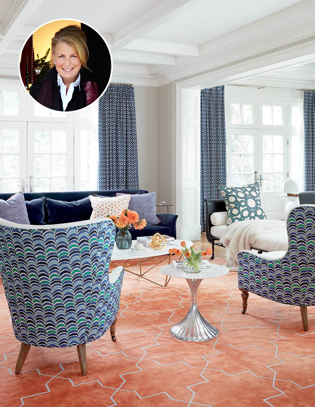
Homeowner Tamara Lennox didn’t need a push to commit to filling her Toronto home with color and pattern. “Jen knows I’m allergic to beige,” laughs Tamara, referring to her color-centric home done by designer Jennifer Worts. “I love that my house is colorful and patterned. I walk into rooms and I just smile — they put me in a great mood.”
And given that Tamara thinks of blue as a neutral, it’s no surprise that she didn’t bat an eye when Jen suggested a bright orange carpet for the living room. “Blue and orange sing together,” says Jen. “It’s a very luxe, sophisticated combination that Tamara won’t tire of.”
To ensure the space didn’t feel overwhelmed with pattern, Jen varied the scale of patterns. “If everything is the same scale, the eye doesn’t know where to look and just gets lost, especially with small patterns in a large room.”
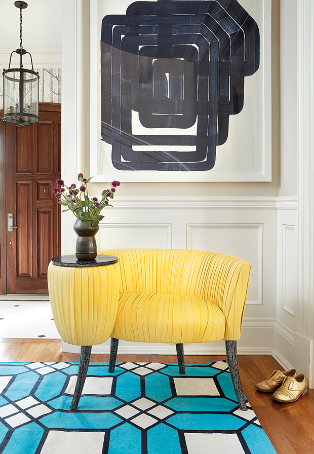
A canary yellow cocktail chair in the foyer is another daring color choice that Tamara couldn’t be happier with. “The chair came in black, but when Jen suggested this, I leapt at it!” she says. An electric blue rug in a graphic pattern is equally statement-making and vibrant.
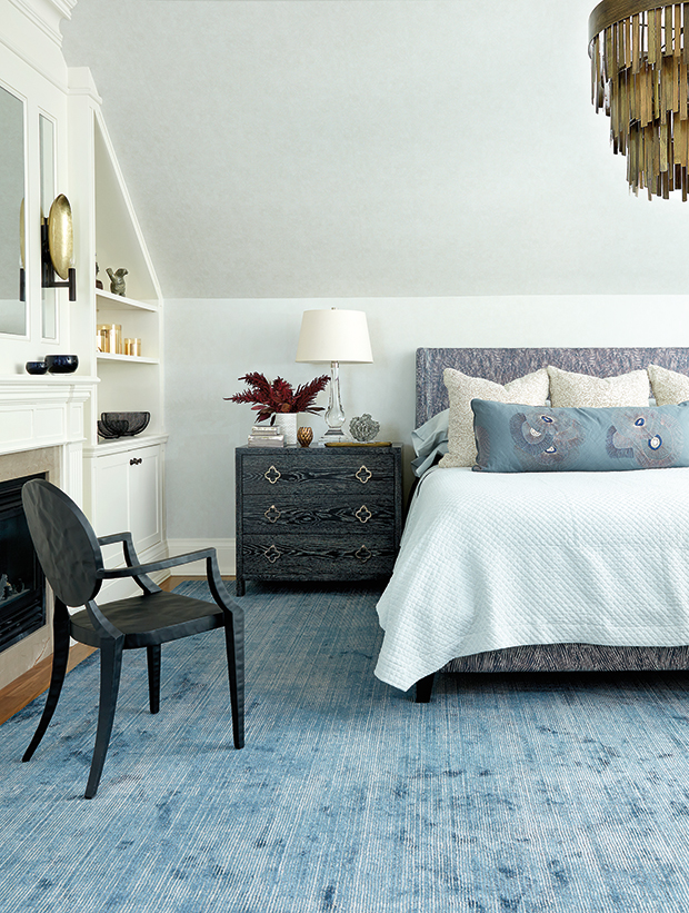
A fusion of watery blues are the common thread that tie everything together in Tamara’s principal bedroom. Different patterns found around the space ensure the mix of blues feel modern, not matchy.
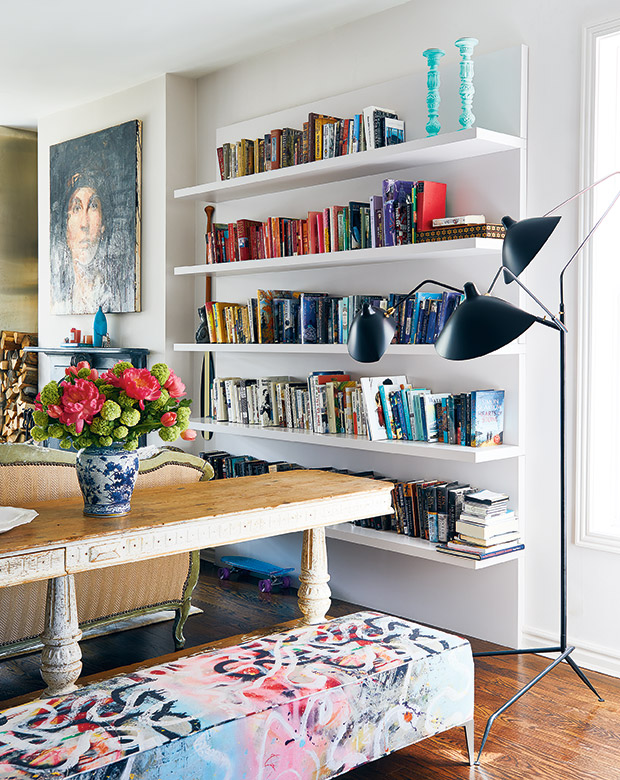
A simple, natural backdrop allows for whimsical patterns and nature-inspired color to come to life in artist and textile designer Virginia Johnson’s home. “My husband Louis and I were living in our beautiful old Victorian semi when this two-storey brick box came up for sale across the street. I’m a pack rat, and Louis is an engineer who likes a very sleek, streamlined style. This new house just works better for us — I didn’t feel sad ripping the newer, unhistorical house apart.”
Layers of casual florals and geometrics liven up Virginia’s living room. “I like to mix investment pieces with vintage ones. I like a colorful home,” she says.
A sweeping bookcase in the family room is home to a huge book collection as well as easy-to-reach toys on lower shelves for the couple’s children. The book’s mishmash of colorful spines ensure that the space’s two distinctly patterned lounge chairs don’t feel out of place.
Soft pattern play and a white backdrop make the principal bedroom feel calm and serene. Pale green drapes behind the bed act as a headboard.