City Homes
Toronto Designer Jackie Di Cara Uses Black, White And Wood Tones To Create Graphic Impact
Updated on January 8, 2024
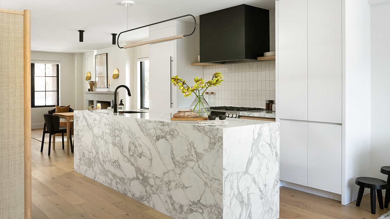
Less is more. That was the guiding mantra for Jackie Di Cara in her redesign of this 1,600-square-foot Rosedale home. Balanced by white oak, the black and white palette was the right choice for Jackie’s client, a busy professional working in the courts who needed a serene retreat to come home to, and a space for entertaining family on the weekends.
This graphic yet warm look is also indicative of a wider shift in design. “In Toronto, there’s been a move toward cleaner, more contemporary interiors,” says Jackie. “Our home has become our oasis; we want an uncluttered environment that brings a sense of calm and order. And our spaces need to function for both working and living.”
Scroll down to take a tour of this impactful space!

For this project, Jackie was so aligned with her client that she felt she was working on a house for herself. “There’s a minimalist undertone that comes from within,” says the designer. “It’s about trying to simplify things as much as possible.” The plan initially revolved around a main-floor renovation to improve the layout and bring more light to the space. However, in the process of designing the sitting area, kitchen, adjacent dining space and living room, the project expanded to a full gut of all three floors, plus a new second-storey addition.
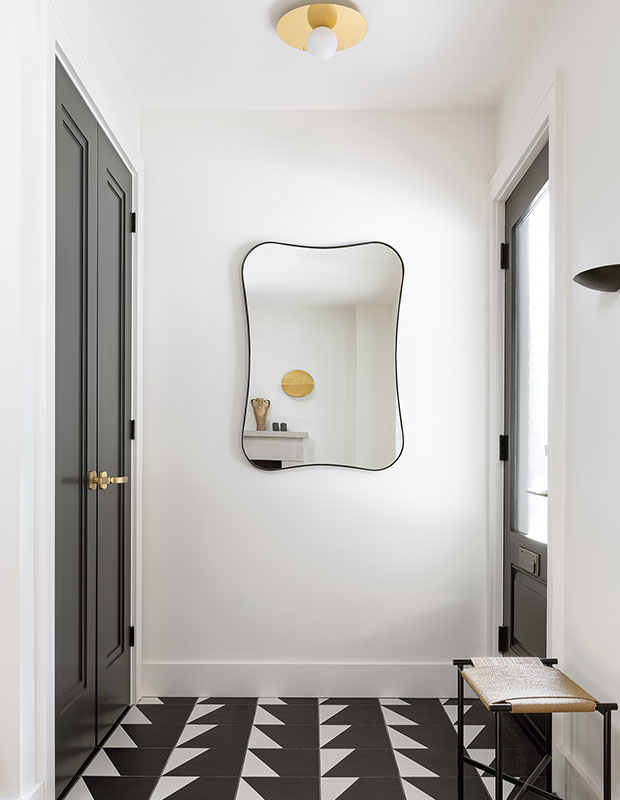
In this house, Jackie tweaked the classic black, white and wood formula to make it feel fresh. Take, for example, the foyer. Instead of going with the traditional black and white checkerboard floor tile you might see in a Victorian house, she modernized the look with a cool triangle pattern. The foyer is an ideal space to incorporate a bold design element like this floor tile.
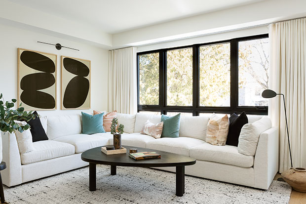
Hits of black, from the window frames, coffee table and striking oversized art, add graphic punch in the living room. The art immediately draws the eye while everything else in the room plays a supporting role. “You have to be careful with black because it’s a very powerful color and design tool,” says Jackie. “The percentage of black in a room will dictate how the space feels, so it’s important to get it right.” And that goes for all kinds of rooms, even ones where the decorating is more adventurous.
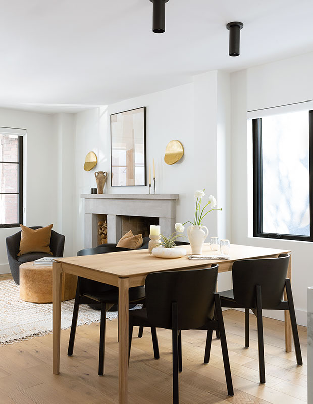
The cast concrete fireplace in the sitting area is the only element that remains from the original floor plan, and Jackie loves the unadorned, clean lines it brings to her design. “It contrasts beautifully with the curvy furniture, softer colors, art and natural tones,” she says. The furniture in the dining area is streamlined and airy.
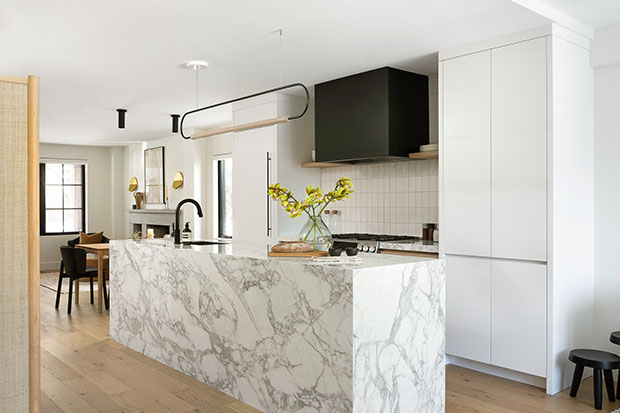
Acting as the centerpiece, the open-plan kitchen has a stunning porcelain island, and a black vent hood that’s an effective punctuation mark. Jackie’s client decided early on that she didn’t need to sit at the kitchen island. “She only wanted to put things in the house that were useful,” says Jackie. “Doing away with the island seating meant that we could clad it with statement slabs and have more comfortable circulation paths through the space.” A contemporary linear light fixture hangs above. “For me, anything graphic is a great way to grab attention,” she adds.
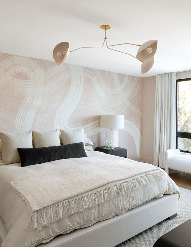
In the serene principal bedroom, Jackie introduced a wallpaper mural with oversized brushstrokes to create visual interest.
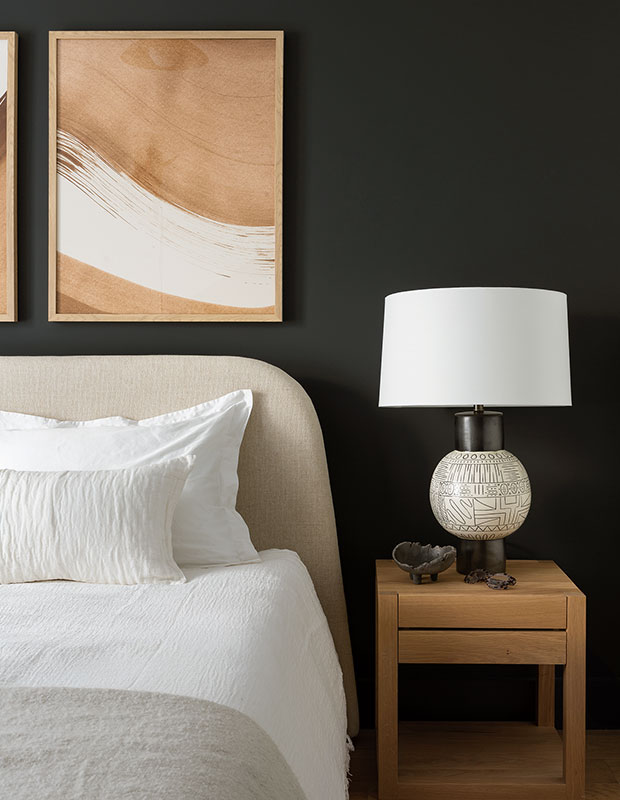
“A well-lit space with lots of natural light can easily take a black accent wall and still feel fresh,” says Jackie, referring to her client’s guest bedroom, “whereas a room with less natural light will take on a moody vibe.”
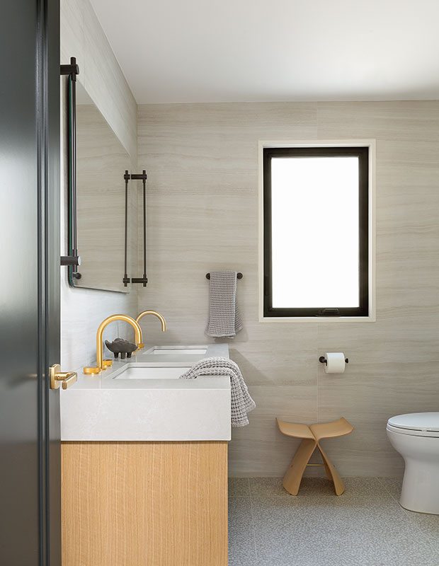
The principal bathroom counter is quartz, which requires virtually no maintenance. With the renovation now complete, the house is a statement-making study of contrasts — elegant and airy yet anchored in dramatic elements. Jackie’s less is more approach balances form and function, creating elevated, uncluttered rooms for her client to enjoy for years to come.
Kiely Ramos
House & Home September 2022
Jackie Di Cara


