Before & After
Before & After: A Tired Toronto House Gets An Elevated Facelift
Updated on January 2, 2024
Good design is balanced, thoughtful and detail oriented. That’s the guiding mantra for Delia Mamann, a Toronto designer who recently helped her clients, a young family of four, turn their builder-basic house into a luxe retreat. When Delia showed up to their North Toronto property, it was a “beautiful, typical Toronto house but everything was dated,” she says. There was wall panelling in all the wrong places, sterile bathrooms and a kitchen that was stuck in the ’90s. Without making any structural changes, Delia reimagined each space with modern finishes, smart storage and plenty of cool, edgy moments — including hits of off black in almost every room.
“The difference between good design and builder basic is that good design will make use of every inch of space,” adds Delia.
Keep scrolling to see how she transformed this tired family home into an oasis in the heart of the city!
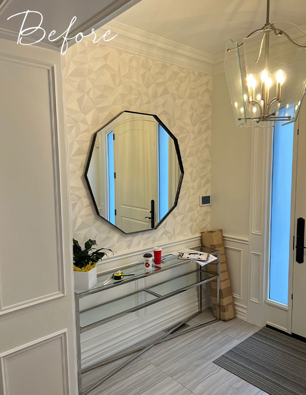
Before: The previous foyer had a silvery-grey palette that lacked personality. “The suspended light was an eyesore that we updated with a sleek flush-mount to make the ceilings feel even higher,” says Delia.
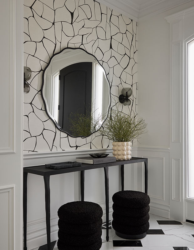
After: The new entryway sings with graphic Schumacher wallpaper, a scalloped mirror, smoked glass wall sconces and a play on checkerboard floors. “We painted the interior of the front door for added drama, and had the new porcelain floor tiles water-jet cut so that we could design them in a checkerboard pattern.”
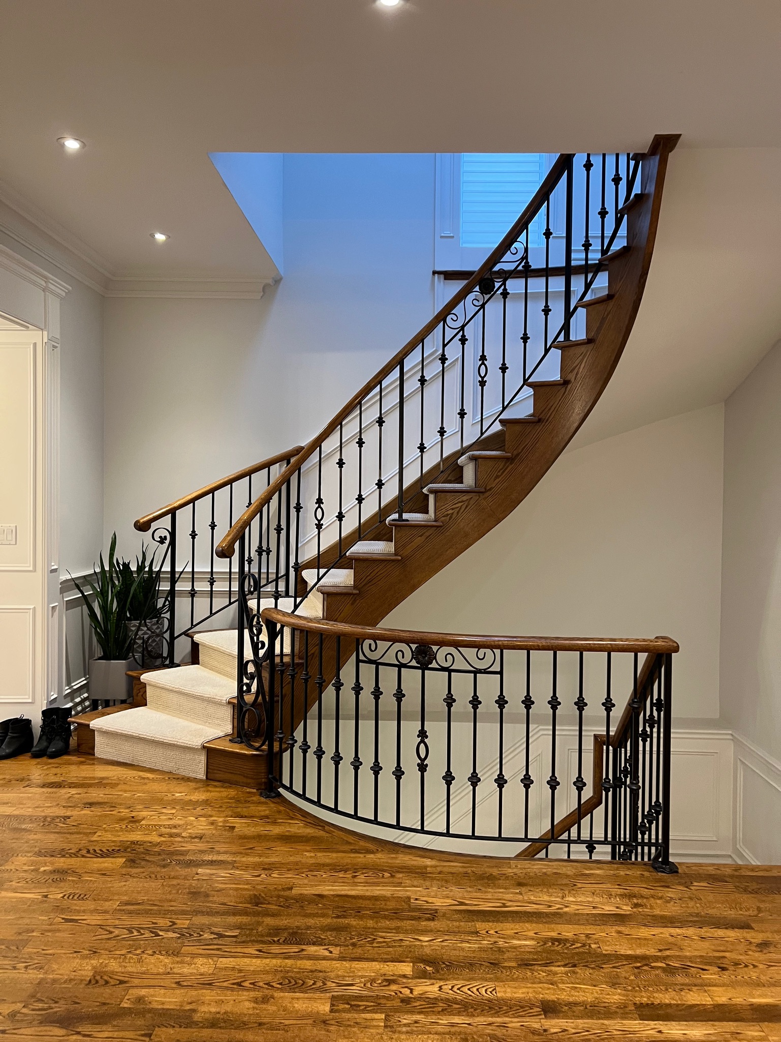
Before: The grand staircase off the foyer was wrapped in poorly designed wainscotting and an awkward niche cut into the wall leading to the basement. The floors were a harsh red oak in a shiny finish.
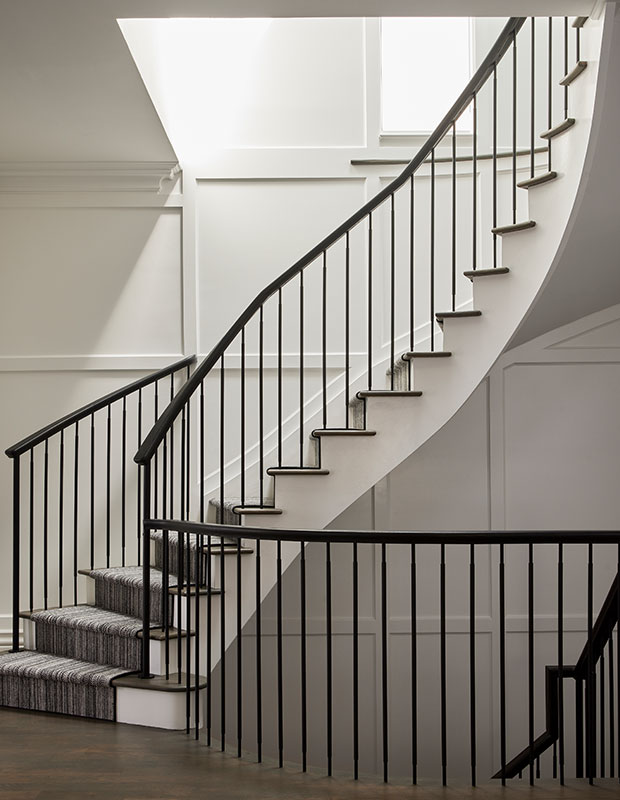
After: The new staircase feels like a sculptural moment. Delia flattened the walls below and above the stairs to create a mirror effect with box panelling. Simple upgrades include a black and white floor runner, new metal spindles, a sleek wood hand rail and a custom matte floor stain. “We took this staircase from dated to timeless,” she says.
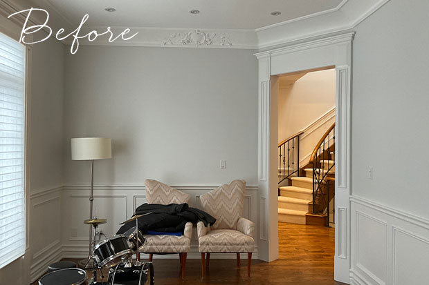
Before: The homeowners wanted to forgo the formal living room for a home office, but Delia urged them to keep the space for both.
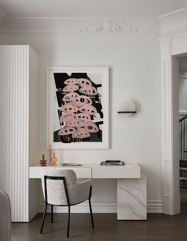
After: The redefined living room gets a new lease on life. A custom desk with a marble base ties in with the fireplace mantel, while a tall fluted cabinet keeps electronics and household items out of sight. Art sourced from On The Wall framing packs a graphic punch. “The goal was to design an office that didn’t feel like an office,” says Delia.
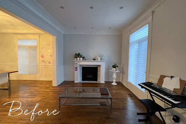
Before: On the opposite wall, the original fireplace insert was installed off-center, so Delia selected a wider marble mantel and removed the panelling to create the illusion of symmetry.
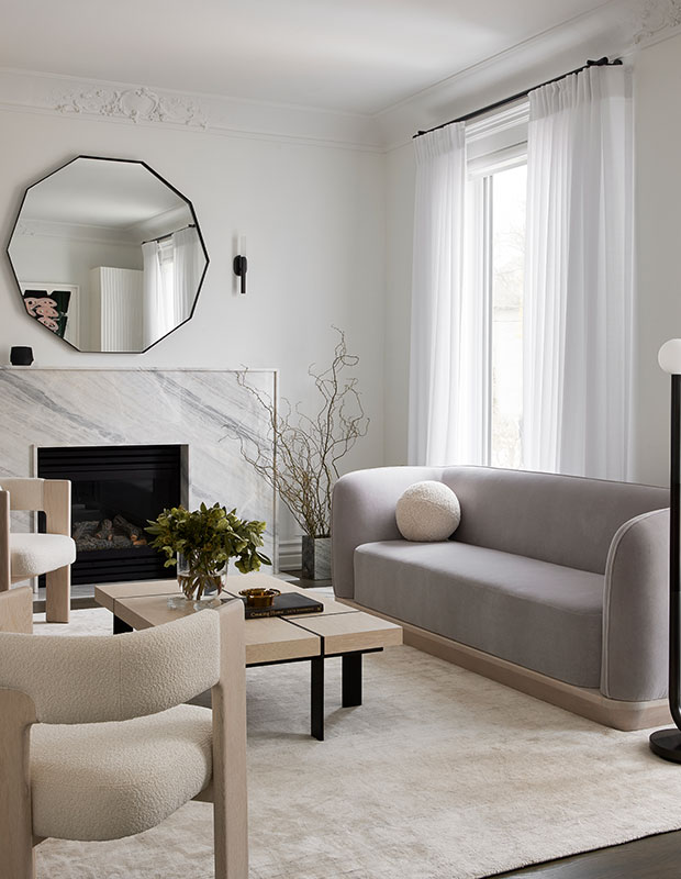
After: The new marble fireplace is a focal point, while original ceiling plaster brings in a piece of the home’s past. Luxe furniture sourced from Arteriors Home gives the reimagined room a modern, airy feel. Delia successfully managed to give her clients both an office and formal living room where they can relax, read and sit by the fire. “This is one of my favorite rooms in the house,” says Delia.
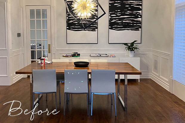
Before: Removing heavy trim and a glass passage door allowed the dining room to breathe. “We widened the archway and moved it to the other side of the room for better flow to the kitchen,” says Delia.
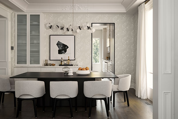
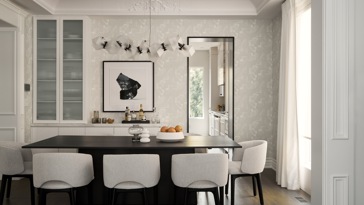
After: The new modern archway juxtaposes the original ceiling trim for a standout moment. This dining room wows with architectural lighting and soft wallpaper. A custom built-in storage unit keeps serving pieces easy to access and the frosted glass makes the white dishes look serene.
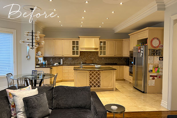
Before: The biggest sore spot for Delia was the kitchen. “When I first walked in, my first question was: Why are there so many rows of lights? It drove me crazy.”
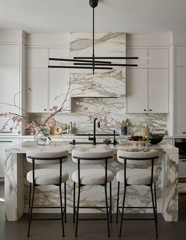
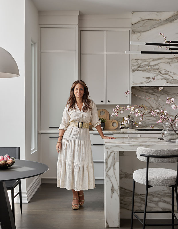
After: The new symmetrical kitchen is striking yet calming. Delia swapped the landing strips of pot lights with a bronze chandelier by Kelly Wearstler. By eliminating the bulkhead, the off-white cabinets soar to the ceiling, maximizing storage and height. “Composite Sintered stone in a silk finish reads like honed marble and gives the kitchen a luxurious look,” says Delia.
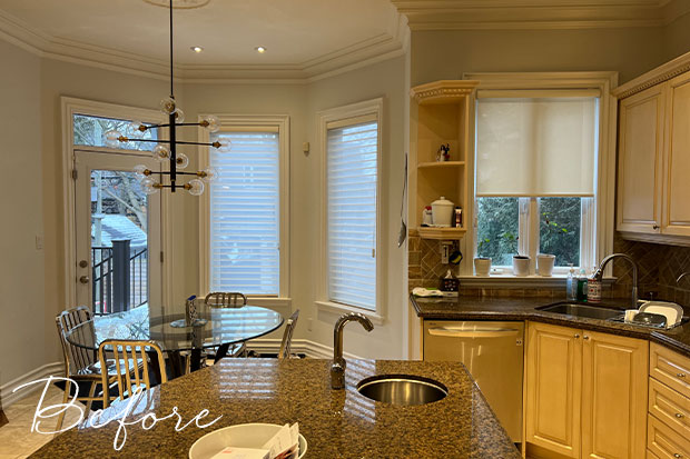
Before: The original kitchen featured a ’90s-style island and corner sink.
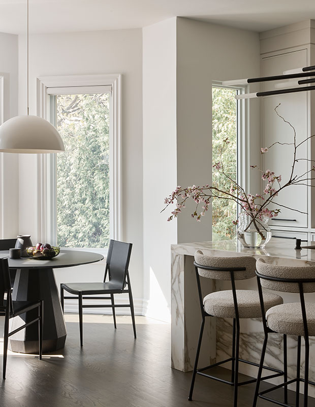
After: The same corner is now home to a tall, slim window that instantly modernizes the space and brings in additional natural light.
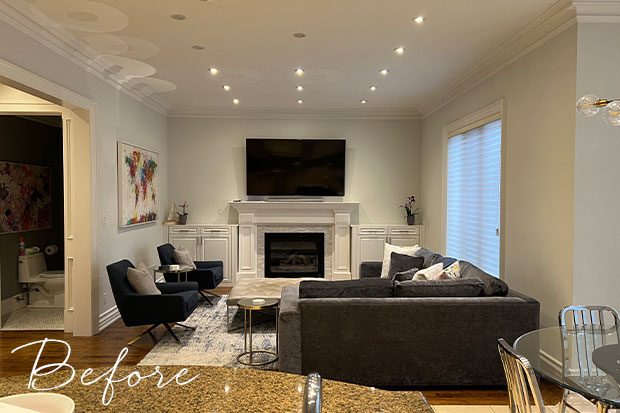
Before: The adjacent family room had stumpy built-ins on either side of the fireplace, cutting the main feature wall in half.
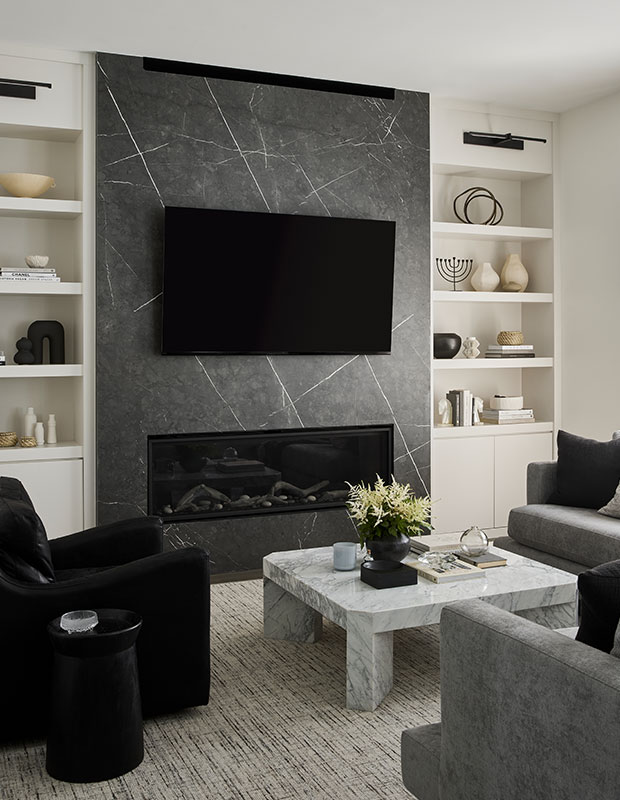
After: An impressive floor-to-ceiling wall of stone gives the family room a grand feel. “Everything is very cohesive in this room. The cabinets are the same color as the kitchen and the picture lights are from the same Kelly Wearstler lighting collection,” says Delia.
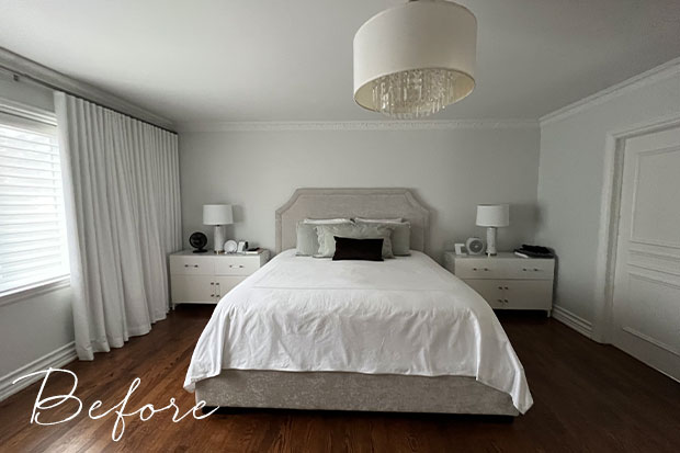
Before: The biggest mistake people make in bedrooms is scale, according to Delia. In the spacious primary bedroom, the bed looked small and insignificant amidst the sterile furnishings and blank walls.
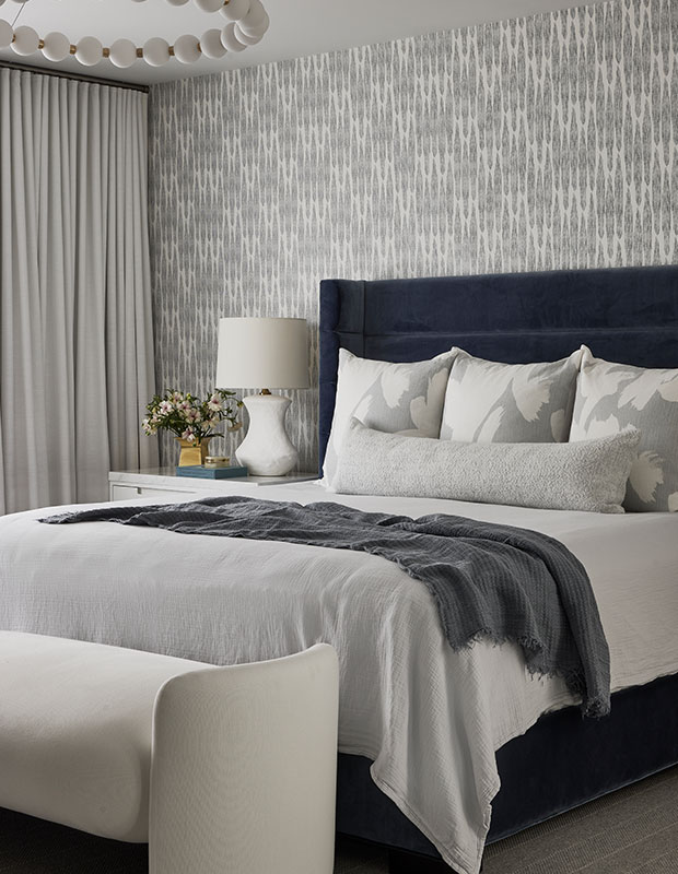
After: The new principal suite goes bold with texture and shapes, including a navy velvet bed, oversized beaded light fixture, patterned wallpaper and curvy bench. “This bedroom now has a ‘look at me’ presence to it,” says Delia.
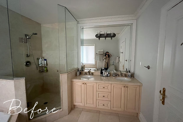
Before: The corner shower and double vanity in the principal bathroom were stuck in the past.
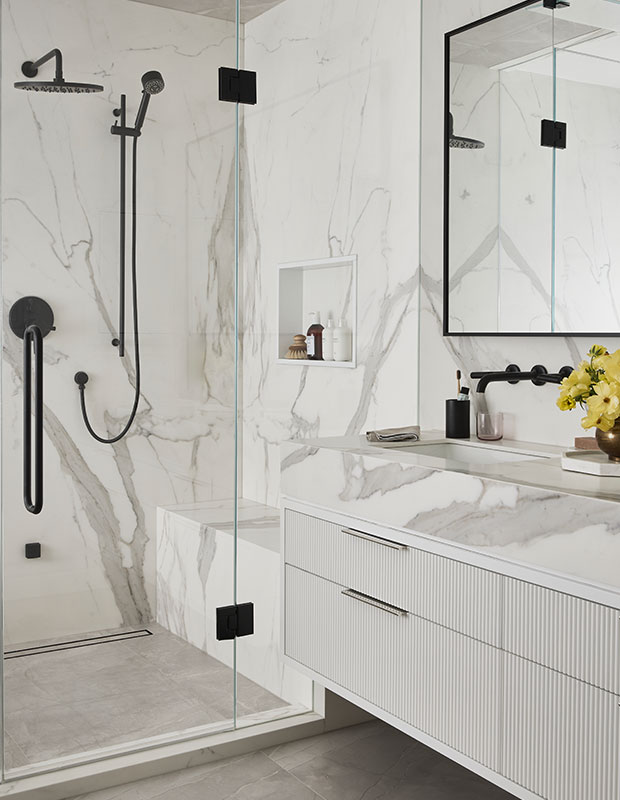
After: Delia turned the builder-basic bathroom into a glamorous oasis with a steam shower, reeded floating vanity and floor-to-ceiling veined slabs from Neolith. “When you design a custom space, you get to create your own story,” she says.
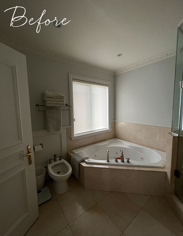
Before: The clients wanted a bigger shower, so they said goodbye to the oversized corner Jacuzzi.
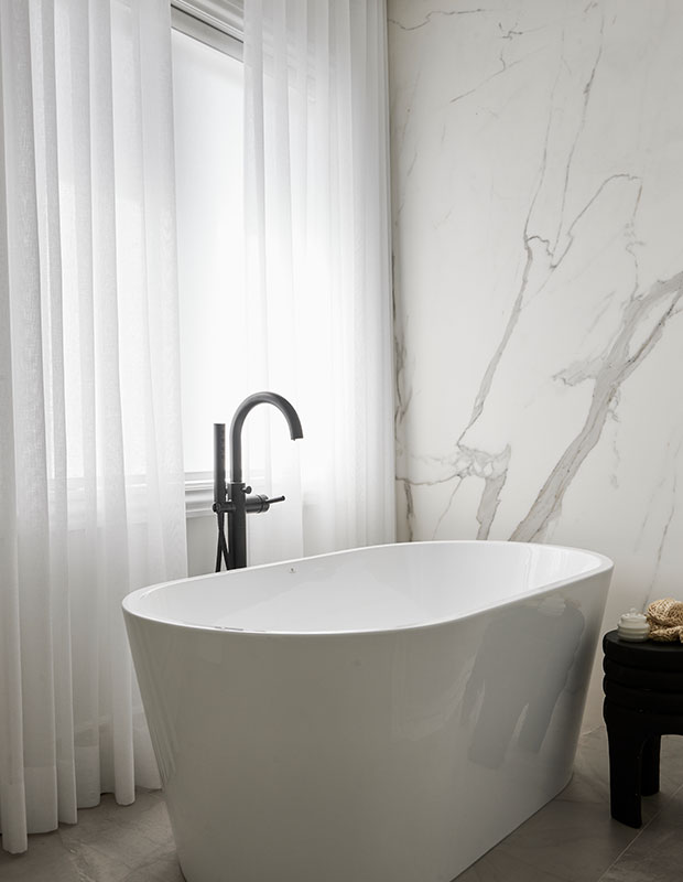
After: The sleek, freestanding tub brings a spa vibe to the modern bathroom. “It’s the same house as before, but an elevated version. The homeowners are so happy here,” says Delia.
To see more dramatic home transformations, click here.
Lauren Miller
Delia Mamann Interiors


