

Decorating & Design
Emma Reddington Shares Ten Common Decorating Mistakes — And How You Can Avoid Them
Updated on May 1, 2025
Pulling off a well-designed house is often about simple decisions that can have an overwhelming effect on the end result of a room. I’m talking about the size of a rug, what height you hang art or the layout of furniture in a space. Small errors of judgement can sometimes make or break a room. Interior designers inherently know when something is working and when it isn’t. Take note of these common design mistakes and see how designers avoid them.
Hanging Art Too High
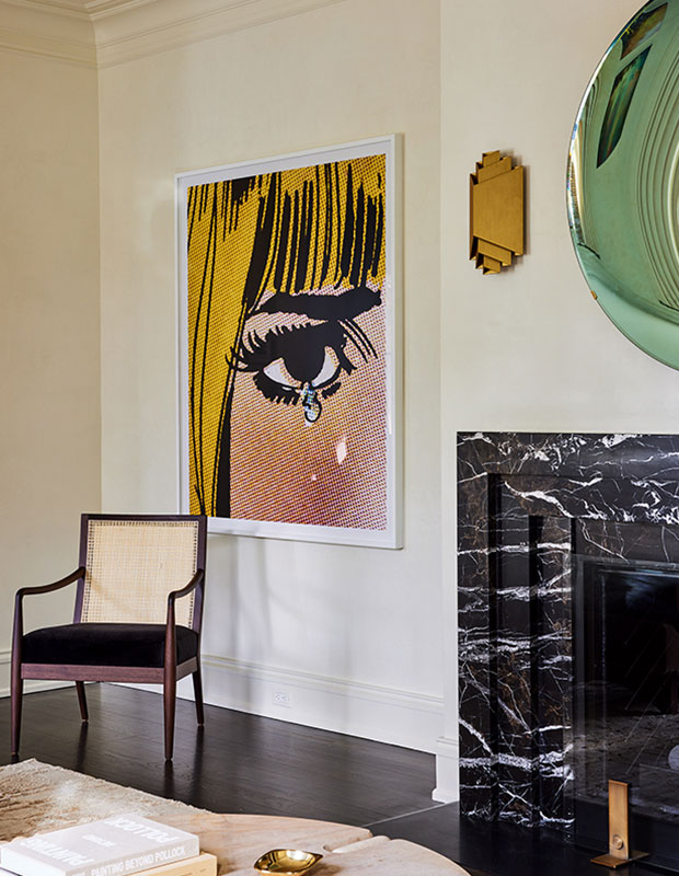
Art that is hung too high can throw off the balance of a room. The general rule is to mount the center of the art piece at eye level or approximately 54 – 60”. However, it’s always important to take the room into consideration. In this living room designed by Monica Fried, the piece of art is mounted at eye level but is also nicely balanced between the floor and crown molding which makes it satisfying to look at.
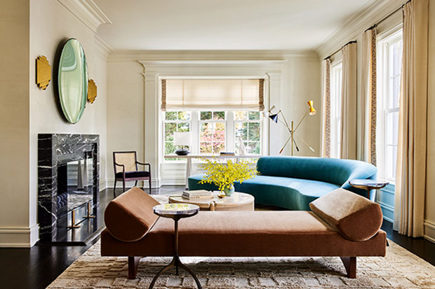
Pushing The Sofas Against The Wall
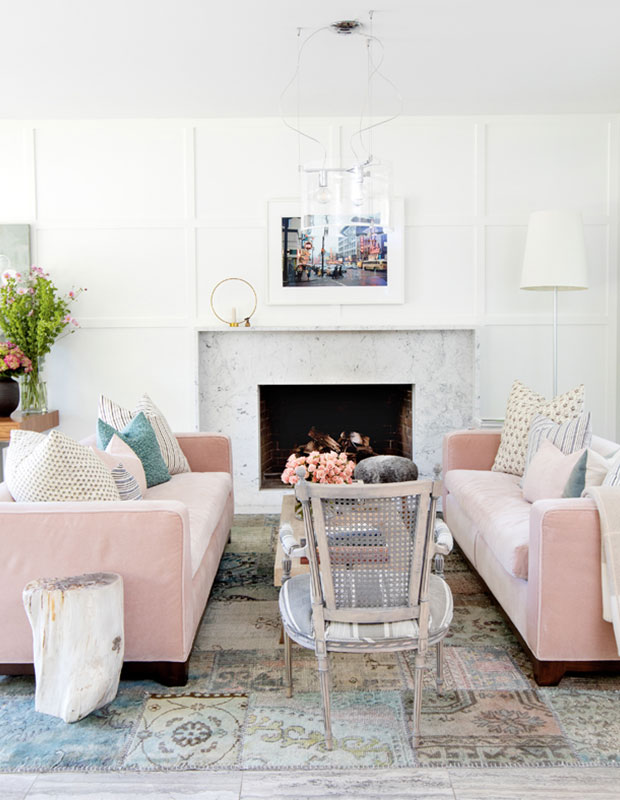
Spreading your seating arrangements too far apart makes it hard to connect with your friends — not to mention reaching the coffee table for your drink! Pull your sofas off the walls and line them up with a focal point like a fireplace. Symmetry is pleasing to the eye so using two of the exact same sofa like Vancouver homeowner and designer Rosie Daykin did can pull a living room together.
Not Having Enough Furniture
Rooms filled with too little furniture looked unfinished. The addition of four lounge chairs to this living room by designer Shirley Meisels not only ensures that everyone has a seat but it fills the space nicely. The key here is to anchor all of the pieces together with a colour scheme and a large enough rug so that everything feels connected.
Choosing A Solid Coloured Rug
Solid coloured rugs are not a design mistake, however you may find they show everyday dirt a bit faster. Rugs with a pattern or variation in colour like this one selected by designer Ali Budd will tend to look cleaner until you get the chance to pull out the vacuum. This is especially important in high traffic zones like entryways or an often-used great room.
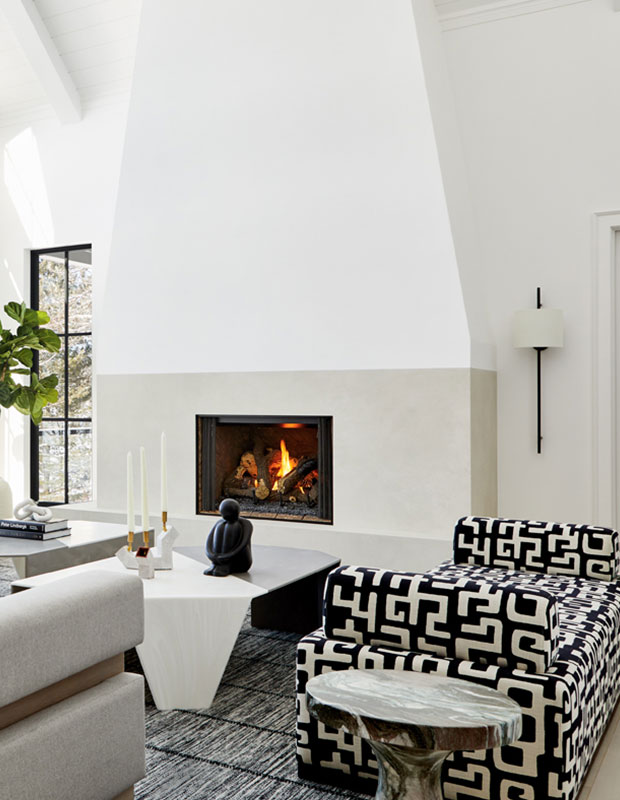
Too Small Rugs
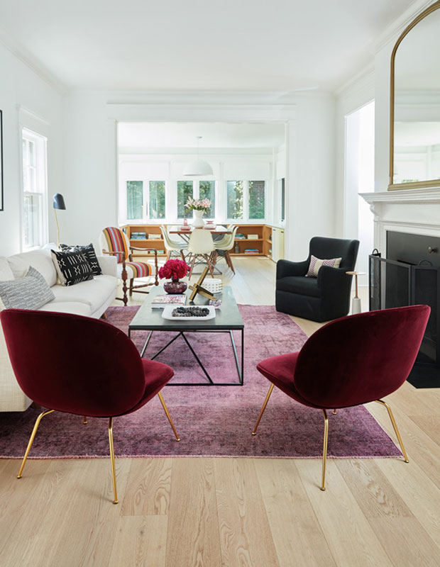
Opting for a generous sized rug is the best decision you can make to ensure that your room looks expensive and well-designed. Skimping out on square footage can immediately throw off the balance of a room. The general rule is that at least the front legs of a chair or sofa should be on the rug. In this living room by designer Monica Fried the ample rug gorgeously grounds the shapely sofas.
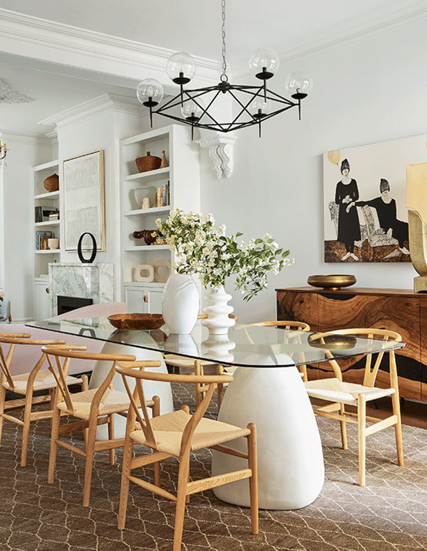
Armed Chairs That Don’t Go Under the Table
There’s nothing more awkward than tucking your chair in as you sit down at a dining room table and realizing that it doesn’t go under the table. If you are buying your table and chairs separately take note of the height of the table underneath the tabletop as well as the height of your armrests to make sure they fit. The iconic Wishbone chairs selected by designer Andi Wheelband elegantly slide under the glass tabletop while the curved backrests match the soft shapes of the table.
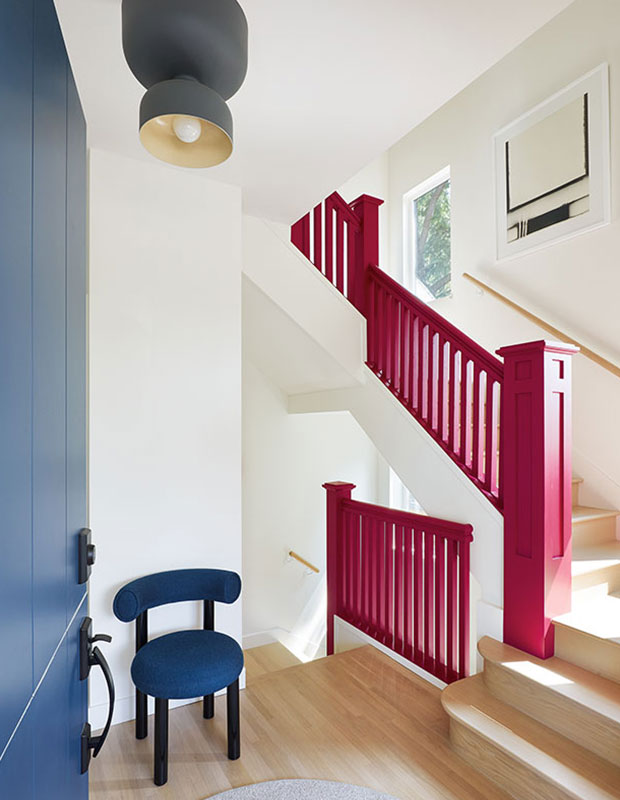
Not Taking Risks
Without a few “wow” moments like this raspberry hued handrail in this Vancouver-based home, designed by Plaid Fox a home can be a little boring. Moments of surprise make a home original and keep them from feeling like everybody elses.
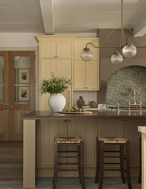
Too Much Of The Same Colour
Not varying your paint colour can also make a room feel a little one-noted. In this kitchen by designer Ashley Montgomery, she uses one shade for the walls, another for the trim, a third for the cabinets and a fourth for the hood vent. The result is a nuanced room with layers of interest that keep your eye moving around the room.
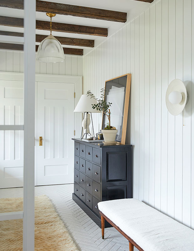
Having Only One Lighting Source In A Room
The best rooms have a range of lighting from overhead pendant lights that can provide an overall glow to more specific task lights like wall sconces and table lamps. This entryway by designer Audreé Kemp Bélanger provides the homeowners with many options allowing them to control the level and quality of light no matter the time of day.
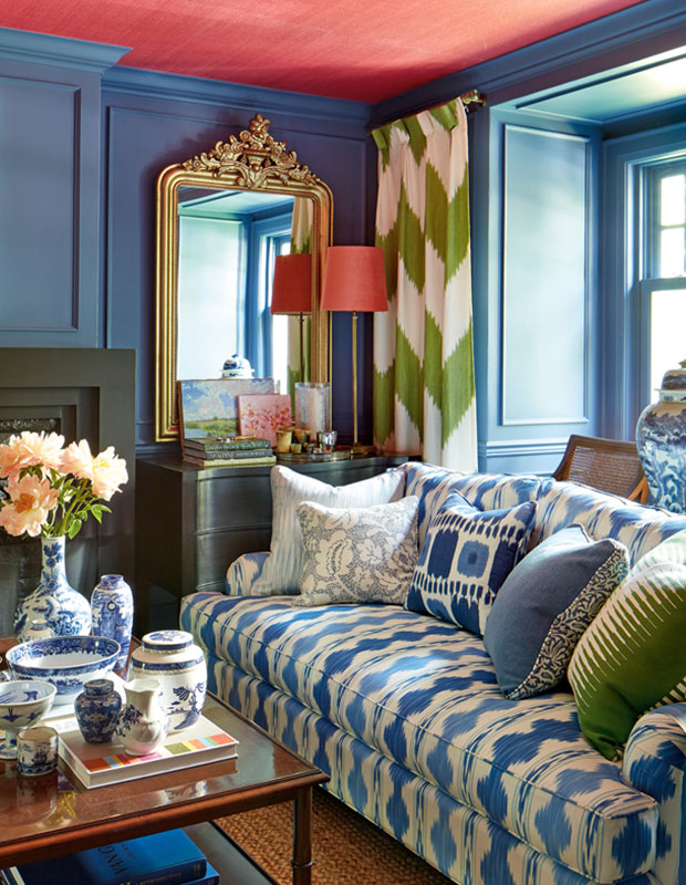
Ignoring The Ceiling
Good designers consider all the surfaces in a room including the ceiling. In this maximalist living room by designer Cynthia Ferguson she opts for a cherry red grasscloth wallpaper but also consider options such as wood beams, shiplap wood or just a simple paint colour change. Once you tie in the ceiling the whole room takes on a different dimension.