
Take A Peek Inside Our Editor-In-Chief’s Home!
Editor-in-chief Beth Hitchcock shares the stories behind the renovating and decorating of her Toronto home.
 Welcome, H&H readers — please come in and make yourselves at home. Since I’m new to the editor-in-chief role, I thought I’d invite you all over (virtually, of course) and give you a tour of the rooms in my house that’ve been featured on the pages of House & Home in the past. And now, if you’ll follow me…

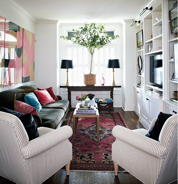
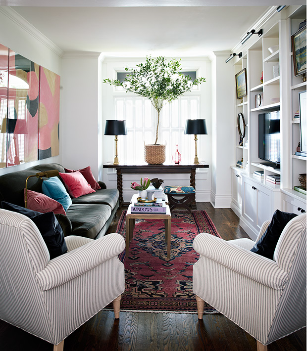
I live in a semi-detached house that was built in 1890, and the original floor plan was definitely part of the appeal. Call me old-fashioned, but I like rooms rather than wide open spaces. So instead of taking out a wall to merge the front hallway and living room, I chose to keep the wall and install built-in bookshelves with a mix of open and closed storage. Would you believe the barley-twist table in the front window used to be my desk in high school? (My mother never met a flea market she didn’t like.) It fits perfectly in the niche. The art over the couch is made from three panels of hand-painted silk by Porter Teleo and framed in plexiglas boxes. I immediately loved its feminine-yet-modern vibe.
House & Home November 2013

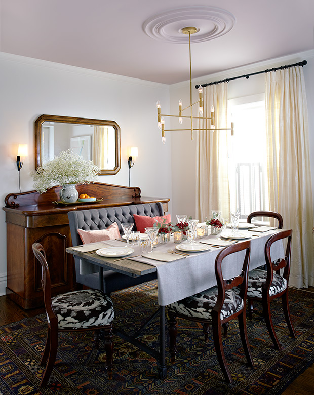
Yes, that’s a pink ceiling in my dining room! (You may also recognize this shot from the Ask a Designer column in our November anniversary issue.) The hue — Calamine (230) by Farrow & Ball — is just subtle enough that some guests don’t even notice, but I love its blush-perfect glow. I updated the antique balloon-back chairs with an ikat-damask linen that ties in with the grey settee. Vintage sconces and a modern multi-armed chandelier add a bit of edginess.
House & Home November 2013

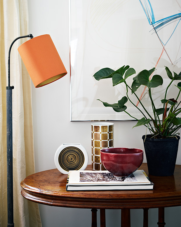
I can’t say no to bowls and vases of all vintages, and three of my favorites found a home here atop an oval antique table. The splash of orange on the floor lamp’s shade clashes in just the right way with all the shades of pink in the room.
House & Home November 2013

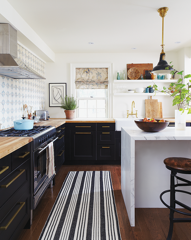
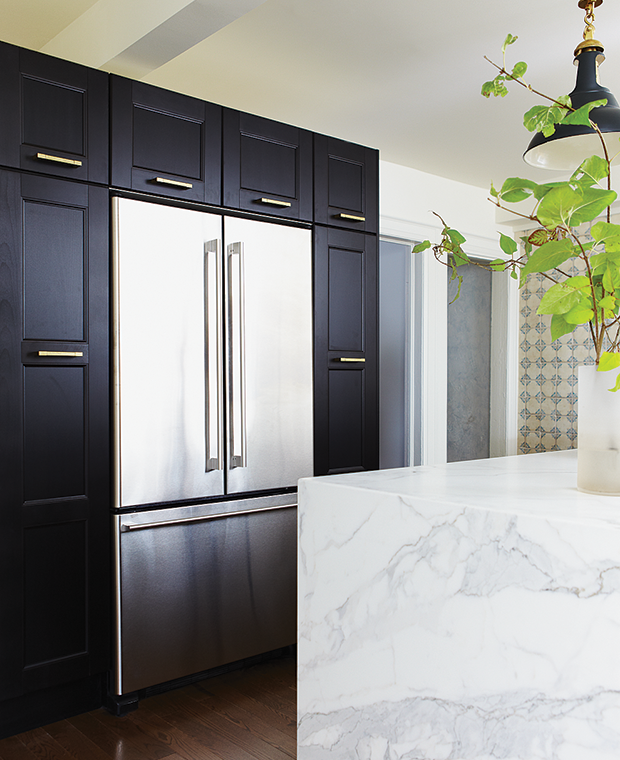
You’re now looking at the view of my kitchen from the dining room. I was initially nervous about going with lower cabinets only, but it turns out I have more than enough storage. Elongated brass hardware adds warmth to the black Ikea cabinetry and an island with a waterfall marble surface brings lightness to the center of the space where everyone gathers. There’s no doubt about it: This is a kitchen-party kitchen.
House & Home February 2012

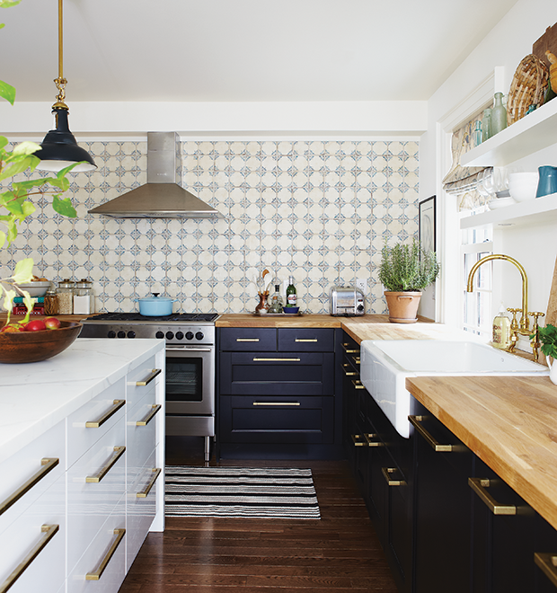
A focal wall of decorative tiles is a huge commitment — believe me, I know. But I kept returning to these hand-painted beauties from Walker Zanger with their creamy backgrounds and light, peacock-blue pattern. So, to make sure I wasn’t making a design mistake, I photocopied the sample tile, made several copies of that, and taped them all together to create “wallpaper” of my tile. Then, I pinned it up to see if I liked the effect. The rest, as you can see, is history.
House & Home February 2012

The cabinets had to be built out several inches to sit flush with the fridge, but I love the seamless look of the pantry wall. I also appreciate the storage — some of the cupboards pull out like drawers for easy access.
House & Home February 2012

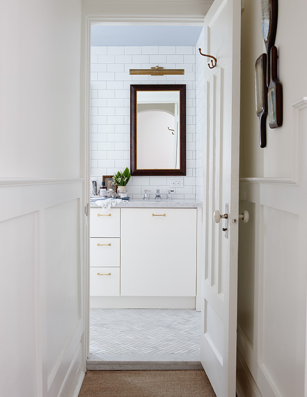
Here’s the view into my bathroom from the landing at the top of the stairs. Unlacquered brass picture lights serve as my sconces and cast a lovely glow; potlights and a window add more brightness for practical matters like putting on makeup. Fun fact: For this image, we had to “level” the floor at the threshold with Photoshop. At 126 years old, my house has more than its share of wonky angles.
House & Home Kitchens & Baths 2012

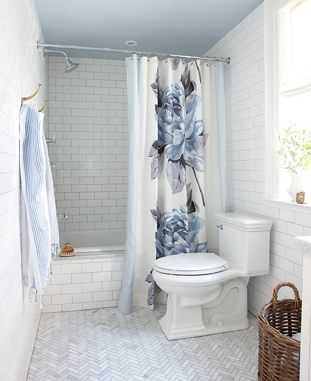
The subway tiles go right to the ceiling, a decision that was in keeping with the vintage of the house. Clearly, I have a thing with painted ceilings, so I went with a soft blue to tie in with the shower curtain, which I had custom-made. Speaking of which, the gorgeous fabric from Designers Guild wasn’t wide enough for a shower, so we added two bands of pale blue linen to extend it. Sometimes, custom ideas require creative solutions!
House & Home Kitchens & Baths 2012

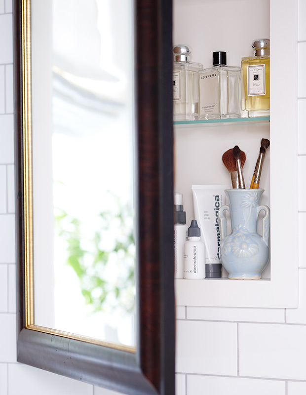
I liked the idea of concealed medicine cabinets, so we had the mirrors made at a framing store and the contractor mounted them on long piano hinges. Confession: These are indeed my everyday products but we styled them strategically and moved the less attractive ones out of view for the shot. (But you probably already guessed that. No one wants to see my used toothbrush, after all.) Thanks for joining me on the tour — it’s been a pleasure hosting you!
House & Home Kitchens & Baths 2012
- Photographer Headshot: Alvaro Goveia