How Designer Mia Parres Chooses Paint Colours for Every Project
Mia Parres, principal designer at Mia Parres Design (MPD) in Toronto, appreciates this collection of 30 handpicked Behr hues.
“At MPD we are constantly layering in millwork, stone, hardware and textiles, and having a paint collection that already feels cohesive makes it easier to build more depth without overcomplicating the process,” says Mia.
“For homeowners, this colour guidance is invaluable. It allows each space to have its own identity while still feeling connected — the result is a home that flows architecturally rather than looks like a series of unrelated rooms.”
Read on to see how the BEHR Designer Collection helps Mia choose the right hues.
THERE’S SO MUCH TO LOVE
“There is a quiet richness to the BEHR Designer Collection palette. The tones feel livable, elevated, and they all relate to each other. As designers, we’re not looking for endless options, but the right options,” says Mia
IT EXUDES SOFTNESS
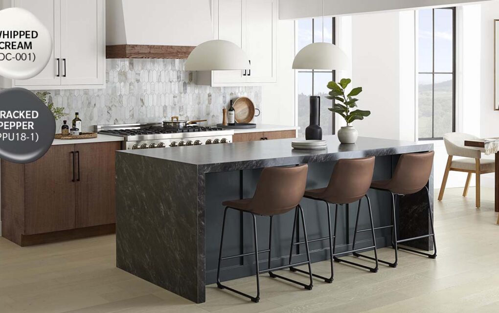
“The whites feel creamy, neutrals are warm without feeling muddy and the accent shades are earthy and architectural rather than trendy,” says Mia, who is drawn to tonal layering with the whites and soft greiges. “To create a moody feel, I love Vintage Pewter or Tranquil Gray on walls paired with Whipped Cream on the trim to add depth. ULTRA PURE WHITE® is crisp and clean and fabulous for ceilings and traditional baseboards.
IT’S A COLLECTION MADE FOR MODERN INTERIORS
Colours like Adirondack Blue and Dark Everglade are grounded, earthy accents that when paired with architectural neutrals like Studio White or Winter White, introduce depth minus the heaviness. “They feel more intentional and refined rather than used for the sake of drama,” says Mia. She loves Adirondack Blue and calls it a classic shade that makes a subtle yet confident statement when used on a kitchen island, on walls in a study or on interior doors.
ALL IN THE COLOUR FAMILY
To find the perfect paint colours, Mia and her team are influenced by finishes like flooring, cabinets and hardware, as well as the home’s natural light, to help guide paint direction. “From there, we choose a small tonal family and sample them on multiple walls to observe the colour throughout the day,” says Mia. “Paint is never chosen in isolation — it’s a part of a broader architectural and material story.”
WHAT ELSE DO WE LOVE?
BEHR paints offer excellent durability and coverage, making them the ideal choice for professional painters and DIYers alike. They’re designed to withstand everyday wear and tear while maintaining a clean, even finish.
VERSATILE IN VARIOUS LIGHTING CONDITIONS
In the collection, Dove and Vintage Pewter respond beautifully to different exposures. In north-facing rooms, they add warmth while in brighter south light, they maintain depth without washing it out. Whipped Cream is also extremely adaptable – working nicely across trim, paneling, millwork, and in full room applications when you want softness without the contrast.
See more Behr paint colours at Behr.ca or visit your local The Home Depot Canada store.
This article was sponsored by BEHR.
- Photographer Patrick Biller (Mia’s portrait)