
Designer Chloe Redmond Warner’s Advice For Decorating With Colour






California designer Chloe Redmond Warner’s love of colour is evident in her first design book, This Must Be the Place: Homes with Atmosphere (Abrams Books, 2026, $68).
The pages of her debut book are full of charming trad touches, such as skirted tables, rich expanses of tile, and bold floral patterns, but it’s the juicy use of colour that really makes it a standout. “For the reader, I hope it will spark some bravery to think of a wonderful time in their life,” says Chloe of the book. She encourages readers to be bold, sidestepping timid moves like a feature wall and instead embrace impactful hues.
Scroll through for her exclusive advice on committing to colour, plus see how she’s used some of her favourite tried-and-true shades in projects.

Designer Chloe Redmond Warner

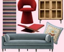
Each chapter opens with a “Style Guide” adapted from the mood boards Chloe presents clients at the beginning of each project; what she calls a “sourdough starter” for the design. In the book, she walks readers through her process step by step for those looking to inject creativity, fun, and colour into homes.

Chloe shows off a masterful use of mixing patterns and with a skirted bar, floral wallpaper and graphic tile in the 2024 Kips Bay Palm Beach showhouse loggia.
House & Home: Your work uses colour so assuredly. Is this something that your clients are increasingly asking for, or do you have to convince them?
Chloe Redmond Warner: Both. Some clients come to us because they already want colour and pattern, but others need help getting comfortable with it. Usually, once they see how colour can make a room feel warmer, happier, and more personal they become enthusiastic. Nothing brings emotion like colour.

A white kitchen is warmed by Farrow & Ball’s Dead Salmon paint and playful pink Nerd stools from Muuto.
H&H: How do you decide on a colour palette for a home?
CRW: I think in colour combinations rather than individual favourite colours. Every colour has potential, and its mood can be amplified by those around it. We often begin with a textile, wallpaper, artwork, or something already meaningful, then build a palette that supports the atmosphere we want the home to have.

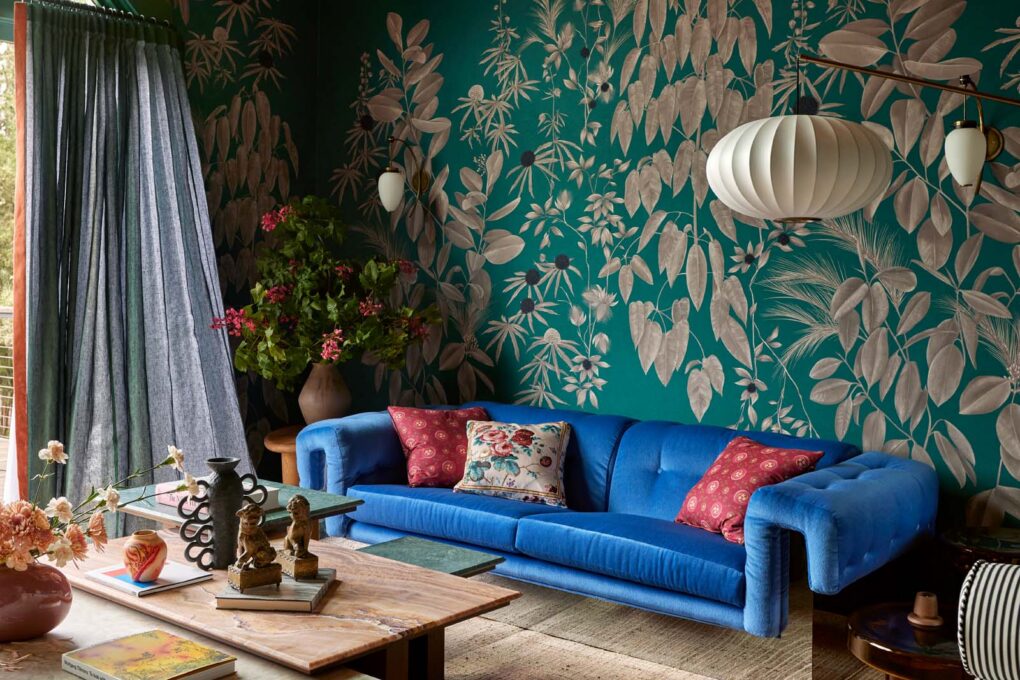
In this San Francisco home, Anna Glover floral wallpaper is accented by a vintage Milo Baughman sofa and Pierre Cardin coffee table.
H&H: Where would you recommend using bold colours?
CRW: Anywhere you want to create a distinct mood. Dining rooms, libraries, powder rooms, and game rooms are natural places to be brave, but I also love colour in bedrooms and kitchens. I don’t think bold colour needs to be confined to a small room or treated as a decorative event.

The loggia shown above was designed in the 2024 Palm Beach Kips Bay showhouse, where Chloe transformed a ‘microwave-like’ stucco box into a lush tropical retreat. The loggia’s peony print wallpaper is from Chloe’s line, RDA Goods, and the design is based on her original artwork.
H&H: Do you usually choose paint colour first?
CRW: Not usually. Paint is part of a larger composition, so I get a feel for the textiles, rugs, art, architecture, natural light, and the relationships between rooms first. A pattern in a textile or piece of art can inspire the colour of one room… or five.

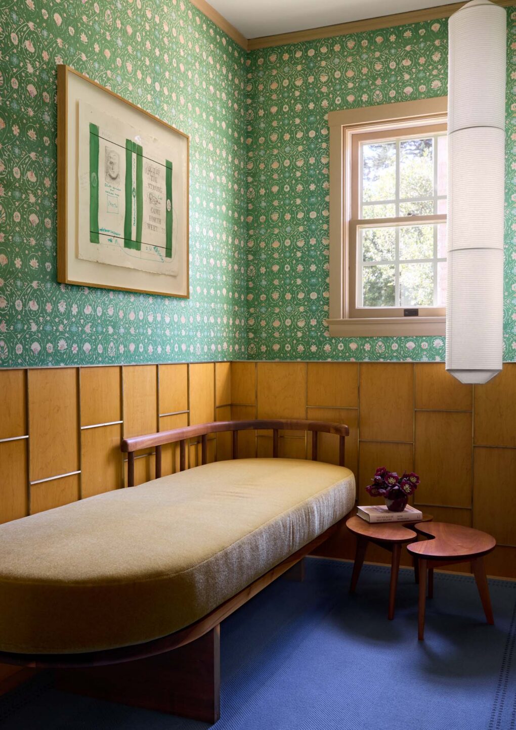
In this Montecito house, a fainting room off the entryway is accented by a floral Arjumand wallpaper and a sapphire blue rug; both offer a lively counterpoint to the neutral upholstery on the chaise.
H&H: What are the biggest colour mistakes homeowners make?
CRW: Fear-based decorating like relying on a single “pop of colour,” painting one accent wall, or assuming that everything else must be neutral. Colour looks more intentional when it is repeated, layered and relates to others throughout the house. Another mistake is choosing colours individually rather than considering what you will see through the doorway into the next room.

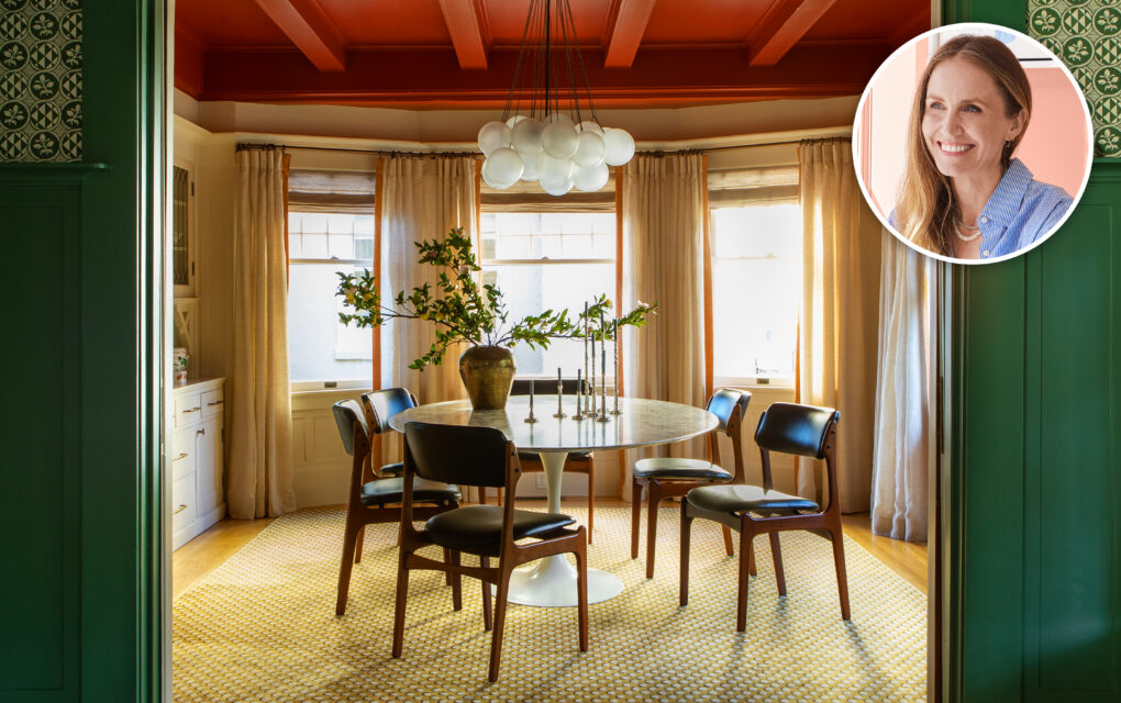
In this Craftsman dining room, a vintage Saarinen tulip table is contrasted by a bubbly Apparatus fixture and Pierre Frey rug.
H&H: Are there any specific paint colours or finishes you recommend?
CRW: Colours that feel connected to nature and colours with depth: muddy greens, softened blues, terracottas, ochres, warm reds, and nuanced pinks. I consider blue a neutral, and I have used the same timeless green in my own bedroom and in clients’ homes.

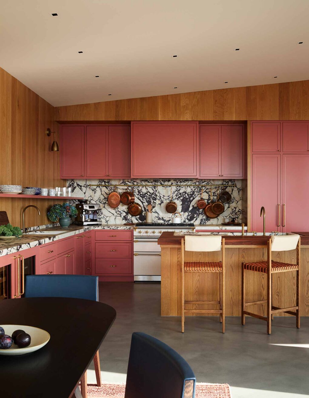
In this kitchen, Farrow & Ball’s Red Earth warms up concrete floors, creamy enamel stove, and heavily veined marble.
H&H: Which colours tend to age well over time?
CRW: I return to colours with some complexity. Shades that shift with the light and don’t feel overly bright or synthetic. Farrow & Ball’s Calke Green, Inchyra Blue, Red Earth, Dead Salmon, Light Blue, and Parma Gray have all worked beautifully in our projects, as has Benjamin Moore’s Mediterranean Olive. But the right colour depends on the room, the light, and what surrounds it.

Farrow & Ball Red Earth in the game room frames a view into the pantry of Benjamin Moore Mediterranean Olive green. The blush lampshades and hunter green bench finish it off.
H&H: What paint finishes do you recommend for different rooms?
CRW: I generally prefer walls and ceilings to have a soft, low-sheen appearance, with a little more durability and definition on trim, cabinetry, and doors. In kitchens, bathrooms, and other rooms where practicality matters, but I still want the finish to support the atmosphere rather than look overly glossy or clinical.

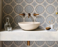
Opalite-toned ceramic tiles are a dreamy backdrop for this chalet kitchen’s walnut cabinets. “The kitchen is where we really went all in on charming materials with patina,” says Chloe.
H&H: Should trim, ceilings, and doors all be the same colour?
CRW: Painting the walls, trim, doors, and ceiling in one colour can make a room feel enveloping and calm but there is no universal rule. Sometimes contrast helps clarify the architecture. In other rooms, carrying one colour across every surface lets the furnishings, artwork, and pattern become the focus.

Painting the walls and trim Farrow & Ball Inchyra Blue turns this bedroom into a moody, atmospheric retreat that feels cocooning and camouflages an awkward angled ceiling.
H&H: How can readers incorporate colour if they are nervous about committing?
CRW: Start by paying attention to what you already love, like the colours in a painting or a rug. But I would encourage people to move beyond one timid accent: repeat the colour, pair it with something unexpected, or let it travel into the next room. Confidence will follow when you see how much better the room feels. Go forth and be brave with colour.

A coffee bar feels elevated by a coat of navy paint, which helps highlight the beadboard panelling texture.
