

Reader’s Letters: RSVP
As a longtime reader, let me start by saying how much I love your magazine (I’m a big fan of the annual Small Spaces issue!). I’m working my way through the March issue while also receiving my T4 statements for 2023. Having just read the cost breakdown for the renovated kitchen in Stittsville, Ont. (“Cali Craftsman”), I was stunned to see the appliances alone cost 30 per cent more than my annual income. Perhaps it’s time to file your publication under the fantasy section of the magazine stand? May I suggest an annual H&H feature where designers are challenged to create beautiful schemes within a budget average Canadians could achieve?
— Susan Gates, Ottawa
I love all the kitchens featured in your March issue, but I’m one of your many subscribers who would never be able to afford a new kitchen. It would be wonderful if you did a DIY kitchen feature discussing the steps required to update your own cabinets — everything from sanding and priming to types of paint to more affordable sources for hardware and sinks. Your More or Less page makes me laugh! I think you need to include a “normal” category that allow those of us who shop at Leon’s, The Brick and thrift stores to have some choices. Most of my friends, now retirees, think your magazine is out of whack with reality! Wouldn’t it be nice if you added a little more for the “ordinary” homeowner?
— Ellen Fox
Thank you for including E.G.’s letter decrying your audacity re: including homosexuals on the cover of your Jan-Feb issue. As a homosexual myself, I’m grateful you’re shining a light on this dark, archaic thinking that, sadly, still exists. I’m a U.S. resident and, suddenly, our LGBTQ+ community is under constant fire after years of progress, so positive representation is more valuable — and more appreciated ¬— than ever. How sad that some think merely existing is something we should be editing or erasing. It’s laughable how someone could enjoy design magazines but take issue with our presence on your cover and in your stories. Honey, we’ve been on and behind these pages for aaages. And we’re not going anywhere!
— Patrick J Hamilton, New York City
Regarding the letter writer who was “shocked” to see two homosexuals on the front cover, I was shocked they actually had the nerve to write that! I, for one, appreciate that you published and exposed this letter to your loyal readers. The writer will no longer support H&H; sadly, this will be their loss. They’ll be missing out on future issues that have and will always be beautiful, inclusive and diversified. Don’t let the door hit you on the way out!
— Marlene Girvan, Ancaster, Ont.
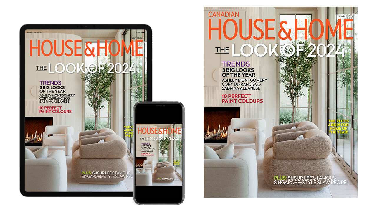
We’re pleased to be posting the many letters that we could not fit in the print edition of House & Home. One issue, in particular, has prompted an unprecedented number of letters: Our November 2023 cover and the subsequent letter from “E.G.” See other topics below including The Challenges Of Accessibility (Jan/Feb 2024 Issue) and more letters from our readers!
New letters about our November 2023 cover:
Thank you for your well thought out response in Jan-Feb issue. to E.G. from British Columbia who was “shocked to see two homosexuals on the cover.” It just boggles the mind!
— Mariette Rozon
I was saddened and mad that someone wrote in to complain about the beautiful couple on the November cover! Last time I checked, it was 2024 and blatant disregard for same sex couples is so 1970s! What a miserable person to openly display such hatred. Love your magazine; please don’t be intimidated by a vacuous human.
— Lynne Robinson
I am total shocked and disgusted with the letter from E.G from B.C. I’m so very sad that people cannot love people for who they are. Who wants someone like that reading your lovely magazine? Not me, and I’m sure many more. I understand you printing it, but it sure was hard to read.
— Sandra McFadden, Sooke, B.C.
I want to applaud H&H for your response to the letter from E.G. in your Jan-Feb issue. Publishing it reminds Canadians that homophobia is on the rise. It was great to see such a great couple featured on the cover and, as a member of the gay community, your response was especially heartwarming. I will continue to enjoy your magazine.
— Gary Giffin, Montreal
Thank you for publishing the homophobic slur sent by E.G., from British Columbia and your response. Quite frankly, I was shocked! I’m just sorry there was a need to think long and hard about publishing it. These kinds of behaviour and opinions need to be addressed openly and quickly. It offers support to the LGBTQ+ community and their allies and shows that kind of behaviour will not be tolerated.
— Jody Farrand
I commend H&H for featuring Chris Bell, Colin Baird and their lovely the home on the cover of the November 2023 issue. I also commend H&H for the editorial response to the letter from E.G. British Columbia. We must all be vigilant to confront bigotry wherever and whenever it arises. Kudos!
— Peter H., Vancouver
I was, as usual, thrilled to receive my November issue in the mail. What a gorgeous cover featuring a talented couple! The letter from E.G. in your Jan-Feb. issue saddened me. I am the mother of a trans child and it gives me comfort and hope when I see all genders and sexual orientations represented in your magazine. Thank you, thank you, thank you for publishing that unfortunate letter with the gutsy editor’s note. Your decision carries a powerful, positive message. Well done!
— H.S., Ont.
I don’t usually do this but I was flabbergasted when I read Jan-Feb’s RSVP. Let her find a better magazine — she won’t. This made me feel better. Keep up the great magazine.
— Sue, Kitchener, Ont.
I am disgusted by your choice to print the letter by E.G. in your November 2023 holiday issue. E.G. is only defining the couple in terms of their sexual identity. Why is E.G. shocked now when House and Home has Brian Gluckstein in almost every issue? Who cares who they spend their lives with and choose to love? House and Home does not get to play the brave hero because they decided to post the abhorrent letter. I have several family members in the 2SLGBTQ?+ community and I find your behaviour beyond reproach. I have thrown away all my issues of House and Home.
— Patricia Donald
Kudos for printing the letter from E.G. objecting to the homeowners’ sexual orientation featured on the November 2023 cover. “It’s a sobering reminder of what’s still out there,” you replied. Well, just watch your mailbox. New subscribers are also “out there.” My cheque for a subscription is enclosed with thanks to E.G. for the motivation.
— Jessie Simpson, Courtenay, B.C.
After reading E.G’s letter in the Jan-Feb issue ,who was “shocked” to see homosexuals on the November cover and is discontinuing their support of the magazine as a result, please publish MORE such covers of people of all sexual orientations, genders, races and religions!
— M.L. Smith, Toronto
Other letters that came in:
I love so much about your magazine and look forward to reading it each month, especially View (I’m a big Lynda Reeves fan), City Column, Artist File and Ask a Designer (which I often turn to first). I enjoyed the December issue’s H&H 100 feature too, and was pleased to see many of my favourites listed. Understanding that you can’t include everyone, I was still disappointed that two of my very favourites, Ines Mazzotta of Kelly Hopter Interiors and Trish Johnston of her eponymous firm, didn’t make the list. If I didn’t live 950 miles away, my only dilemma would be deciding which of them to hire! Thanks for showcasing beautiful Canadian design.
— Shay Herman, Atlanta
Thank you, Lynda, for your honesty regarding Michel’s challenges and what this has meant from your personal design perspective. Michel is very fortunate to have such a caring and talented partner who was able to “customize and rework” the design of your new apartment. I am now reliant on a cane due to arthritis. Poor design in buildings, stores, houses, transportation and public washrooms means my quality of life is compromised. We must all be aware that disaster is a constant possibility for ourselves, our partners, our friends and yes, even our children. I would encourage more discussion and design features that will inspire owners, architects, designers and builders to make decisions, not just for today, but for life. Secondly, I want to thank everyone at H&H for the carefully considered decision to print the letter regarding the cover of the November 2023 issue. The editor’s note was brilliant and made me proud that the premier Canadian design publication has taken such a public stand against ignorance, prejudice and hate. Lastly, I bought my copy of Jan-Feb 2024 issue on newsstands but as a direct result of your editorial comments, have just signed up for a two-year subscription. I look forward to many more wonderful design features.
— Jan Lashbrook Green, Nanaimo, B.C.
Just enjoying my morning coffee and the Jan-Feb issue. My heart goes out to Lynda and wishing her and all family the best of 2024. I am now a widow and going through a major change as well. I am surrounded by 60+ years of stuff and memories. I have just decided to downsize to an 850 square foot apartment. It will have a building for care and one for assistive living. At age 80 and proactive, I’ve decided that I now want amenities like the pool, wellness gym and the opportunity to attend theatre events. And perhaps join others for a meal, coffee, golf or curling (yes, still on the ice). I’m donating items that are excess; I know that I want the feel as Lynda mentions (for me, colour, comfort and some sparkle). I chose a unit with floor to ceiling windows and a large balcony. What I need is ideas to make my 10-foot-wide living room and bedroom look great. It is open concept from opening the door through to a length of 30 feet to the windows and balcony. I have wonderful art that I have collected over the years and hope to make an impact there. Like Lynda suggests and I actually do daily, is use my crystal, china and silver. Your magazine could really help seniors as we are among the largest and fastest growing group. Space saving and versatile furnishings are a need. Window coverings are provided but I need help with dramatic curtains or panels. Can one adapt ready-made curtains for high ceilings? Walls can be painted by I want it to look uniform and warm. The art for me will provide the fun. Don’t forget this significant group of stalwarts. Many thanks.
— Frances
Thank you so much to Lynda and Michael for being willing to share your story about Michael’s debilitating stroke and the good news of his continued recovery. I am a home care Occupational Therapist practicing for the past 35 years in Burlington Ontario, and while this kind of news is not optimal to read about in your magazine, I am very grateful that the topic of functional changes and ageing in place has made it onto your pages. Perhaps in future issues, there may be more articles sharing information and ideas regarding design and modification of environments optimizing independent function and dignity for various limiting conditions. I especially appreciated reading that they are ready to “have others in.” Sometimes, with changing abilities, different equipment and devices may now be essential (not curated) in the home setting. It can be challenging for everyone to accept these changes. One of the many things I find rewarding as an Occupational Therapist is helping to make the space inclusive, welcoming and honouring of new and different abilities. Keep up the great work Michel, Lynda and all of you at Canadian House & Home.
— C. Hall, Burlington, Ont.
I’m a long-time subscriber and though I appreciate the publication, have never been motivated to write. However, the combination of the Lynda Reeves editorial letter describing life adjustments after a major health issue, and some of the excellent 2024 ideas, I want to compliment. Particularly the sensitivity and dignity with which the stroke of husband Michel was revealed: matter of fact, solution oriented, love and partnership. Changing topics, I lament that so often, by the time a publication reaches one, products in question are sold out. This is the case with the attractive looking artificial olive tree supposedly available at Hudson’s Bay. First world problem.
— Lis Welch
Past Issues
Thank you for publishing the letter from E.G. with the Editor’s note. I was shocked and appalled to read the letter. Your measured response was perfect. It’s curious that E.G., who appears to have been a subscriber or purchaser of the magazine previously, has never before reacted negatively to the many features focusing on the homes and gardens of same sex couples. Why such a strong and absurd reaction to this particular photo, which is utterly charming and totally in keeping with the themes of peace, joy and love associated with the holiday season? I trust that you will have been inundated with supportive comments from your readers. I sincerely hope that Chris and Colin know that their decision to share the story of their beautiful family home was a wonderful thing to do, despite this isolated negative comment. — Jan
Firstly, just a short comment on the letter from E.G. in B.C. You were absolutely correct in publishing that comment and, as a resident of Vancouver, I was saddened and dismayed that a fellow B.C. resident had such a venomous reaction to the November cover. Just to set the record straight, that attitude in no way represents our province! H&H reflects all that makes our country outstanding in so many ways. I very much enjoyed your trends issue; brilliant as always. Also, Lynda Reeves’ poignant and very personal reflections in her column were admirable. I’ve been a subscriber to H&H for what seems like forever, and Ms. Reeves has written about her husband so often that readers have come to understand what a wonderful relationship they share. Her positive and loving attitude will be inspirational, as her husband continues his recovery. — D. MacKinnon, Vancouver
The November cover was absolutely stunning — one of your best. I thought the two gentlemen on it looked classy and happy. Well done H&H for supporting people of all backgrounds and sexual orientations. This magazine is for everyone. Period. — Sue Kainz, Toronto
It was sad seeing the homophobic letter to the editor in your Jan-Feb issue, but I wanted to thank you for speaking out, supporting the LGBTQ+ community and supporting an inclusive Canada. — Laura
The decision to print E.G’s letter was wise and necessary. May we all start this new year with respect for each other and vow to reverse some of the misery and inequality that exists. I hope H&H continues to show the diversity of people and ideas, as you have done for so many years. — Gillian Linsdell, Montreal
I’ve looked at the November cover many times since my magazine arrived. It’s so beautiful. Those two handsome men in the wintry scene! They look so polished, relaxed and confident. Their baby is so lucky. I’m wishing for a world filled with younger generations who know themselves and are able to achieve personal goals. — Sally Vegso
I’m horrified to read the letter from E.G. Let it be known that in our beautiful province of B.C., we do not condone that ignorant attitude! I’m sure your decision to print was a difficult one; I say hooray to you! To the two gentlemen on the November cover: my sincere apologies from a loyal reader. Keep up the great work. — Jo Meyers, Kelowna, B.C.
Though I’ve never written in before, I decided I had to offer my support to your editors for the response to the horrible letter about the November cover. I cannot believe that someone would send this hateful comment in 2023. Your response was very well done. Keep up the good work and continue to be inclusive. I hope many others were as appalled as my husband and I were. — Hélène Dahl, Halifax
As a homosexual who has read your publication for years, I feel sad that E.G. in B.C. feels this strongly to write in, scolding you for being inclusive. But good for you for publishing the letter to show that we still have a way to go! Please feel free to publish my name — I’m not hiding!
— David Law, Edmonton
I can’t tell you how proud I am of your response to a reader who felt the depiction of two “homosexuals” on the November cover was somehow irresponsible. How wonderful it was to see your editors carefully craft a response to that letter that explained your stand on such criticism. You could have let this person’s letter never see the light of day but, instead, you took the opportunity to point out that, for the most part, we as Canadians and House & Home will rise above such attitudes. — Sue Prestedge, Hamilton
I was shocked, saddened and sickened when I read the letter from E.G. in the Jan-Feb edition. This kind of ignorance and hate is unacceptable. I’m glad you published it and responded as you did. Thank you, H&H, for your inclusive content. — J.S.
I’m a longtime fan of H&H. I was appalled to read the critical comment of a reader who was shocked to see two men on the cover. The editor’s note said they thought long and hard before publishing the letter. Indeed, it’s a sobering reminder of what is still out there. H&H welcomes all races, religions, genders and sexual orientations to their company and on their pages. I expect nothing less of this fine magazine. — Sandy Ages
I was shocked to read the letter from E.G. in your Jan-Feb issue. Not because of the writer’s stance on homosexuality or because you published it, but because the writer is just now being offended. They seemed oblivious to the fact that your “wonderful magazine” has been featuring the fabulous designs of many “homosexuals” for decades. Perhaps they thought it was OK as long as they weren’t on the cover? It’s very sad that people can’t learn to be more accepting of others. There is far too much hatred in the world. I appreciated the editor’s note. Keep up the good work. — Diane Tyszka, Puslinch, Ont.
I just couldn’t resist replying to E.G. in reference to their astonishing comment in Jan-Feb’s RSVP. It’s so sad to read and hear such thinking in 2023. We all have a right to live free of judgment. I welcome every article in your magazine putting the light on differences and beautiful people. E.G. will be the one losing the most — your magazine and learning a life’s lesson on acceptance and inclusiveness. — Carole Dubé, St-Jerome Que.
I just received your Jan-Feb issue and began browsing when I was stopped by the letter from E.G. regarding your November 2023 cover. I feel sorry for this small person with a small mind and smaller heart. Fortunately, many people come by inclusiveness and a sense of generosity and caring as a natural part of who they are. We can only hope that these good human qualities will become wider spread and more evident. — Sam Bland, Trent Hills, Ont.
I was surprised at the letter about your November cover. I thought your answer was stellar. And to the letter writer: don’t let the door hit you on the way out. — Bonnie Powell
I was saddened and shocked by remarks made by E.G. regarding November’s cover. Thank you for enlightening everyone that not all Canadians are kind and considerate. I wish Chris, Colin, Wesley and Cole all the best, now and in the future. — Marina, London, Ont.
I appreciate your publishing the letter from E.G. for whom it is apparently OK to have gay people “in the closet” on the inside pages, but not on the magazine cover. These sobering reminders are important. Most of us, like H&H, easily welcome and have people of all races, genders and sexual orientations in our lives. We can sometimes forget that pockets of bigotry still exist, so we must continue to openly declare our position on inclusion and respect, as you have. — Susan
Bravo for your decision to publish E.G.’s letter criticizing the handsome, talented men on your front cover. I’m astonished that such attitudes still exist. I shouldn’t be, but I am. As you state, it is a sobering reminder. — Edie Lewis, Brantford, Ont.
Good for you for publishing the letter complaining about the featuring of “two homosexuals” who grace the cover of your November issue. You have shone a light on the appalling ignorance that still lurks in our society, for which we must all be mindful. Hopefully, through education and examples such as yours, discrimination will one day become a thing of the past. — Mary Sargent, Ottawa
I’ve loved your magazine for decades! I particularly loved the November cover featuring Chris Bell and Colin Baird with Cole. I was appalled to read E.G.’s letter and applaud H&H for printing it. I think E.G. should be ashamed of themselves! Go ahead and convey your archaic belief to others; I’m certain no one would listen. My son is gay and I love him; I’m so very proud of him and my son-in-law! E.G., your beliefs come from the Dark Ages, and you are offensive! — Lynn Brown, Welland, Ont.
Thank you for publishing that letter from B.C. We need to be reminded that bigotry is on the rise, and we need to remain vigilant at all times. Keep up the inclusive model, House & Home. That particular cover and accompanying article was one of my favourites. — Mary
Yes, E.G. by all means convey to your friends, if they already don’t know, that you’re a bigoted homophobe. — N. Nelson
How sad and astonishing that E.G. would make such a cruel comment about the couple on the November cover. Discrimination of any sort, including for the bizarre reason of who people love, is precisely what the world does not need; it makes one wonder what poison and fear this unfortunate person carries within their heart. — Glori-Jeanne Stephenson, Calgary
You were absolutely correct in printing E.G.’s letter. No Canadians — regardless of race, religion or sexual orientation — deserve such condemnation around their home and family. Yet it still exists and must be challenged. P.S.: Our upstairs neighbour shares her H&H subscription with us: two married men of 16+ years! — James Harcott, Vancouver
I’m a longtime subscriber of your wonderful magazine. I live in New York’s beautiful Hudson Valley and was pleasantly surprised to see your spotlight on the area in the Jan-Feb 2024 issue. However, I was compelled to write and praise you for your perfect response to the homophobic letter writer. As shocked and disgusted as I was by their letter, I think it’s extremely important to expose it and address it as you did. Bigotry and hatred in all of their forms will only lose their power if we stand up to them! — James Milne, N.Y.
By publishing E.G. from British Columbia’s letter, you gave hate a voice. I hope you do not want to be a platform for bigotry. I wish peace to all. — L.D., Ont.
I felt compelled to write regarding the complaint of E.G. of B.C. Another wake up call. To say I was struck by that person’s intolerance is to put it mildly. Hopefully their comments are not that of the majority, but of a few narrow-minded bigots. Thank you to H&H for publishing the note. — J. Duncan, Cobourg, Ont.
I always read the letters to H&H. The person who was shocked by two men on the cover, presuming they’re a gay couple, brought shock and sadness to me! I had to read a few times to comprehend the beliefs of this person in 2023!! No matter what their sexual orientation, they have every right to be on the cover, as do any other designers or homeowners that H&H chooses to photograph for its magazine. Kudos for publishing the letter and the response, setting the record straight! — Polly Griesbach
Thank you for publishing that unfortunate letter in your Jan-Feb 2024 issue. I was taught that there are only two kinds of people: good people and bad people. I will be subscribing to your magazine for a very long while. — MSC, Charleston, S.C.
I don’t know what planet E.G. has been on, as House and Home mag has been featuring same-sex couples for years. Inconsequential to me. It occurs to me this letter could be a “plant” designed to stir people up and create more division. — L.M., Ont.
I’m not even going to bother with any civility… I’m outraged to see that you would print a letter from a reader about how you printed a cover with two young men on the cover. You just gave that person (initials E.G. because they didn’t have the balls to use their whole name) a voice, credibility and validity for their five seconds in the spotlight. This proves to me again just how out of touch, let alone elitist, House & Home is with its readers. I, for one, do not want to listen to Lynda moan about how she didn’t get to travel because of her husband’s stroke. Rather, I feel personally feel bad for the fella and, more importantly, what does this have to do with design and decorating content that seems to dwindle with every mailed-out, plastic-wrapped magazine? In the meantime, this proud mother of a successful young man will not be renewing her subscription. Disappointed? Yes. Disgusted? Absolutely. — Sandra Baker, Kelowna, B.C.
Editor’s note: We made the editorial decision to use E.G.’s initials and province only when we printed this letter.
Thank you for publishing the letter from the prejudiced individual who was “shocked to see two homosexuals” on your front cover. We all need reminding that homophobia still exists. And that someone would feel it is acceptable to write to you about it! Well done and thank you again. — Jane Karch, Schomberg, Ont.
Thank you for publishing the homophobic note from E.G. of B.C… It’s hard to believe E.G. is unaware that some of the most gifted designers have been, and are, gay since interior design began. Or how E.G. failed to notice that H&H since its inception has showcased exquisite properties owned by gay couples. E.G.’s letter illustrated the sad fact that open prejudice against a wide variety of groups sems to be regaining legitimacy. I was planning to renew my lapsed subscription anyway, but the decision to publish this disturbing note has confirmed. My commitment to your publication. Thanks again for being a trendsetter on the human rights front as well. — Hawley Shields, Toronto
The Challenges of Accessibility (From Our Jan/Feb 2024 Issue)
Lynda, you can never retire! I love your tips and takes on decorating. Also, keep the interview videos coming please. I always learn something. Thank you for sharing some aspects of your own personal journey. It takes courage to do this. As a retired RN, tell Michel to keep at the rehab. It is a long-term process. I remember smiling when you wrote about your mother telling you that you needed a kitchen table at your lakehouse. Mom knows best! And your touching tribute to her brought a tear to my eye.
I just love your magazine. I don’t care if there are gay men on the cover (re: the letter from the outraged reader — really?? And I loved their home, by the way), or if there are too many big, expensive homes and pricey items in the Stye Files section. To me, your magazine is about beautiful images and inspiration. I totally relate to the reader who wrote that she often tears out pages for future reference and then finds herself tearing out every page of a featured home. I’ve often done that myself. Truly, there is something for everyone in every issue, as far as I’m concerned — colour, neutrals, traditional, minimalist, etc. Even if it’s not to my taste, I can appreciate these images. I’m not a big Christmas decorator, but I even love your holiday editions. — Cheryl Somers— Cheryl Somers
Thank you for a meaningful message about designing today’s homes. Registered nurses focused on healthy aging are especially well-prepared to consult on issues related to design for mobility in place — it isn’t related to aging per se. Wider (and preferably) shorter halls, using designer grab bars that don’t look so institutional, creating color contrast, avoiding “dragging” textures (those thick carpet piles), and eliminating steps are all critical. A slanted entry to the house from the garage (rather than the traditional step) and a slanted entry into a shower can make huge differences for people with mobility challenges. Thank you for addressing this important issue. — Patricia S. Yoder-Wise
I always look forward to receiving H&H. It’s the only one that I still subscribe to. I’m a grandmother who likes to think I somewhat keep up with the times. I didn’t like the use of the term “Pretty Trad” (“Trends 2024,”Jan-Feb). It could be phrased as “a refreshed nod to the past,” for instance. Have you asked your grandmothers how they like this? Please keep a more appropriate description in mind for the future, and ask the editorial staff to retain this concept on their checklist of things to weed out. Secondly, I found Lynda Reeves’ editorial about her husband’s health issues very poignant. It’s a reminder that some of us are indeed aging, but living, as we want to, older or younger. Perhaps design to accommodate reduced mobility and other challenges could appear periodically on your pages. — Arlette Spencer
Other letters from March 2024
It’s amazing how much colour occupies a decorator’s or designer’s tool kit — how important it is, and how frequently it is misunderstood. In a desire to better see and understand undertones, I sought out a better system to help me and landed on the CIELAB colour space (developed in 1976 by the International Commission on Illumination with the intent of creating a standard for colour communication) that’s based in part on the Munsell colour system and measures how humans perceive colour. I use it all the time now in my design business. When I see things like describing Sabre Gray (1482) from Benjamin Moore in the Paint Report (“Drenched in Colour,” Jan-Feb) as “cool iteration with silvery blue undertones,” I recognize how much even the experts in decorating and design have room to learn According to CIELAB, 1482 Sabre Gray is L*67, a -1.9 and b +3.76. This means that Sabre Gray has yellow-green undertones and is not a cool, silvery blue — it’s a warm grey. Try looking at it again with this knowledge and I bet you’ll be able to see it. Undertones are very hard to see in greys, but they are so important in creating a harmonious space. For me, a little effort in learning this system has had a big benefit. I have much more confidence in my colour specifications now than I did before. I suggest that you may benefit from it as well, and then your readers will, too. — Lara Kalins
Cory deFrancisco’s home is a perfect, gorgeous work of art and should be entitled, “ne touche pas.” I hope he has a basement annex where his family can really live. — Norma de Gryp
I’ve been a subscriber for years and am always happy when a new edition arrives in the mail. I have to comment on how unrealistic your “Trend #2: Cool & Considered” space is: no side tables, seating so far apart you’d need phones to chat with each other, and not a lamp in sight. I can’t imagine spending an evening with guests here. There’s no value in photographing a space that one can’t imagine represents the real life of this homeowner. — Linda
I don’t follow trends; I do what I like and what feels right for me. Just before the holidays, I replaced my old pale grey armchairs with some new black velvet swivel chairs. I also went a little anti-pale and painted one wall in Behr’s Cracked Black Pepper. So imagine my surprise when I turned the pages of my H&H Jan-Feb 2024 issue to find swivel chairs were the new hot thing (Focus) and my paint colour was Behr’s 2024 Colour of the Year (The Paint Report). I suppose when you change things up regularly, there’s a good chance that you’ll fall right on trend at some point. — Tracy, Vancouver Island, B.C.
I’m enjoying my ritual of a cup of coffee and looking through the new H&H magazine. As I read through reader letters, I’m reminded of how I felt about the October issue. I remember feeling so cluttered and unsettled in my mind until I came across one calming home and was able to relax. I understand not everyone has the same taste, but I do feel that a house should be a calming and peaceful sanctuary to declutter the business of our lives. During the Suzanne Dimma days, I felt that in every issue. — Kathleen Macdonald, Halifax
The November issue is a keeper! It’s beautiful, and I loved the cover as well as the content. I’m a fan of the “white and simple” style of decorating. The article about Colin and Chris’s home reminded me of the Cabbagetown home of the late landscape designer, Murray Haigh. It was great that they kept the house and updated its charm rather than rebuilding. — Chris Yorke, Collingwood, Ont.
Please note the White Chocolate Raspberry Scones recipe (“Just Desserts,” November) should show the baking temperature at 400°F or 425°F — not 325°F. It’s a very good recipe, but the temperature must have a typo. After baking 15 minutes at 325°F, they became an all-together mush. I increased the temperature and baked them longer, but they became drier. I’ll still bake them again as the recipe is very good. — Mariann Ionesq, Ralston, Alta.
The temperature in the White Chocolate Raspberry Scones recipe is incorrect. Scones are usually baked at 400°F to 425°F — Steven Hodge’s recipe states 325°F. I followed his recipe, thinking the temperature sounded low. After the recommended time, the scones were still half-baked. I’m now raising the temperature to 400°F and hoping I did not waste the time and money to make what I thought would be amazing scones! — Beverly Kochuk
Editor’s note: After checking with chef Steven Hodge and making the recipe ourselves at both temperatures, we can confirm that 325°F is correct. When baked at this temperature, the scones are moist and absolutely delicious!
I very much enjoy your magazine, but I finally decided I had to contact you in regard to something that truly bothered me. November’s “Glad Tidings” by executive editor Day Helesic was the most enjoyable read until I came to an unacceptable abbreviation of the word traditional — trad! Your attention to this matter would be greatly appreciated. — Linda S. Quibell
Thank you for your November cover and feature (“Let It Snow!”). Everything about it — the white cedar siding backdrop, the twinkle light–festooned tree, the falling snow and the smiling family — invoked the feeling of Christmas. In View, executive editor Day Helesic wrote, “The look is trad, tailored and 100 per cent cosy,” and I think that’s exactly what the holiday season needs! Thank you for bringing the Christmas spirit! — Jodi Scott, Coldstream, B.C.
Imagine my surprise upon receiving an offensive religious insert along with your December 2023 issue. I do not consent to receiving anything other than my monthly design magazine subscription. If, for whatever reason, I receive a similar insert, I will immediately cancel my subscription. — Jennifer Zerczy
Editor’s note: House & Home does not include religious inserts in its issues. Unfortunately, the material was likely inserted after your subscriber copy was delivered to your mailbox.
In the past, I’ve rolled my eyes at the More or Less feature, seeing the “Less” options as still too pricey. However, in the December issue, I was pleased to see that More or Less actually had a price point that was affordable for those of us on a budget. Please keep it up! — Alyson Lemire, Ottawa
I don’t understand why every year you make November the Christmas issue. December has always been a month to celebrate Christmas and Hanukkah, but there’s no flavour of Christmas at all in your December issue. I understand you feature some Christmas content early, but why not have some in the December issue, too, when people are starting to decorate, shop, cook and have people over for drinks etc.? I know you hear this every year from readers, and I wonder why you ignore it. — Laura Keogh
I wanted to send a quick note to comment on the December issue and the top designers in Canada list. While I so appreciate that there was a clear effort to represent provinces across the country, I was disappointed to see zero Ottawa designers featured. I do appreciate the clear attempts at country-wide representation, but it feels like Ottawa always gets passed over as part of the checkmark for “Ontario representation.” There has to be at least one designer from Ottawa worth featuring, right? Maybe next year… — Monica H.
Do you not think Colette van den Thillart’s designs look the same after a while? Move on and highlight others, please. — JM Pace, Halifax
Congratulations to Colette van den Thillart for Designer of The Year 2023. I would like to see more bedroom makeovers and ideas for storage in small spaces, like bedrooms and bathrooms. Your articles are wonderful and I especially like when you feature paint colours with the brand and colour names. — Suzanne Kavanaugh, St. Catharines, Ont.
Your H&H 100 — what happened to Ferris Rafauli? — Graham R. Leishman
So very disappointed there’s nothing in the December issue for holidays. I’m seriously thinking of not renewing this year — November was poor, too! You are forgetting about your readers. — Anonymous
I have a question regarding Vanessa Belanger’s Baked Camembert recipe (Food News, December): Prior to baking and ripping the Camembert wheel into cubes, do I peel the white coating off the cheese wheel? — Sue Maglietta
Editor’s Note: For Camembert, you typically leave the rind on. It’s edible and adds a delicious tang and contrasting texture to the gooey interior of the cheese. Enjoy!
Lynda, in your View column (Jan-Feb), you had good advice for generating a beautiful, functional home, no matter the size, but I take issue with encouraging people to get a gas fireplace. With global emissions continuing on a frightening trajectory, media should be promoting electric fireplaces, not gas, a potent fossil fuel. I’ve enjoyed your magazine for decades; please keep the energy clean! — Shirley Ballin, Vancouver
In the last magazine, the “Cool & Considered” feature (Jan-Feb) was so beautifully done. Finally, some decorating that is minimalistic. However, I won’t be renewing my subscription, as I find the prices ridiculously expensive and not representative of the average Canadian. Moderately priced items are just as functional and aesthetically beautiful. Please consider this in future publications. — Pam Couves, Kelowna, B.C.
In your Jan-Feb issue, I was struck that most of the rooms in the articles look dark and or dull. I don’t know if this is because your photographers didn’t light them adequately, or if they used techniques that didn’t allow for the benefit of natural lighting, or if you changed the type of paper you print on, or something else. I noticed this issue even in rooms that have very light walls and light furniture. This issue made it hard for me to appreciate the design or furnishings. — Myra Sourkes
It amazes me that Canadian content remains limited to a small portion of our country. Sadly, in recent issues, instead of showing homes from more diverse places in Canada, you’ve decided to show more American homes. One issue in the fall had two homes from the usual places in Canada and two from the U.S. I will be seriously considering my subscription renewal when the time comes. Maybe it’s time to take “Canadian” off your masthead. — J. Atkinson, Hamilton
I’ve cancelled my subscription simply because the pages do not reflect the real world. While the photos are beautiful, I can’t help but feel that they are often both pretentious and out of touch. Coming from an area in Canada that’s economically depressed, but still house-proud, I see absolutely no reference to the average household. — J. Harrison
I’ve read a number of letters expressing disappointment that H&H arrives in plastic wrap. Readers are (quite rightly) questioning if the use of plastic is sustainable or necessary. In November, your response noted that the polyethylene wrap is considered recyclable and biodegradable. Unfortunately, this is a common misunderstanding and one often perpetuated in marketing materials. Film plastic is accepted for recycling in many depot recycling programs, but biodegradable plastic is not recyclable. It contaminates “normal” recycling and should not be mixed in with other types of plastic. It’s not compostable either, so must be landfilled. “Biodegradable” plastic only breaks down when exposed to light and air, two conditions that do not exist in a modern closed-cell landfill. From a former recycling professional (and longtime fan of H&H), the most sustainable thing to do is skip the plastic altogether. — Harmony Huffman, Duncan, B.C.
Contrary to some of the comments in H&H’s November 2023 issue, I really do appreciate that you provide plastic wrap for your magazines. My local mailman often scribbles little notes on the magazines and this plastic wrap prevents my magazine from getting defaced. Keep doing what you’re doing! — Angela
Love your magazine, especially the features of uncluttered interiors with off-white, grey walls and black accents! As a senior, I would love to see interiors with furniture arrangements suitable for the elderly or those with disabilities, who plan to age in their own homes. They may have to navigate with a walker around a kitchen island, through a hallway or sit while cooking in front of a stove. Could a commode be hidden discreetly out of sight into a bedside table? Perhaps a platform elevator to the basement could be inside a closet? Or maybe front door steps could be made navigable for a walker or wheelchair while complementing the home’s design instead of long ramps that announce an elderly or disabled person lives there? An “apartment” for live-in help would also be useful, along with resources and costs for renovations that may be needed. Thank you for your consideration. — Mary Anne, Renfrew, Ont.
Greetings from the West Coast of Canada! Your magazine continues to delight and inspire me. Might you consider an article that highlights aging in place? More and more Canadians are choosing to stay in their homes longer than ever before. I’d be interested to see how others from across the country have adapted their homes to facilitate this long known fact — we all age. H&H is the perfect vehicle to show that practical and aesthetically pleasing can go hand in hand. — Peggy Grant, Port Coquitlam, B.C.
I admire Lynda Reeves’ refreshing independence from American influence. H&H is the only design magazine I read that had the courage to reference the crisis in the Middle East (View, December). While great design can and should take us into fantasy, sometimes reality is so terrible it must be acknowledged. Lynda had the courage to remind us as we look at these pages that, somewhere else, thousands of people on both sides of this war will never have homes to return to. — Nehama Jacobs, Los Angeles
As much as I think so many of your featured houses are delicious, I enjoy More or Less perhaps even more. The Moroccan-inspired rugs in the December issue are a perfect example of having more dash than cash. Yes, you get what you pay for, but getting “the look” for less is often uppermost in homeowners’ minds. — Nicola MJ Stainlay, Boonah, Australia
I always look forward to your magazine’s arrival, but when the November issue came full of Christmas content while I was still in Thanksgiving mode, looking forward to Halloween activities, it felt too soon. Then, December’s issue arrived with no mention of holiday celebrations. I realize advance planning is required, but I’m just now sitting and starting to really enjoy your October issue! — S. Magwood, Hamilton
I’m disappointed with your December issue. This is Canada and Christmas. Where is the snow, Christmas trees, wreaths and garlands? It’s so sad we are losing our identity. — Judy Melland-Smith
I have just received my December issue of H&H and am very, very disappointed. There is no mention of the holiday season, no decorating, no recipes. This issue could have been published any other time of the year. The November issue had some decorating, but it seemed to be limited to spreading a few pine boughs around. Where is the joy of celebrating at thistime of year? Christmas, Hanukkah, Diwali and New Year’s all fall in this season, and it is a time of joy, friendship, family and community. This is not the first year that the December issues have little mention of the holiday season. I sincerely hope you will reconsider when planning your issues for 2024. — L. Mundy, Ottawa
In October’s Artist File, Emmanuel Osahor’s paintings of gardens are serene, calming places of potential sanctuary. This peaceful atmosphere then pivots to Diana Hamm writing about “anxiety-inducing news,” which does not necessarily resonate with the reader, or properly ascribe intent to Mr. Osahor’s art. House & Home need not devolve into politics to maintain its clientele.
— Marilyn Mol, Edmonton
I used to subscribe to H&H, when I was working on having a home built; I enjoyed all the ideas. However, I found that everything in the magazine was priced well beyond my reach. October’s More or Less article, in particular, was striking. The inexpensive table costs $2,799 and one dining chair sells at $674! Sadly, H&H has become a magazine for the one per cent. Even a single article for decorating on a budget or shopping secondhand might have encouraged me to remain a subscriber.
— Catherine Towers, Ship Harbour, N.S.
I’m a longtime reader H&H and love your magazine. I was a bit disappointed to read Emma Reddington’s View in the July-August issue describing her cottage time in the “Muskokas.” The region’s name is singular Muskoka; we don’t say the “Torontos” or the “Vancouvers.” Unfortunately, we’re seeing more people refer to it plurally. Your editors may want to keep an eye out for that in the future! My great-great-grandparents who helped settle the region would thank you. Thanks for producing such a great magazine!
— Wendy Lowe, Ottawa
In July-August’s Garden News, Alison Westlake recommends foraging and drying buckthorn as an environmentally friendly decorating item. This is particularly interesting as common buckthorn is actually invasive across Canada. This plant is very good at outcompeting native plants. Disturbing this plant can cause its berries to fall and spread. It’s also difficult to dispose of, since you can’t dump the branches in your compost as the seeds will take root. I’m disappointed that an invasive species made it into an environmentally friendly decorating recommendation. Please do better vetting on the plants you recommend.
— Kayla G., Aurora, Ont.
Editor’s note: Buckthorn is easy to forage and makes for an attractive branch display but, you’re right, it is invasive. Thank you for pointing out that these branches need to be carefully disposed of.
I felt compelled to write after reading your July-August issue. I expected to see cottages and quaint houses but, instead, I found several multimillion-dollar residences. I understand that the magazine is providing inspiration, but this is well beyond what most of your readers can afford. In times of inflation, soaring interest rates and budget-cutting, I’m not sure why you would highlight such expensive homes. Personally, I would have liked to have seen smaller and more manageable renovation projects that are in keeping with a cottage lifestyle.
— Christine Krubnik
I renewed my subscription to H&H this year, hoping to find more original content. But honestly, do we need another spread on neutral interiors? In the July-August issue, apart front the Condo of the Month (“Simply Fabulous”), it was more neutral and natural, seen-it-before fare. More art, more colour, more originality!
— Siobhan-Louise O’Keefe, Vancouver
I love the July-August issue, except the glass railing on the deck on page 61 (“A Modern Beauty”). What about aquatic birds that die because of those railings?
— Francine Baillargeon, Lac-Etchemin, Que.
I’ve been a loyal subscriber to H&H since its inception, but your constant focus on Toronto and Ontario is unacceptable. If you want a truly Canadian decorating magazine, concentrate on the whole of Canada. Also, the featured articles are bland and have merged in to one theme: slick, colourless, contemporary is best. The colours are muted and faded. Over the years, I’ve enjoyed learning about the many facets of home decorating — not so much now.
— Donna Michaels, Brandon, Man.
I’ve been a subscriber and decorating junkie for many, many years. During all that time, I don’t think I’ve ever seen so little originality in kitchen backsplashes as I have seen in your recent issues. Whether the home is traditional, transitional, modern, farmhouse or something else, it has a single stone slab behind the sink and stove. Good heavens, designers, show something different for a change! There is a world of interesting tile out there — could someone please use it?
— Alison Baxter, Toronto
I’ve been disappointed with House & Home’s lack of interest regarding our planet’s climate crisis. Only one page in each issue is saved for sustainable living. My second concern is the proliferation of American features. Recently, your travel destinations were American, three design books appearing on your pages were all by American authors, as were many of the designers. I would think that Canadian chefs, garden experts and travel businesses would be clambering to have a page in House & Home.
— Rozanne Stein, Collingwood, Ont.
Thank you for continuing to bring inspiring decorating to your readers. I always look forward to getting my magazine in the mail and sitting down with my Saturday morning coffee to peruse all that’s new with interior design. I used to receive my magazine with no envelope, and sometimes it was worse for wear, damp or scrunched. I appreciate the idea of a protective envelope, but single-use plastics is not the direction we need to go. I would suggest a paper envelope; it can be easily recycled or reused. Please consider it — we have to stop the devastating effects of global warming, together.
— Brendan Taylor, Montreal
The May issue is really attractive. I agree with other readers that some of your price points are too high for many people in the current economy, and I wish you had more articles about upcycling, refinishing and reusing instead of always featuring the latest “must-haves,” but creativity can be sparked anywhere and House & Home should remain a good source of inspiration.
— Samantha McCuaig, Trent Hills, Ont.
With the new laws around pool fencing coming into effect in Quebec in 2025, I would love it if you could feature options for fencing, whether for a country house or a city dwelling.
— Isabelle, Que.
I totally agree with Cindy Lalande’s letter in the April issue. How about decorating with items the majority of people can afford?
— Juliette Lavoie
I read your magazine every month and enjoy it immensely. That said, I noticed a recurring commentary in your Letters section in the March 2023 issue that echoes something I have long felt: many of your recommendations and retail spotlights are for items priced well beyond what 99 per cent of your readership can afford. In today’s struggling economy, with inflation at an all-time high, it seems arrogant to be suggesting $140 aromatherapy candles and $8,000 light fixtures as if they are perfectly normal and reasonable. I truly believe you can and should do better than cater to the tiny minority of people who believe $400 for napkin rings is reasonable.
— Greg Vickers, Hamilton, Ont.
As a long-term subscriber, I always look forward to receiving your magazine and seeing the latest and greatest trends. I noticed, when looking at the floor plans and photos, that the principal bedroom in April’s “Open Invitation” and the TOM Design Studio makeover (“Refined & Elegant”) both lacked closet space. How can this be? Am I the only one who thinks adequate closet space is a must-have in a principal suite?
— Catherine Grant, Toronto
My son has purchased House & Home for me every Christmas. I feel like I’ve known Lynda Reeves from the first magazine published. Over the years, my husband and I have either built or remodelled many homes together. When our son grew up, he became a ticketed carpenter. We have designed and built a number of houses together. We’re not builders but love turning houses into beautiful homes through renovations or building from scratch. I’m writing to ask if you ever considered doing an issue on amateur interior designers like myself? As I read through each issue of your magazine, I’m disappointed to see every beautiful home is designed by a famous designer or design firm. I’m sure there are many homes designed and decorated by people who, like me, have no formal training. Our budgets may be much lower, but we produce a stunning product just the same. Thank you for the monthly inspiration!
— Brenda Gottfried, Victoria, B.C.
I had a subscription to House & Home for a number of years, but I found that all the homes started to look the same. They’re all Scandi-style with white, beige and black. They look sparse and lack warmth, colour and interest. I’m not sure if it’s because Canadian homes all look the same and you’re unable to find more interesting homes, or if it’s intentional. I wish H&H would
say goodbye to Scandi design and be a little more daring!
— Karen Braun, Victoria, B.C.
I love the topic of your magazine, some of the designs and, occasionally, articles about home style not from Toronto. However, as I don’t live in a century-old renovated Toronto house, won’t be styling my condo with a design team and can only look at a $21,000 Le Cornue range with wonder, I will not be subscribing to your magazine. I live in metropolitan Vancouver, own a condo with a beautiful terrace and have been looking to refresh its look, thinking there may be inspiration at H&H. However, there hasn’t been, and nothing indicates that will change. Yours isn’t a magazine that relates to my home at all.
—B. McEwan Vancouver
In your March issue, too many featured kitchens and homes were decorated in neutrals. Are neutrals the new colour? Except for Luke Edward Hall’s colourful English style (Interview), the other interiors were architecturally interesting but otherwise blah.
— Susan Smuckler, Burlington, Ont.
I’ve been an avid subscriber for more than 20 years. My last two homes were decorated based on many of your editions from over the years. In your March issue, you wrote that “every town needs great home stores” (View, “The Perfect Kitchen”). My niece, Mallory McDonald, recently opened a small store in Lancaster, Ont., called Marigold Market that’s committed to featuring sustainable, Canadian-made products that last or that can be recycled. She will certainly be up and coming, and I hope you’ll check it out. Thank you, and I love this issue… I need a new kitchen reno!
— Lisa McCool-Philbin, Corbeil, Ont.
Poring over your pages brings me so much joy, and one particular detail gives me the warm fuzzies like no other: you always include the name and breed of homeowners’ pets! These shout-outs to furry family members never fail to make me smile.
— Helen Macaulay, Victoria
I would really like to see an article written about venetian blinds. From what I understand, cords are no longer permissible & I’m not sure about the lift & lock concept. I would like to know more about the alternatives. Personally, I prefer a blind with wide slats that are easier to clean but I do like the idea of being able to either tilt the blinds or to raise them in order to let more light in.
— Carol Bielby, Vancouver
I really enjoy your magazine; I find a good mix of styles which is refreshing (and not just neutral on neutral, which is so bland). But the column by Lynda Reeves (“View,” October) kind of floored me; she says getting decorating done that’s “colourful, busy, over the top” is “very pricey” and “jars the senses.” Colour doesn’t equate to “jarring.”
— Dana Batho, Victoria
The instructions for Ryan Lister’s roasted chicken say to let the chicken brine for 12 hours, but it doesn’t say whether the brining should be done in the refrigerator or not. Can you please clarify this for me and for other H&H readers?
— Paula Pasquali
Editor’s note: We reached out to chef Ryan Lister and he confirms that the brining should be done in the refrigerator!
My perfect place in the sun… after reading your article “A Summer State of Mind” while sitting in my gazebo, I felt compelled to share this with you. After downsizing, selling our house and now living in an apartment, I was allowed to construct an outdoor space on the back lawn of our apartment complex. I enjoy the beautiful breezes, sounds of birds singing, children playing and listening to my wind chimes that I had purchased in 1996 while visiting Lake Louise, Alta.. Thank you for the decades of joy that Canadian House & Home has given me.
— Trudy Vince, Stellarton, N.S.
Love your recipes! Could you make a printer-friendly version? All that black ink is absolutely not great. The page was literally wet.
— Lisa Zagerman, Toronto
Have you ever considered doing a story on someone who doesn’t know what their style is or should be for a home they live in? Just wondering.
— April Kennedy, Dunvegan, Ont.
I’ve loved your magazine for decades, and I have to say your addition of Artist File is fantastic. I always find Diana Hamm’s articles informative and entertaining. Thank you!
— Tyler Schulz
I love the idea of showcasing the before and after of a renovation. Some of the rooms actually included some colour in the April issue, but in five homes we received five white kitchens! I thought colour was one of the 2022 design trends? Apparently not in your world of kitchens. It felt like a predictable H&H issue, I was disappointed.
— Judy M., Victoria
As a longtime subscriber, I was happy to see my favourite city, Paris, featured in the April issue of H&H. However, I was also saddened reading that a certain restaurant with a newly minted Michelin star serves “dishes like foie gras for a dining experience you won’t forget.” It’s maddening that in 2022 foie gras is readily available, since most of the time ducks and geese are still being force fed to procure the fatty livers needed for this “delicacy,” serving no quality of life. I believe this practice should be stopped, and certainly not promoted.
— Lisa McKean, Stayner, Ont.
Thank you so much for recommending my book, “The Kitchen” to Brian Gluckstein and Gary during your first episode of Housebound! I was happily watching you and Brian chatting and then all of a sudden I nearly fell out of my chair when you brought out the book! It means a lot to me that you would express such kind words about the book and bring it to Brian’s attention. I have been enjoying your series Housebound very much – informative, personal and entertaining. Such a fun and happy way to present homes during this difficult time. I hope that you have a happy Spring!
— John Ota
House & Home was the first magazine I read when I moved to Canada. I don’t read it as much anymore but when I picked up your March issue at the grocery checkout, I see that the magazine has changed quite a lot.
— Francesca DeSouza, Ottawa
I think you should develop a feature about people who don’t have a lot of money and use ingenuity to get what they need. For example, a few years a go I read a story somewhere about a guy who got all the materials for his kitchen from Habitat for Humanity.
— Julie Potter
I was happy to see that the magazine was beginning to use Instagram for more than just sharing photos, but it seems that you have stopped doing so. Will House & Home start up with the live interviews again? Takeovers from designers would be a great idea, too.
— Svenela Sans, Kingston, Ont.
Hello! I just got the new issue of your magazine with Lynda Reeves on the front page. And what did my eyes immediately spot: a Bearded Collie laying beside her….looking exactly like my Libby who passed away in August last year. What a lovely surprise! Now I have to look through the magazine!
— Lilli Delf, Mississauga
It’s almost overwhelming trying to keep up with all of the “new” trends year after year. This time around, it seems everything has taken a much more grounded approach. I think it’s time I renovate.
— Julian Andrews, Moosejaw, Sask.
I am an 83-year-old widower living alone. I have a number of hobbies and subscribe to a varied array of magazines, including yours. Once I am finished with them, I usually toos them in the recycling. Last month, however, the registered nurse practitioner who visits me took all of my publications and brought them to a seniors residence in town. I was so leased to hear that this small gesture brought so much joy. I thought it was a nice idea to pass thing along to other readers who might want to make someone else’s day.
— David Taylor, Berwick, N.S.