13 Paint Colors We’re Loving Right Now
These thirteen trending shades will rejuvenate your rooms this year.

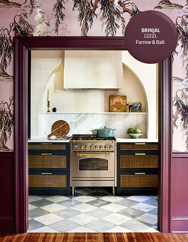
Brinjal
This deeply saturated purple will transform, depending on the quality of the light. In a room flooded with sunlight, it will feel whimsical and vibrant; in darker spaces, expect quiet and mellow vibes.
Brinjal (222), Farrow & Ball

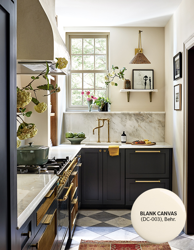
Blank Canvas
Behr’s 2023 Color of the Year is all about fresh starts. The perfectly creamy off-white instantly brings a relaxed ambience. Pair it with other natural tones and textures to give rooms a soft look with warmth.
Blank Canvas (DC-003), Behr

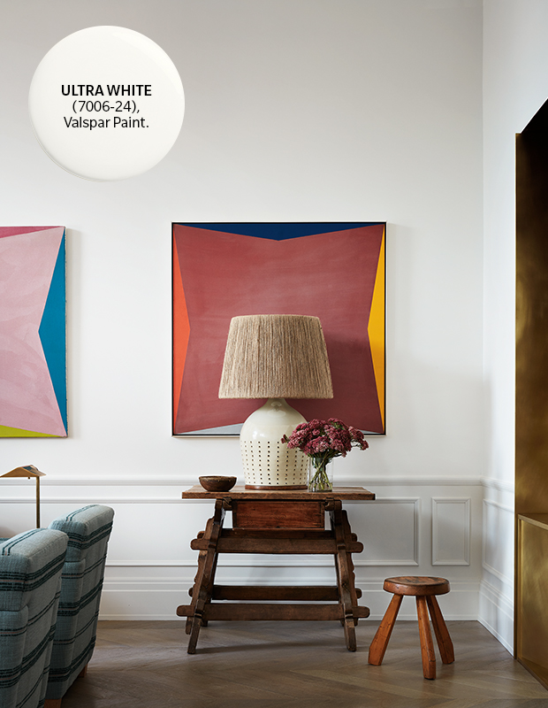
Ultra White
Think sophisticated, not stark, with this cool-toned white, which creates the perfect backdrop for bold art and unique furniture. Carry the color onto paneling for added dimension.
Ultra White (7006-24), Valspar

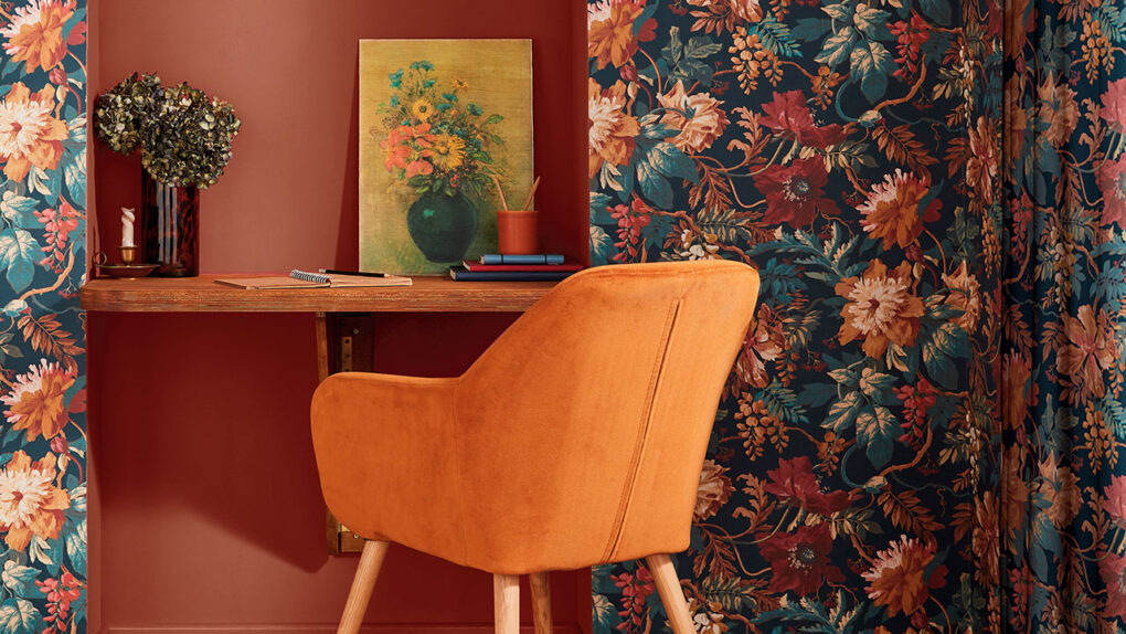
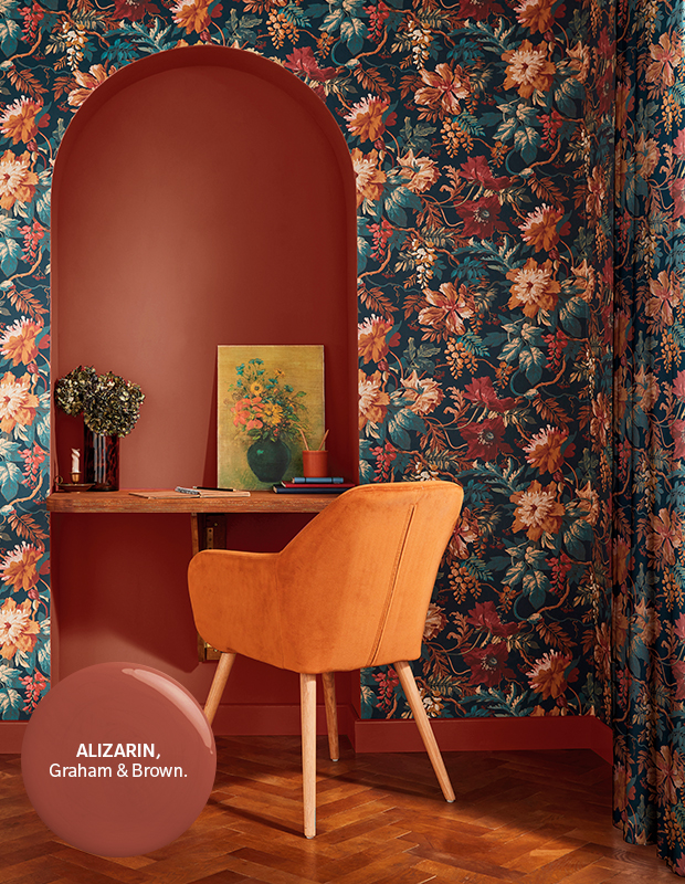
Alizarin
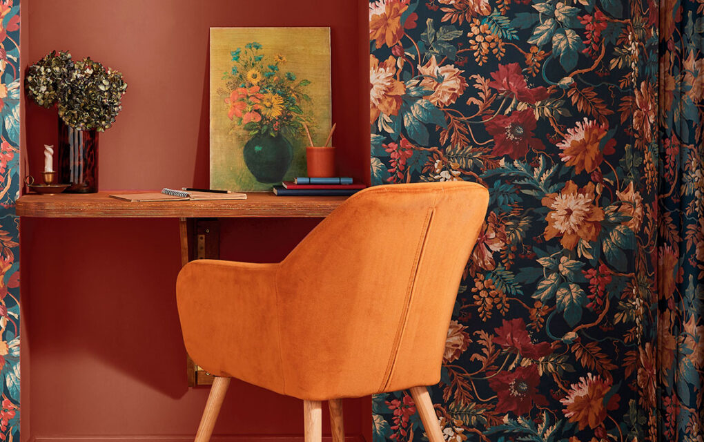
Graham & Brown’s Color of the Year is a rich auburn that instantly spices up your space. The name comes from a red dye used throughout history, and Alizarin’s warm orange undertone makes it approachable and inviting. Add this uplifting shade to a home office to inspire expression and creativity.
Alizarin, Graham & Brown

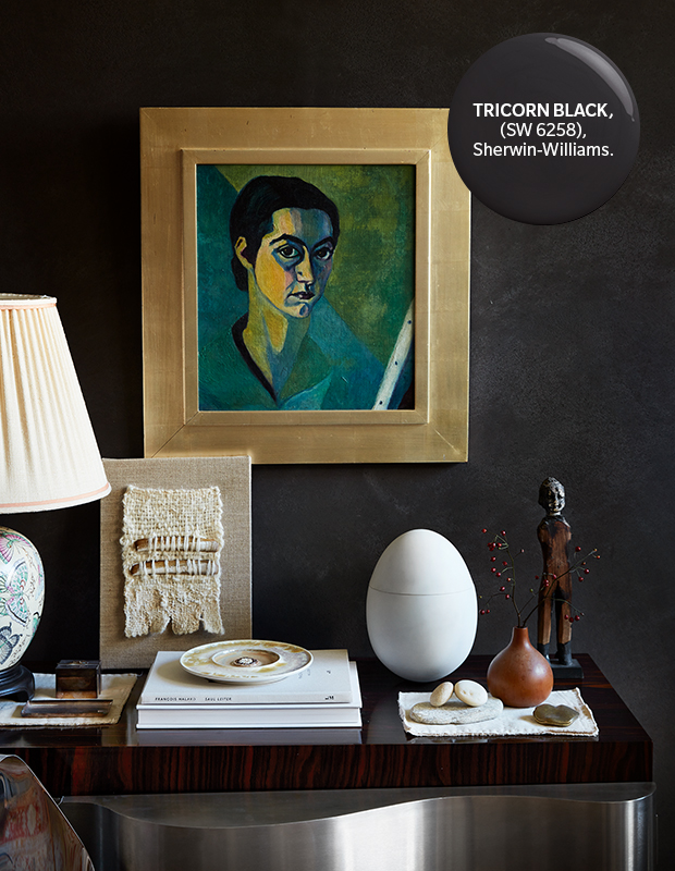
Tricorn Black
Neither warm nor cool, this true black works well in most lighting conditions, making it a designer favorite. Envelop your space in the inky shade — right down to the baseboards — for maximum drama.
Tricorn Black (SW 6258), Sherwin Williams

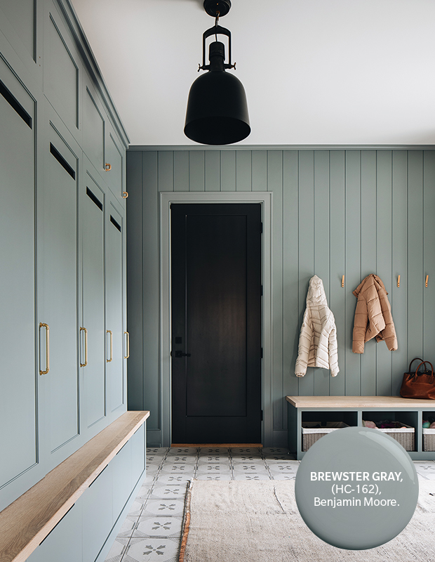
Brewster Gray
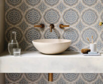
Capturing a cool Scandinavian aesthetic — especially when paired with blond woods — this blue-tinged grey creates a calm and serene vibe, and looks great in a foyer, powder room or nursery.
Brewster Gray (HC-162), Benjamin Moore

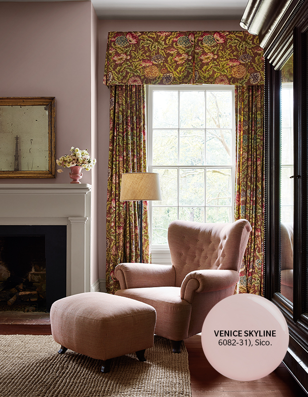
Venice Skyline
Natural light highlights the ethereal quality of this mauvy pink. The sophisticated sister to bold fuchsia, the pale blush tone creates an uplifting mood in both small and large spaces.
Venice Skyline (6082-31), Sico

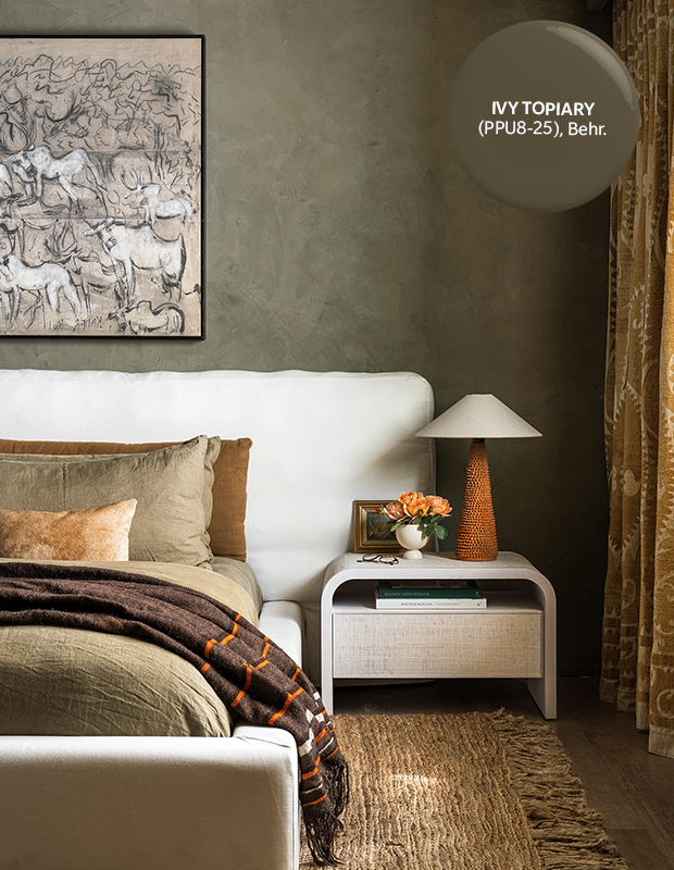
Ivy Topiary
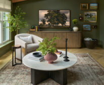
Green still reigns! This earthy olive hue with its warm brown undertone is energizing yet grounded — a feeling we’ve all been craving. No space is off-limits for this muddy green; its versatility cements it as a go-to hue this year.
Ivy Topiary (PPU8-25), Behr

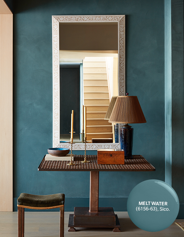
Melt Water
Sico’s Color of the Year is a triumphant return to classic teal. A lively balance of blue and green, this brilliant hue is both muted and dynamic. Burnt orange or caramel shades make a delicious pairing!
Melt Water (6156-63), Sico

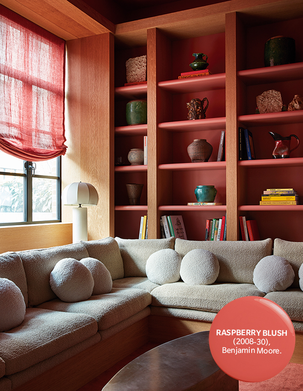
Raspberry Blush
It’s no surprise that this electrifying coral hue was Benjamin Moore’s pick for Color of the Year. Not for the color-shy, the bold and enigmatic shade adds a bright energy to spaces, especially when grounded with neutrals and wood tones.
Raspberry Blush (2008-30), Benjamin Moore

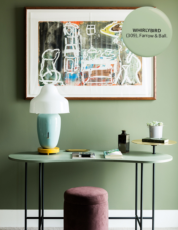
Whirlybird
A new addition to the Farrow & Ball palette, this playful green feels crisp and perfectly quirky. Try it in a hallway as a refreshing passage between rooms, or pair it with plum tones and bright golds for an instant mood boost.
Whirlybird (No. 309), Farrow & Ball

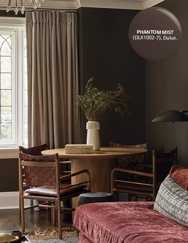
Phantom Mist
With dark and moody rooms continuing to trend, browns aren’t going anywhere. Seductively lush, this chocolatey hue works beautifully in entertaining and relaxation spaces. Go tonal by layering it with navy and rich plum, or use it as a foundation to make brighter colors such as cranberry and cerulean pop.
Phantom Mist (DLX1002-7), Dulux

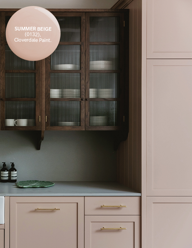
Summer Beige
This shade has just the right balance of pink and grey to make it feel romantic, but not overly feminine. The dusty rose is timeless and intriguing when combined with dark-stained wood and brass accents.
Summer Beige, Cloverdale Paint