
Emma Reddington Shares Her Favorite Paint Colors
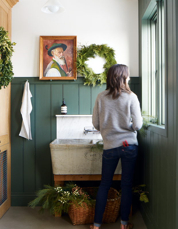
Emma Reddington is no stranger to taking a risk or two with paint. In her renovated Victorian home in Toronto (which you can see in the September issue, on newsstands August 9), there are barely any white walls — instead, dark green, pale purple and striking navy speak to the creative’s eclectic decorating style. Committing to color can be intimidating, so we asked Emma to share her favorite paint colors and exactly how to use them. Scroll down and take notes!

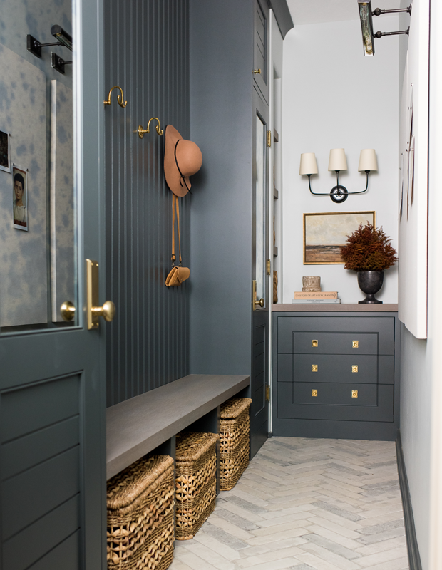
“I used this color in my dining room to create a moody and intimate space designed for evening dinners and special occasions. I’ve had many friends comment how much they love being in this space, and I think a lot of that has to do with the warm, cocooning feeling of the dark gray-blue walls.”
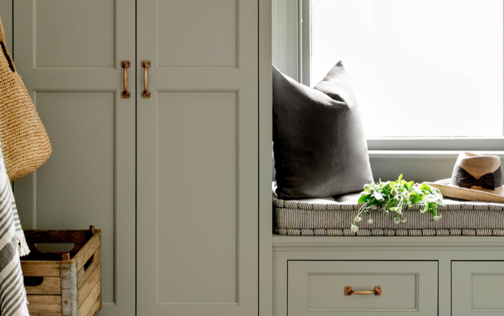
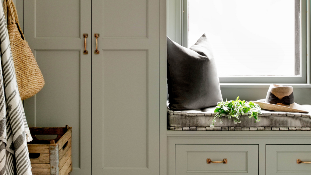
Beadboard detailing in the same hue gives this mudroom a touch of English character.

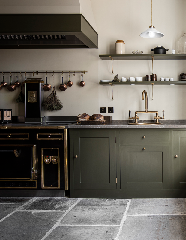
“This is a color I haven’t used to date, but it is definitely on my favorites list. I think it would work well on the exterior of a house paired with black accents especially on the West Coast where it would blend into the natural setting.”
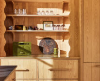
This English-inspired kitchen‘s cabinets are swathed in a similar muddy green color.
Plain English

“This shade has always confounded me. It’s a blue-green that sometimes wants to be gray depending on the light and time of day. I’d label it a difficult color that’s not always easy to live with, but it definitely delivers some personality to a space and makes it unforgettable.”

Simply White by Benjamin Moore
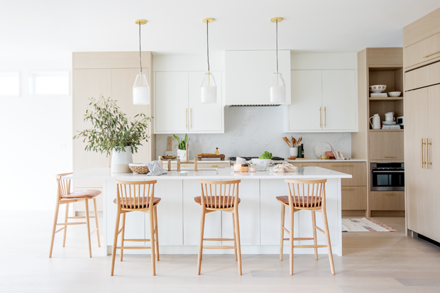
“This is my go-to white for modern, contemporary spaces. It’s neither too cool (blue tones) or warm (yellow tones). It’s the perfect white and the one I recommend the most of modern kitchens and bathrooms.”
See more of our favorite white paint colors.
House & Home March 2020

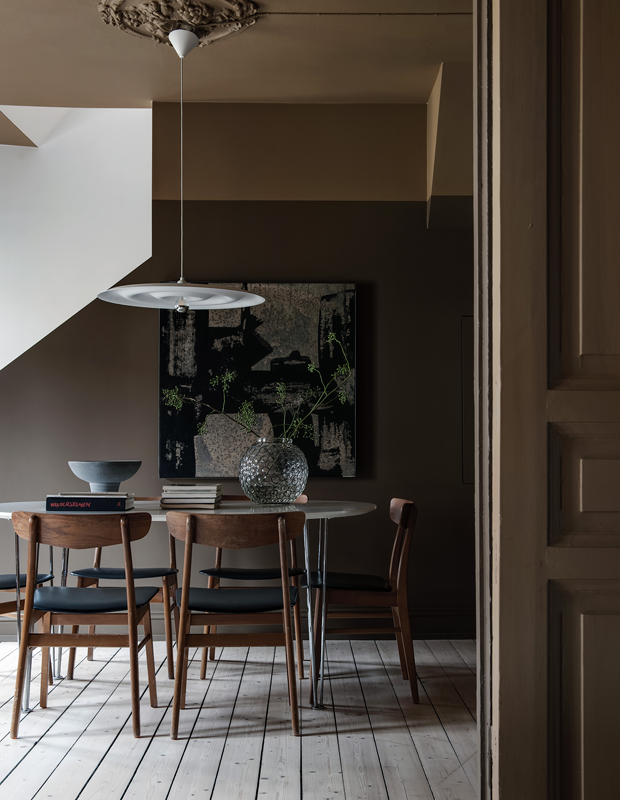
“Brown has been underused lately, and as a result, I think it looks quite fresh and unexpected when used in a room. I find myself being drawn more and more to rooms that use this shade. Salon Drab has enough olivey-green in it that it doesn’t look too old-fashioned or dated.”

Urbane Bronze by Sherwin-Williams
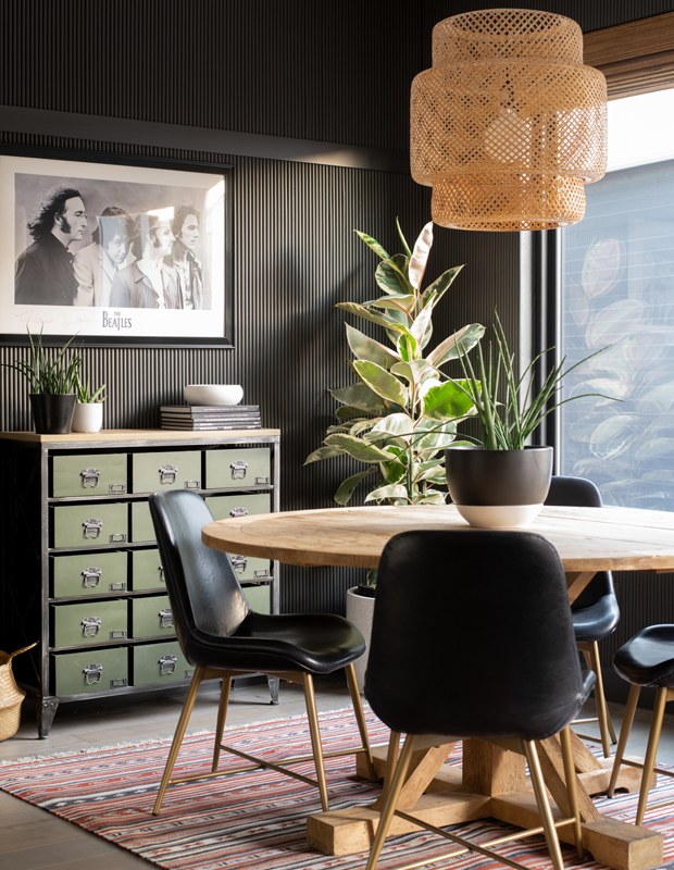
“This is Sherwin-Williams’ Color of the Year for 2021, and I think it might be my new go-to neutral. It would pair well with natural materials like wood, stone and mixed metals.”

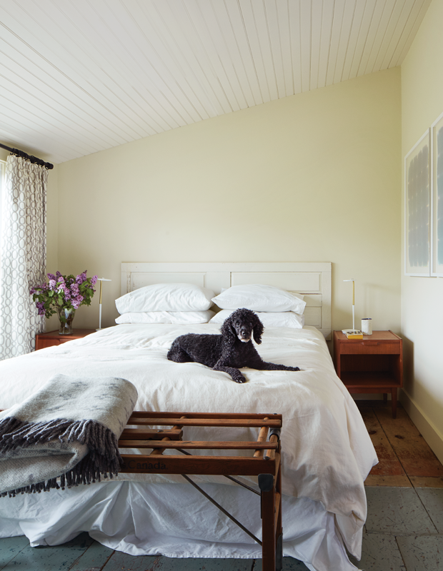
“For more traditional homes, I like to use Pointing. It’s a warmer white that is better suited to homes with high baseboards, moldings and wall panels. I used it in my living and dining room.”
Warm white paint draws the eye to the peaked ceiling in this Cape Cod saltbox‘s bedroom.
House & Home October 2015

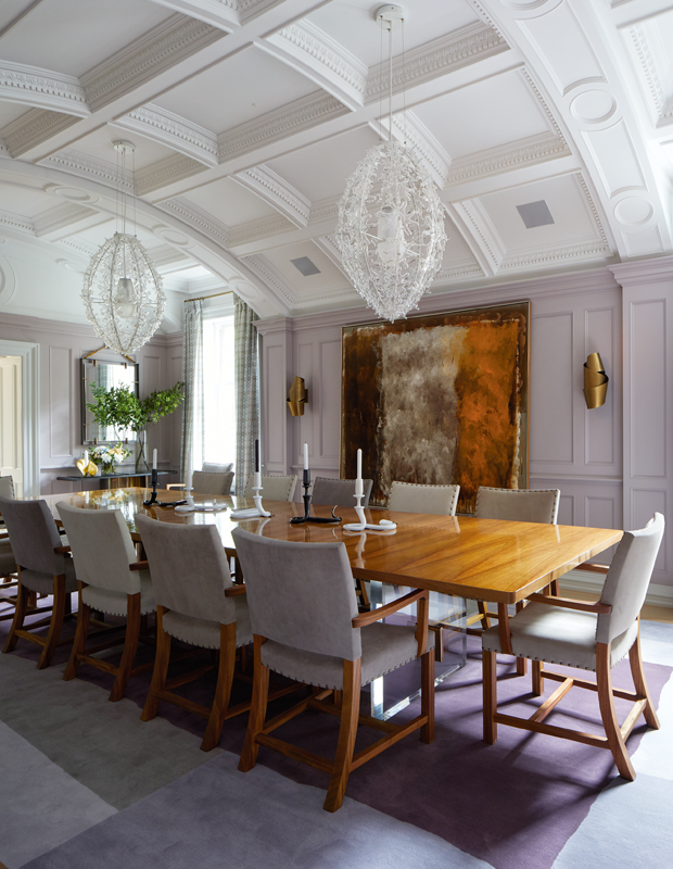
“Purple is probably my least favorite color, but when you have a pre-teen daughter who wants a purple room, you need to find a compromise. This mauve shade with an undertone of gray is both elegant and playful and works for us both.”
Designer Katherine Newman used smoky mauve paint to brighten this dining room.
House & Home December 2017

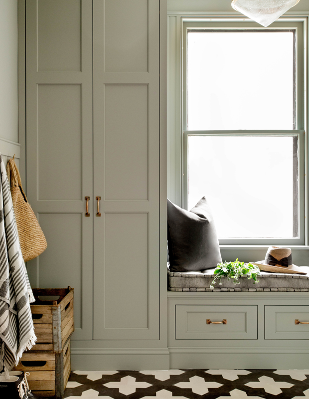
“A perfect dark green in my opinion. I tried many different versions of this shade when I was painting my bathroom, but this one eventually won out. I think it would look beautiful on kitchen cabinets or in a mudroom.”
House & Home November 2019