
Designer Sean Symington on The Art of The Well-Collected Home
Canadian designer Sean Symington has built his career in England, running his design studio in Tetbury in the Cotswolds while taking on projects globally.
He’s celebrated for his colourful, exuberant rooms and joyful approach to decorating. H&H Deputy Editor Emma Reddington asked Sean for his expert advice on creating layered interiors.

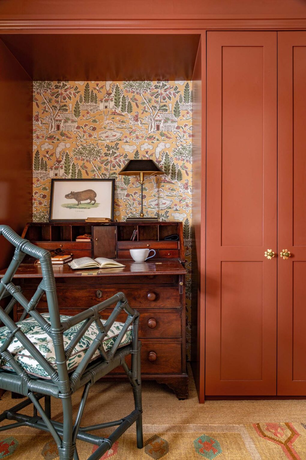
In this guest room in the Cotswolds, a small nook is lined with pastoral wallpaper and outfitted with a writing desk.
H&H: Where do you begin when creating a collected room?
Sean Symington: I always start with a strong anchor, usually a hero print from a fabric, artwork or a rug with a beautiful mix of pattern and colour. From there, I layer in complementary tones and textures, letting that initial palette guide everything from cushions to lamps and artwork.

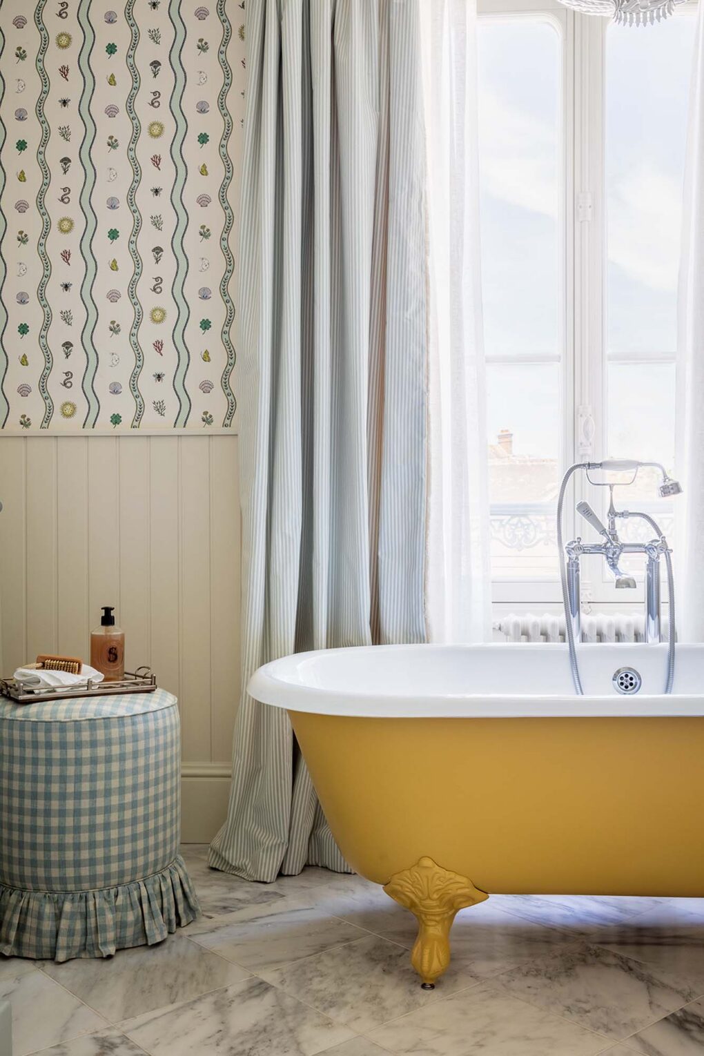
The yellow cast-iron tub brings a playful pop of colour to the bathroom’s understated palette; a skirted gingham stool enhances the room’s charm.

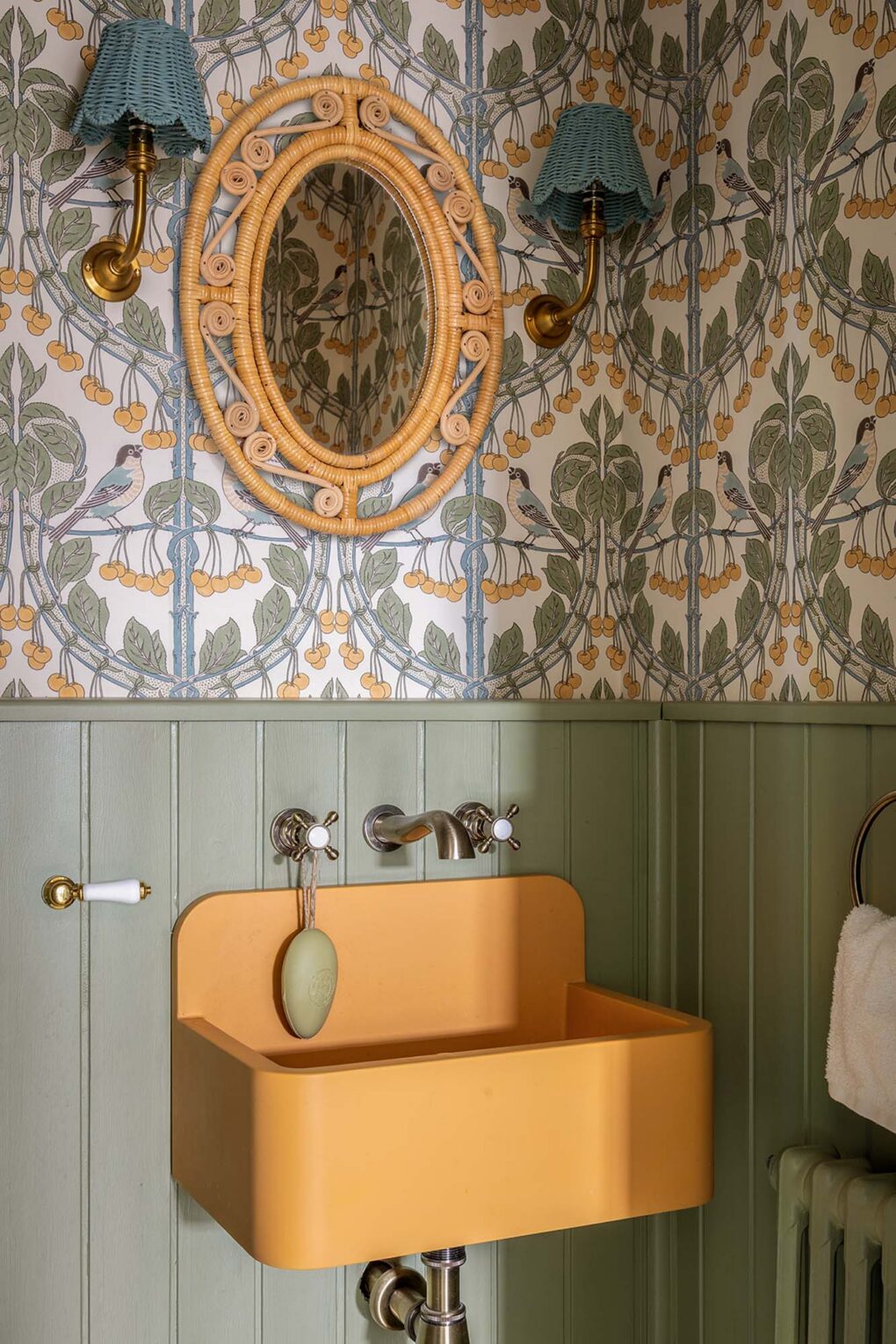
A modern marigold-hued concrete sink is the perfect counterpoint to the Arts and Crafts wallpaper — first block-printed in 1903 — and wicker accessories.
H&H: What’s the secret to pulling off a look that feels curated rather than cluttered?
SS: It’s all about thoughtful contrasts and understanding proportion: the juxtaposition of small and large-scale patterns, rich woods next to rattan, and antiques paired with playful prints. It’s those considered contrasts that keep a room dynamic without it tipping into chaos.

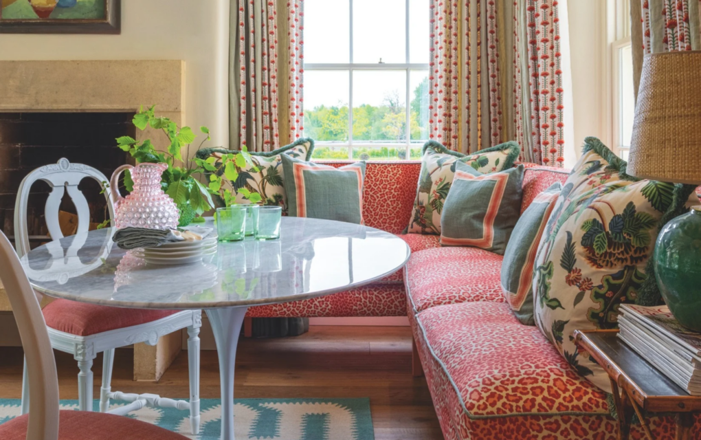
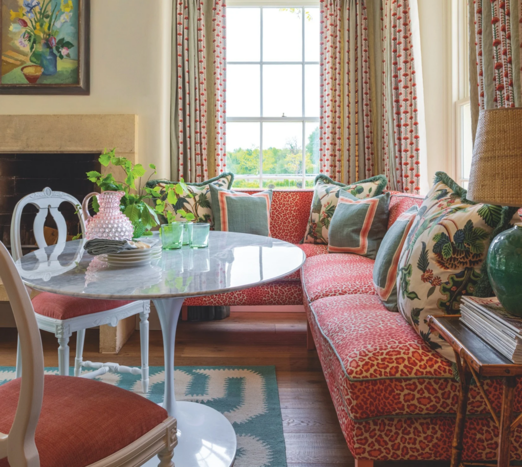
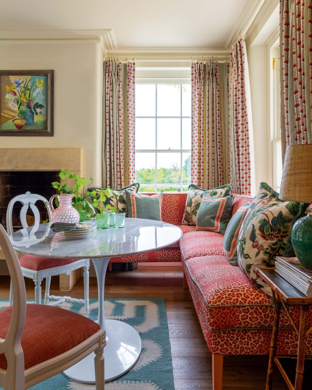
“Mixing hard and soft surfaces is key here,” says Sean. “We love the glossy Carrara marble top combined with the plush softness of the upholstered banquette.”
H&H: What’s your editing process? How do you create breathing space?
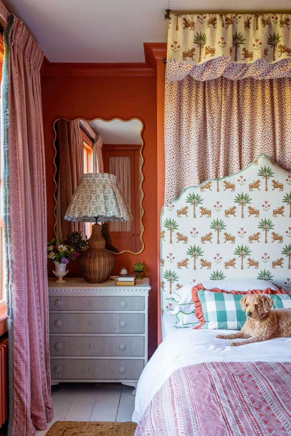
SS: In a layered room, the negative space is just as important as the positive. Breathing space doesn’t necessarily mean plain — a very small-scale pattern reads as a solid from across the room — it’s really the interplay of scale that does the editing for you. If you have a busy rug, balance it with a plain or small-scale patterned sofa on top. Or, if you have a plain headboard, introduce a large-scale cushion fabric against it. Pair a huge pattern with a small one and the room finds its own rhythm. It’s the layering of print sizes that creates that sense of calm within the richness.

“Use a large-scale print, combine it with a medium-and small-scale print and think about motif and colour. It simply works.”

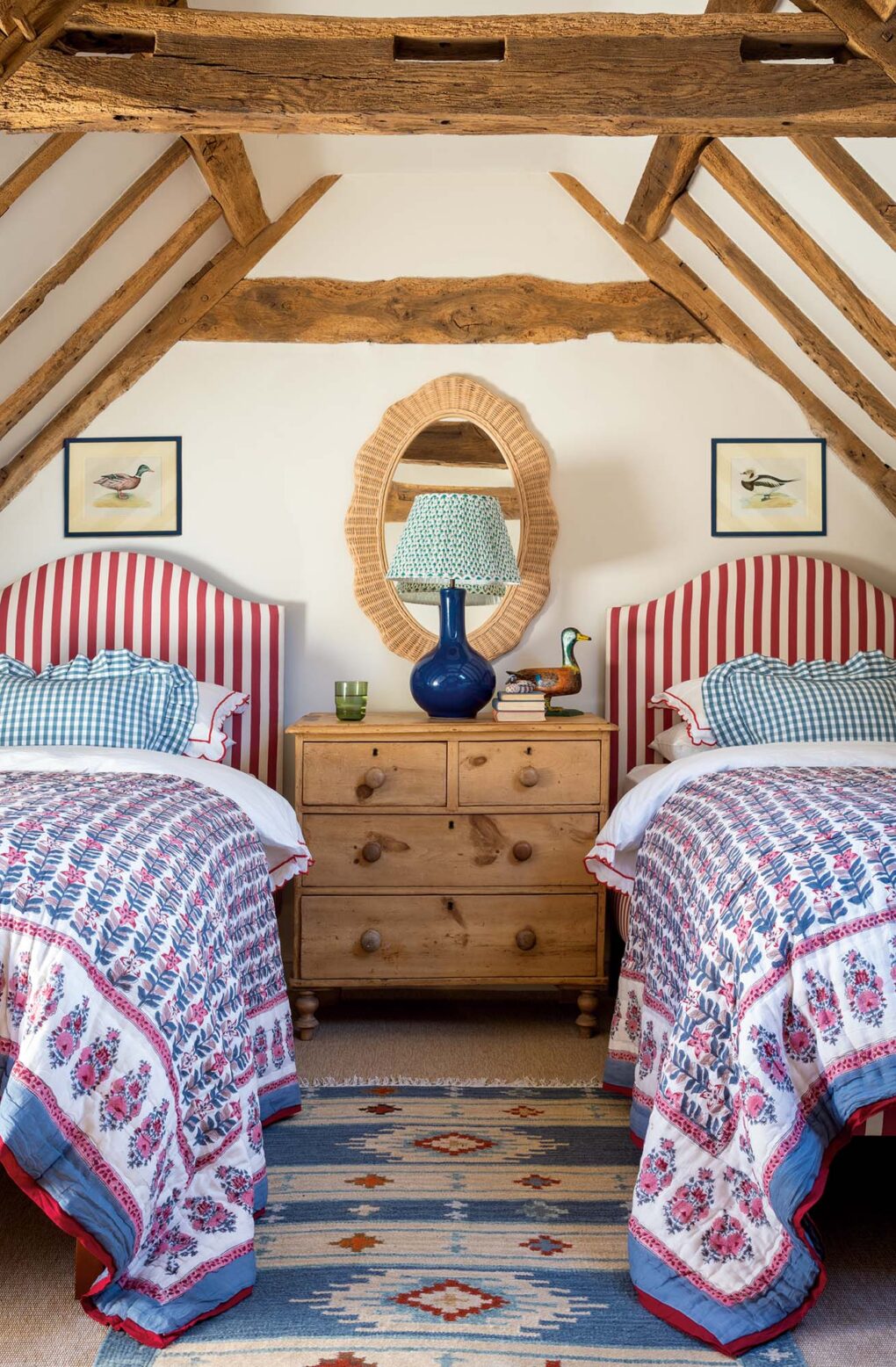
Bold stripes, floral block prints and gingham patterns comingle in this delightful guest room tucked in the eaves of an old farmhouse.
H&H: How do you mix different eras and textures so seamlessly?
SS: We’re all about the eclectic mix, like a textural vintage bamboo side table sitting alongside a mid-century tulip table. Varying the eras is essential to creating a layered, thoughtful space.

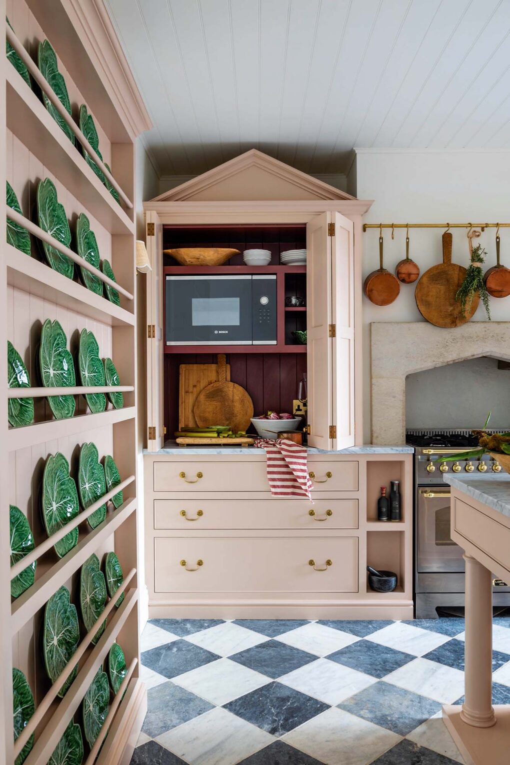
Sean’s own kitchen, in a former student rental house, has cabinets that were designed to appear as if they’ve always been here. “We didn’t want the kitchen to feel too fitted,” says Sean. Quirky architectural details like the pointed pediment on top of the pantry add a touch of whimsy.
H&H: How do you add warmth to utilitarian spaces like your own kitchen?
SS: The muddy pink paint shade is inherently warm, so combining it with a deeper red on the cabinet interiors — that plummy raspberry against the pale pink — makes the whole space glow. Antique brass hardware adds to that warmth, as do the vintage and antique accessories like the hanging rail with its copper pots, which brings dimension and a lovely lived-in quality. The Carrara marble then adds a classic crispness and freshness against all that warmth. It’s the combination that makes it sing.