

Before & After: Nyla Free Gives a Century-Old House In Calgary A Long-Awaited Redo

It’s often said that history repeats itself — and this rang particularly true for the owners of this heritage Craftsman in Calgary’s Elbow Park neighborhood.

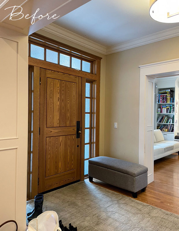
Before: The foyer featured a rustic-look front door, dated accessories and awkward bench seating.

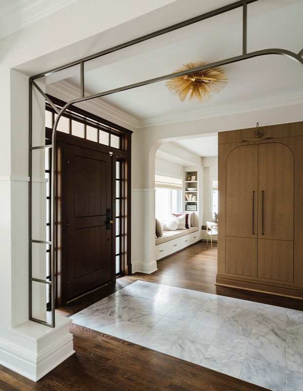
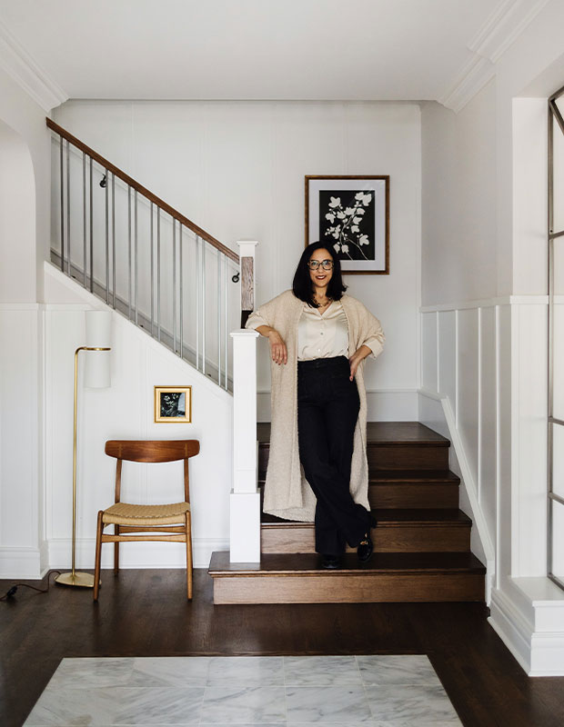
Now, the foyer makes a grand statement. Nyla chose an elegant and durable floor tile for the refreshed entry.
H&H: What do you love about this makeover?
Nyla Free: I love the foyer. One of our goals was to create an environment where you felt welcomed as you walked into the house. The armoire serves as a piece of furniture, a functional closet and a divider wall. I also love the four-point metal arch, which adds another divider. My clients love the function and relaxed feel of the space. There’s no stress around kids spilling things or lounging on the furniture — the home was designed with everyone in mind.

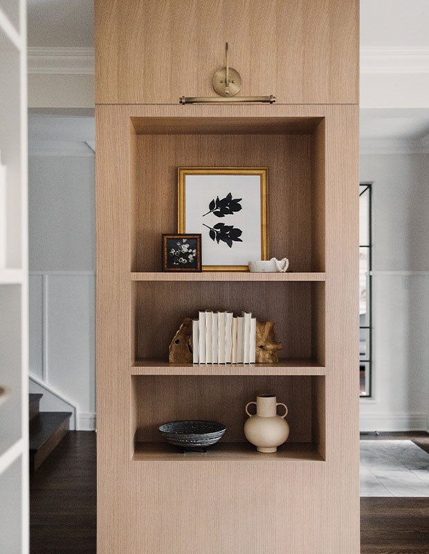
The entry side of the armoire houses coats while the parlor side has display for books and objets.

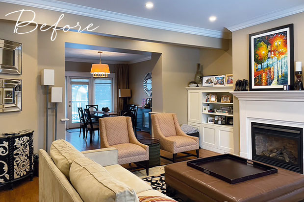
Before: Previous renovations had all been “lipstick approaches,” according to Nyla, leaving the home with poor flow as seen the original parlor.


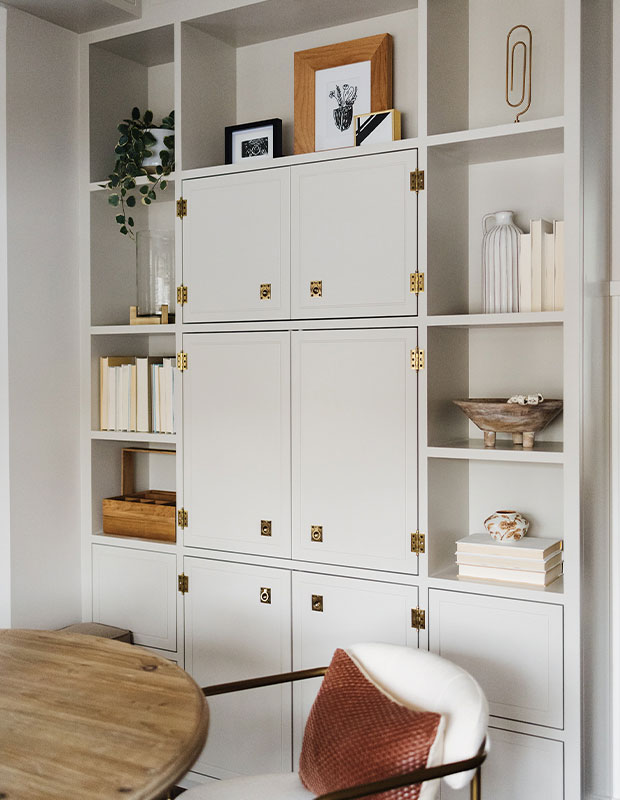
The parlor’s built-ins are both stylish and functional; warm metal hardware adds character.

H&H: How did you get the ball rolling?
NF: My client had created a lookbook featuring her likes and dislikes to present to potential designers, a suggestion that had come from a porch chat with a neighbor. Through this process, she found she was drawn to neutrals, cosy textures and hard- wearing fabrics — patterns, waterfall islands and farmhouse style didn’t jibe for her. Above all, she was seeking functionality. Using her lookbook, we established the floor plan and presented our materials, and then the owners handed over their house in complete trust so we could execute the design. She wanted a reveal — a turnkey moment — where she would just walk in and the house would be fully furnished and styled.

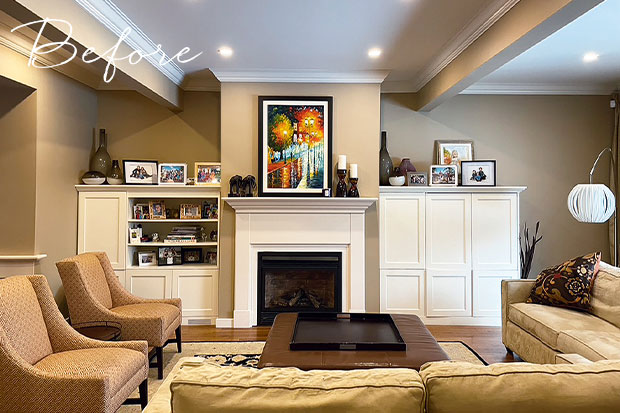
Before: The living room lacked impact with a dated fireplace and mid-height cabinets.

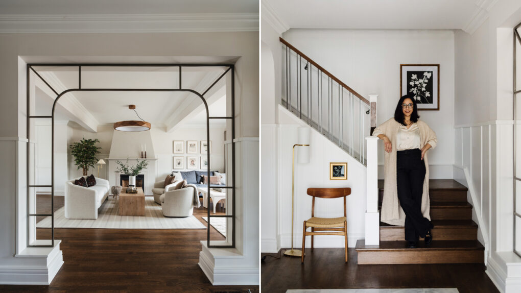
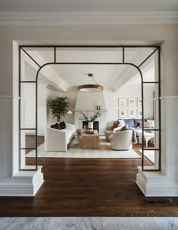
After: The four-point arch has a gunmetal pewter finish and frames the entrance to the living room. “It’s an unexpected detail that offers an interesting focal point,” says Nyla. A textured chimney breast has an old world vibe.
H&H: What was the biggest challenge during the makeover?
NF: The main floor’s 11 different ceiling heights that came from various renovations over the past 100 years — some were simply an additional layer of drywall, while others were hiding mechanical. We worked with Focused Renovations to open up the ceiling and streamline the ductwork to reduce the number of transitions. I think we got it down to about five!

Before: The clients preferred a neutral palette throughout, without relying too much on black.

After: Black accents were used sparingly to add depth.
H&H: What were the key design elements?
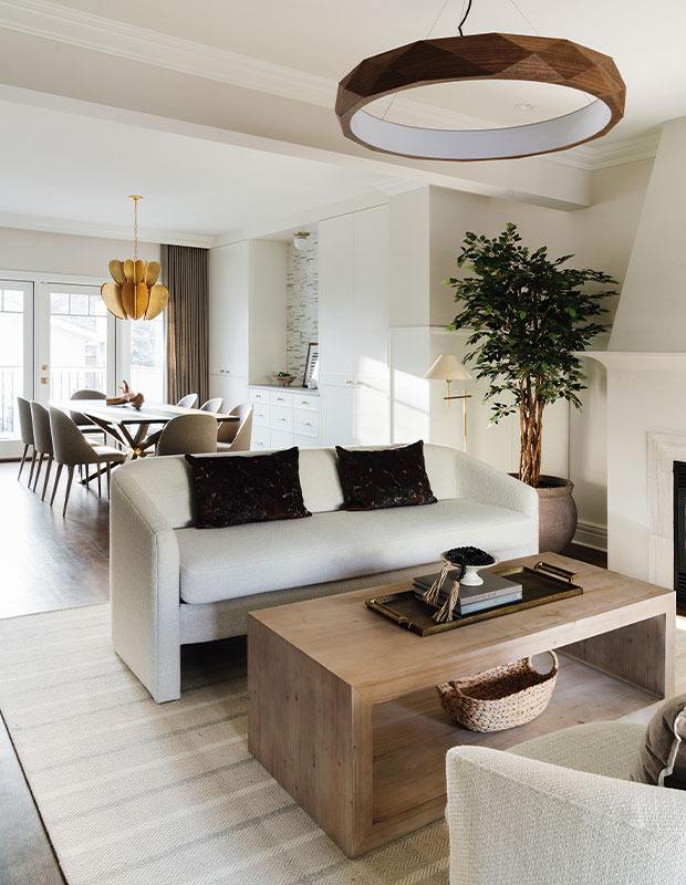
NF: The client wanted a calm, relaxed and family- friendly vibe, something that felt put together but not too precious, and they wanted to create a sense of flow when they welcomed guests. It was important that the kids — now 12, 10 and 7 — could feel at home and sit anywhere, so we made sure any fabric we used was durable. We also added storage in the dining room, front parlor and kitchen.

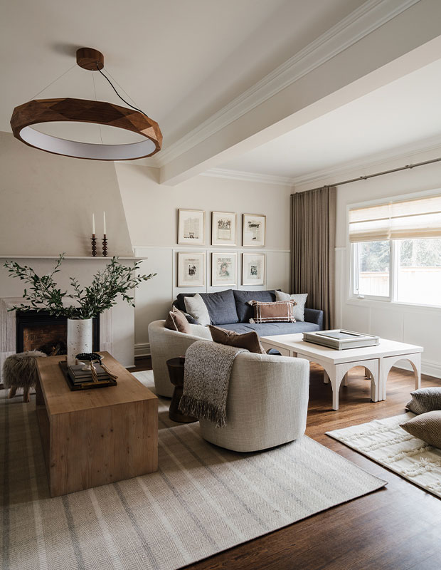
Swivel chairs can be turned to create a small seating area for TV-watching.
H&H: How did you upgrade the fireplace?
NF: I love a beautiful fireplace — that’s a meaningful design element for me. Replacing the existing fireplace wasn’t key for the client, so we simply updated the wall and surround. I intended to incorporate a plaster finish for texture, but it was expensive, so we created a texture with drywall mud and, in the end, it turned out super cool and gave us that textural quality we were looking for.

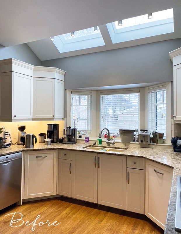
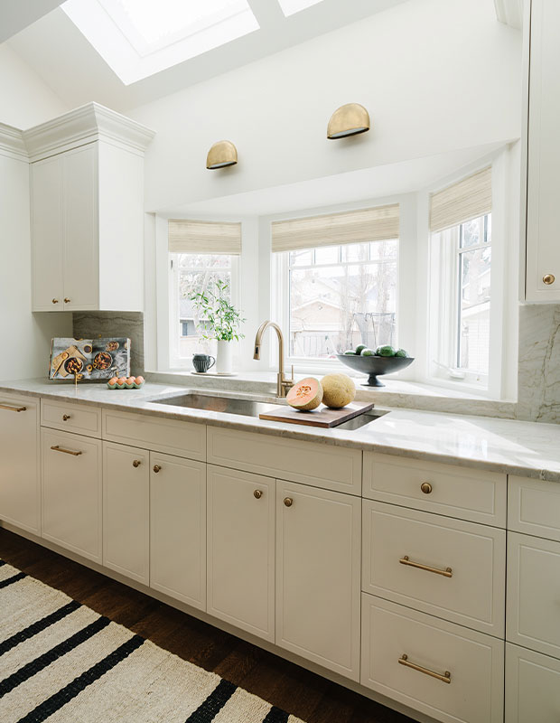
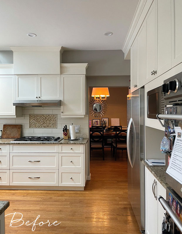
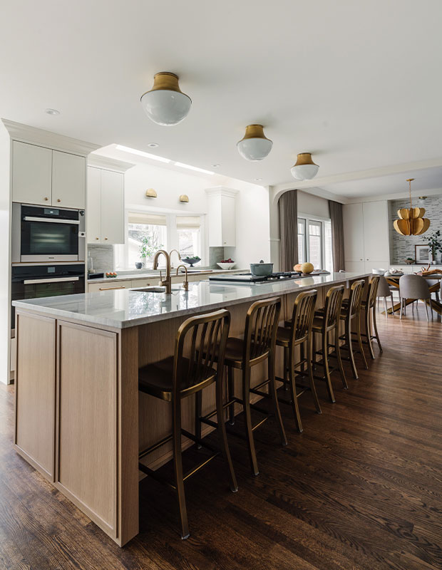
Before: “We decided to keep the sink where it was in the kitchen since the home is west-facing; the owners get beautiful sunlight from the windows,” says Nyla.

H&H: Where did you save and splurge?
NF: We saved by refinishing the existing hardwood floors and keeping the original fireplace insert. The metal framework in the entryway was a splurge that added a great detail. We also splurged on the Home Refinements by Julien SmartStation sink to fill the large space in the kitchen’s bay window.

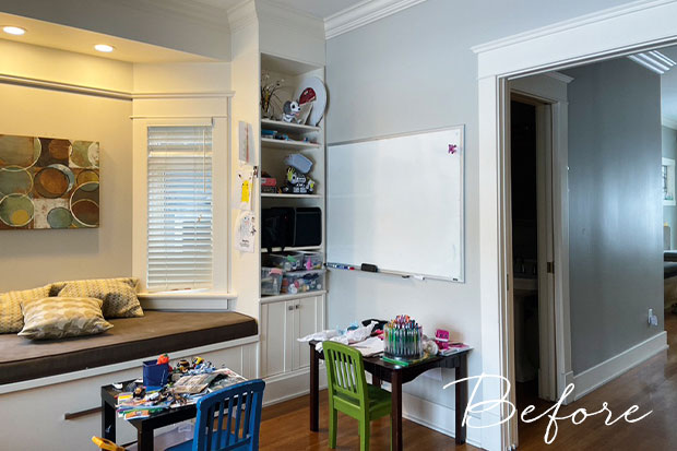
Before: The original layout lacked flow between rooms, including the kitchen and dining room.
HH: Why did the owners choose to renovate rather than just move?
NF: The family loved the location of the house — the walkability and connection to their neighbors. After spending a lot of time in the house during lockdowns, they felt it was time to upgrade the space to one that better served their needs as a family and their love of entertaining. The first hammer fell on June 1, 2021, and the family moved back in seven months later, just before Christmas.


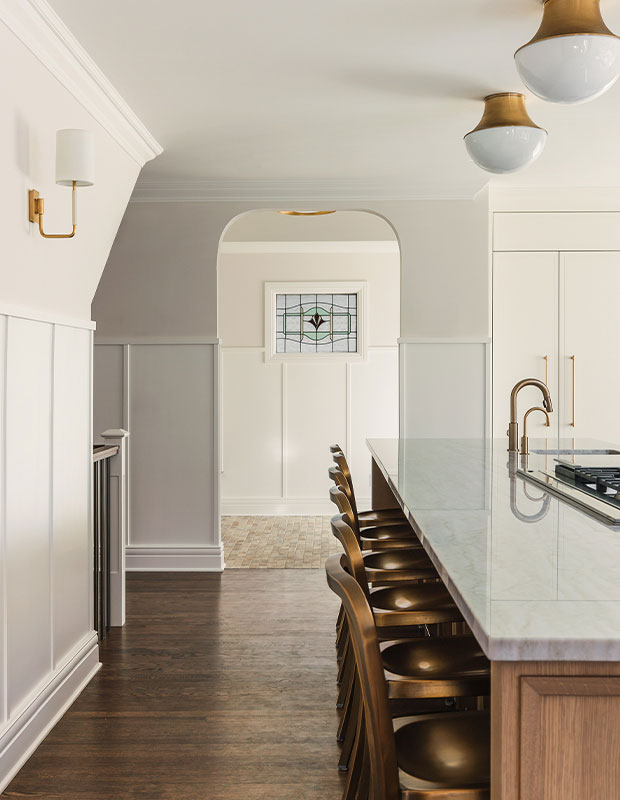
Adding subtle, rounded arches best suited the heritage of the house, as seen in the entry to the mudroom.

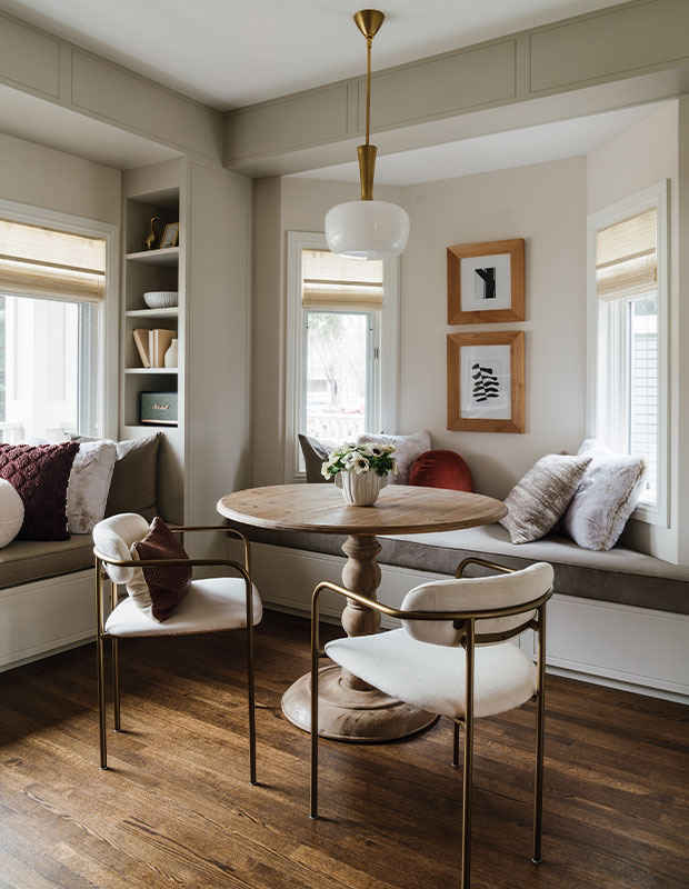
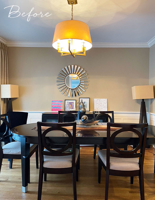
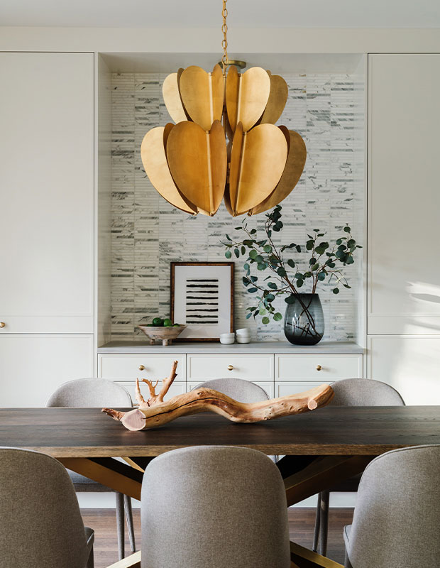
Before: The dining room lacked storage and adequate lighting.

After: The dining room’s stacked tile adds visual interest in between full-height cabinets.

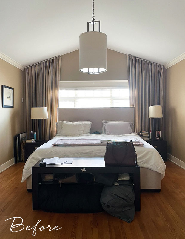
Before: The primary bedroom was dark and cramped with awkwardly laid-out furniture.

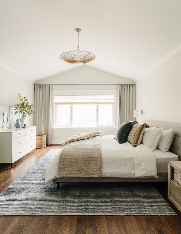
After: A whimsical light fixture adds flair to the otherwise serene principal bedroom.

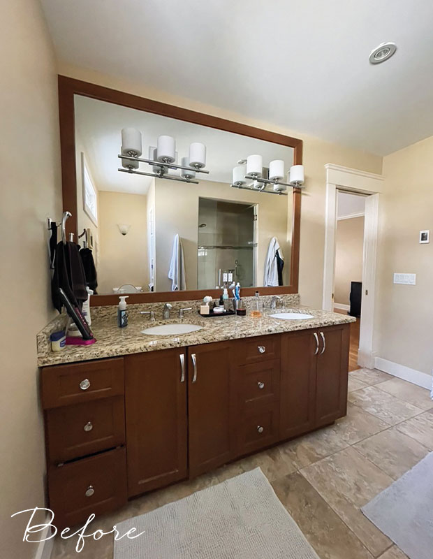
Before: The principal bathroom was stuck in the past with brown cabinets.

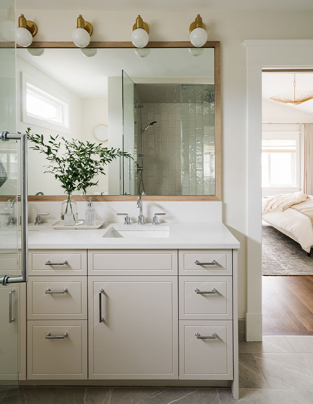
After: An artful mix of materials — antique brass sconces, chrome faucets and a wood-framed mirror — work in concert for a layered look.

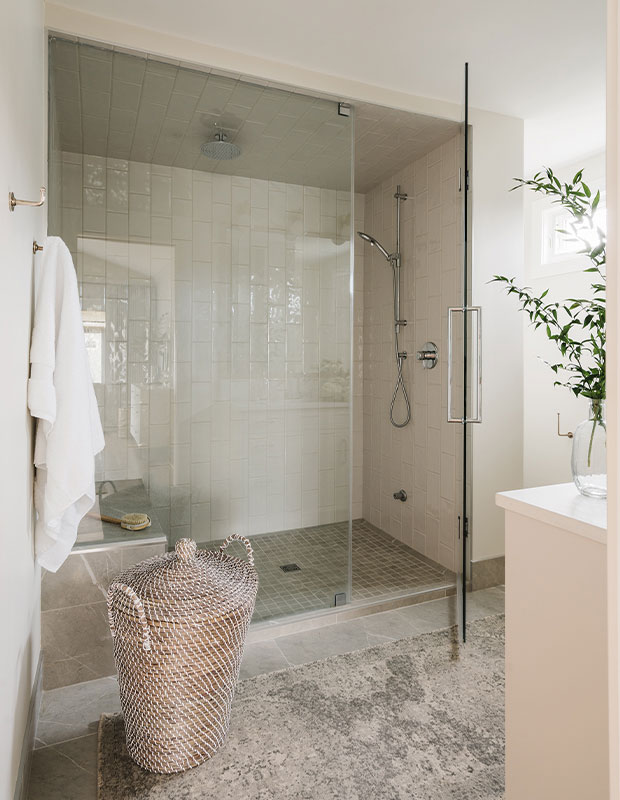
Textured elements in neutral hues create a spa-like sanctuary in the principal bathroom.
- Photographer Michelle Johnson
- Designer Nyla Free