
How Designers Create the Art Gallery Effect at Home
There’s an art to designing a gallery wall — and these designers have mastered it.
We checked in with a few of the experts to see how they turned blank walls into layered, personal displays that tell a story. “How thrilling to have a client with fantastic art,” says designer Colette van den Thillart. “Technically speaking there are many ways to achieve a gallery wall, some people tape up scaled craft paper pieces, or draw it out on paper, but my preferred method is to lay things out on the floor with the shape of gallery area taped out.”
Below, designers reveal how they bring this curated, lived-in look to life.

Designer Orsi Panos’ circa-1885 bungalow
Orsi Panos
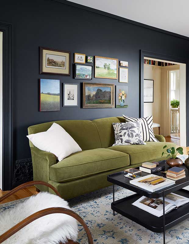
“My favourite approach to gallery walls is salon-style (organic)—mixing sizes and orientations to create a relaxed, collected feel. I love blending frame colours and styles, along with different art mediums and genres, to achieve an authentic, layered look that truly reflects one’s personal style,” says Orsi. “Curating a gallery wall above a sofa works beautifully because the space is naturally defined by the width of the sofa. I like to keep the overall art composition slightly narrower than the sofa itself, allowing the sofa to remain the anchoring piece and ensuring the arrangement feels balanced and intentional.”

A food blogger’s Toronto home
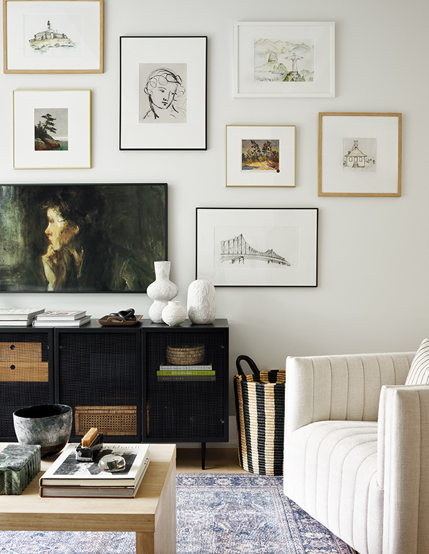
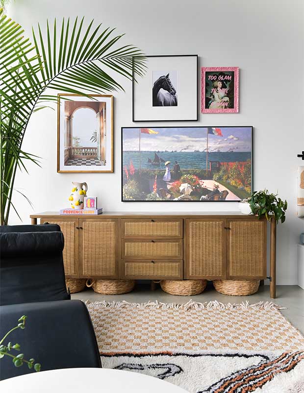
“I also love creating gallery walls around a TV to help camouflage it and draw attention away from the screen,” says Orsi of her clients’ living room. “Since a TV is typically a larger visual element, I like to anchor it with larger-scale artwork, layered with smaller pieces for balance. With TV gallery walls, I often let the composition extend beyond the media cabinet, allowing the art to flow more freely and feel less constrained.”

Feature house by 2023 Designer of the Year, Colette van den Thillart
Colette van den Thillart
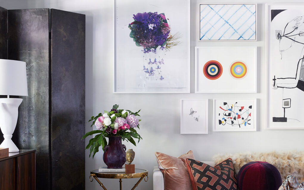
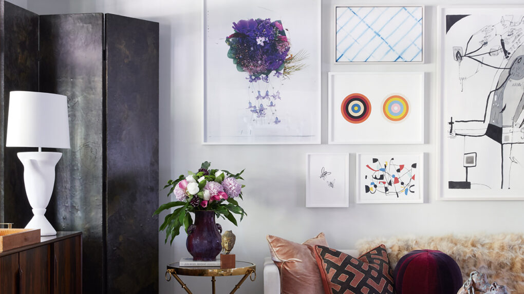
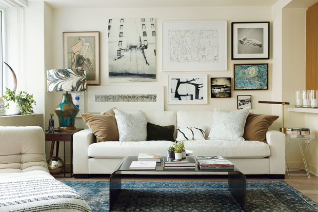
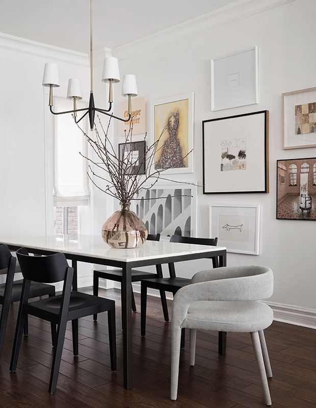
“For this space we assembled a collection of disparate works from Canadian and international artists and decided on white frames to unify them and really let the work speak. It’s a bit like the white walls in this space: a quiet foil for the lively objects which populate it,” says Colette. “I like to put smaller more intimate works at eye level so they can be appreciated while seated, and as a general rule — larger works really look best over smaller pieces.”

Colette’s New York City pied-à-terre
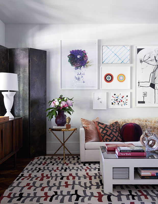
“I like putting lamps in front of art, it helps soften the sharp corners of the frames and of course adds a great glow to the nearby works. I like to mix artistic mediums as much as possible: works on paper, oils, photographs and even sculpture,” says Colette. “A wall bracket with a piece of sculpture is a wonderful interrupter for a gallery wall, adding instant dimension. The most important thing to remember is that you can alway move things around — it’s just nails! And don’t forget to leave a little space for new acquisitions!”

Canadian Jeweler Noura Sakkijha’s Victorian home
Sarah Birnie
“For this space, my goal was to create a gallery wall that felt calm and intentional rather than busy. I tend to favour fewer, larger-scale pieces, which allows each piece to breathe,” says designer Sarah Birnie. “Generous spacing between frames creates visual rhythm and balance, and helps the arrangement feel cohesive rather than cluttered. My biggest tip for homeowners is to edit thoughtfully— you don’t need to fill every inch of wall. Letting negative space play a role is often what makes a gallery wall feel elevated and timeless.”

A moody, Parisian-inspired Toronto condo
Cindy McKay
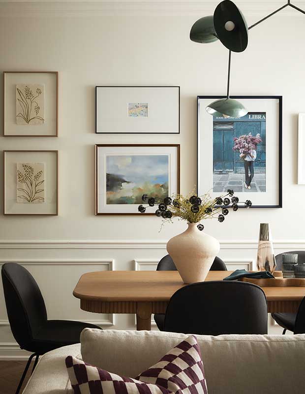
“This living room gallery wall was achieved through a mix of new and existing pieces,” says Cindy McKay. “I love mixing up art sizes, frame styles and mat sizes for a thoughtful, layered look that’s anything but boring.”

Designer Linda Lam’s Vancouver loft
Linda Lam
“When creating a gallery wall, I like to mix different frame styles and art mediums. This layering adds depth, texture, and visual interest,” says Linda. “Playing with varied sizes and configurations keeps the composition feeling organic and allows the art to tell a story. A key consideration is ensuring the pieces feel harmonious together, without competing in colour or composition. Most importantly, every piece should make you feel good.”