
The Best White Paint Colors: Which White Is Right?
This is by far the question I am asked most often. That’s because there are way too many whites to choose from.
It’s no surprise that designers all use the same few white paint colors from the leading paint companies, over and over again. Here is what matters: You get what you pay for. The most expensive paint from the leading paint companies cost more because not only are they good quality paints that cover well with fewer coats, but the actual color is more complex. It has more tints in it which means that the color is richer. This goes for whites especially. That’s the reason that some painted walls look like they are just primed, while others have depth saturation, and reflect the light beautifully. It all depends on the light in your room. You absolutely must paint a board with primer plus two coats of the white paint you are testing. Carry it around the house and see how it looks in both day and night time. Sheen level matters. It’s all personal, but I like a low lustre finish such as Pearl for walls, and a semi gloss and sometimes a high gloss for baseboards, trim, and mouldings. The more whites the better. I believe in using several different whites in one space. You don’t have to use 10 in a couple of rooms like I do…but use two or three if you can. One on walls, one on baseboards or one on doors. The differences will be very subtle but they will still create visual interest. Discover my 3 favorite whites from 3 different brands below.

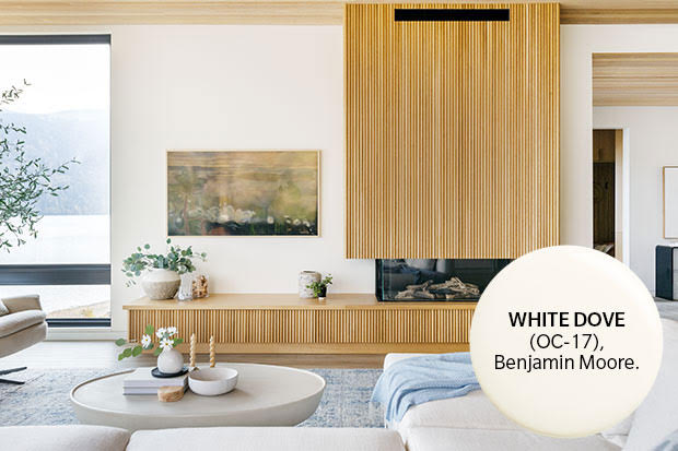
Benjamin Moore’s White Dove (OC-17)
Why I Like It: No yellow, not grey, pure without being cold.
House & Home

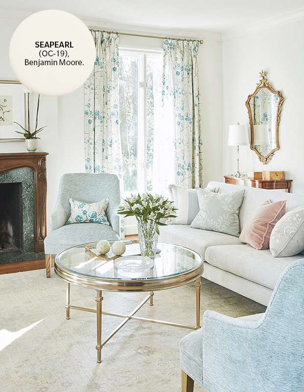
Benjamin Moore’s Seapearl (OC-19)
Why I Like It: Soft with a grey undertone.
House & Home

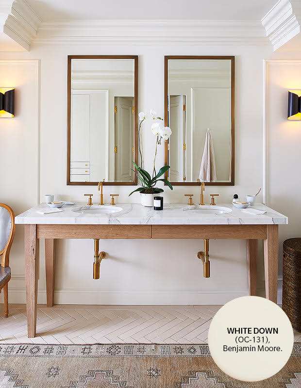
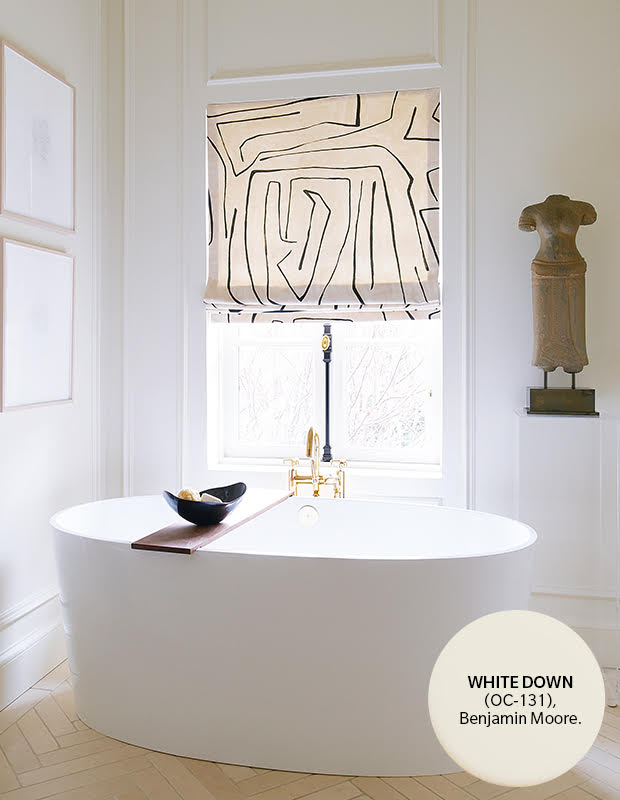
Benjamin Moore’s White Down (OC-131)
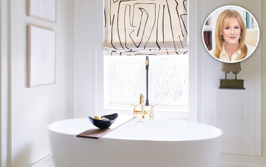
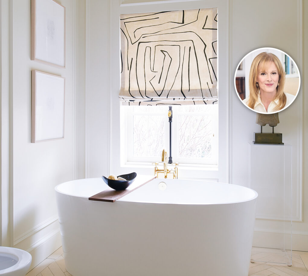
Why I Like It: It’s calm with a creamy finish. My all time favorite white that I used here in my bathroom!
House & Home

House & Home

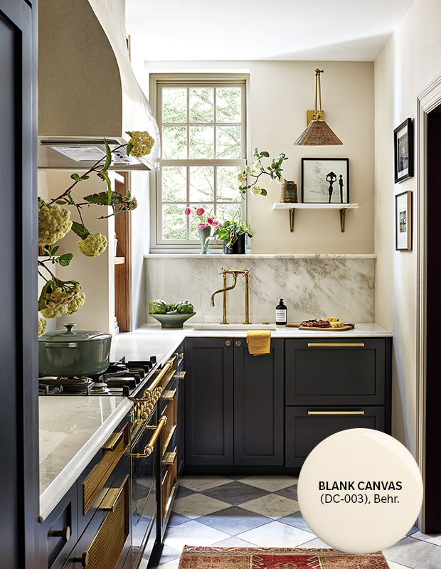
Behr’s Blank Canvas (DC-003)
Why I Like It: This has the feeling of light limestone. Gorgeous!
House & Home

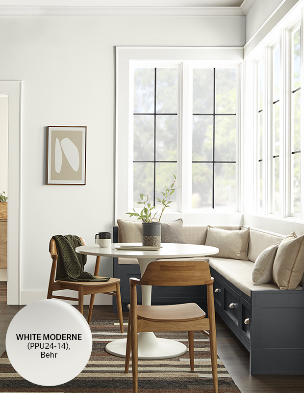
Behr’s White Moderne (PPU24-14)
Why I Like It: It’s a bright white with a touch of grey.
Behr

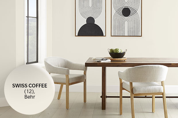
Behr’s Swiss Coffee (12)
Why I Like It: It’s warm and creamy. A classic!
Behr

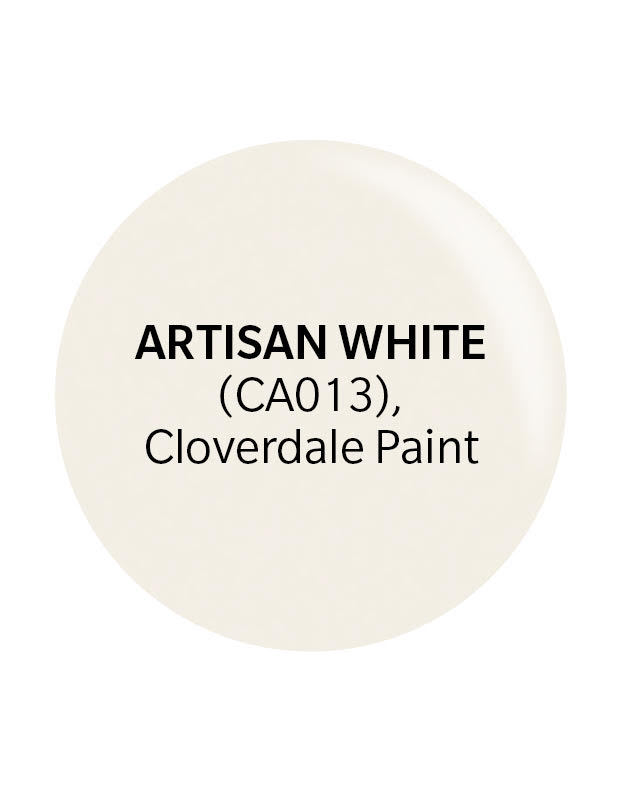
Cloverdale’s Artisan White (CA013)
Why I Like It: It’s creamy with brown undertones.
Cloverdale

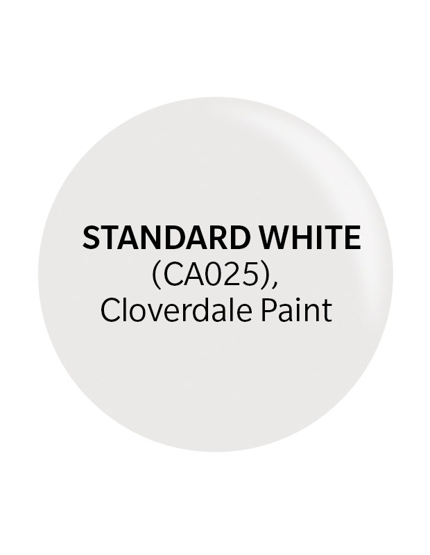
Cloverdale’s Standard White (CA025)
Why I Like It: A bright go-to white when you just want a pure look.
Cloverdale

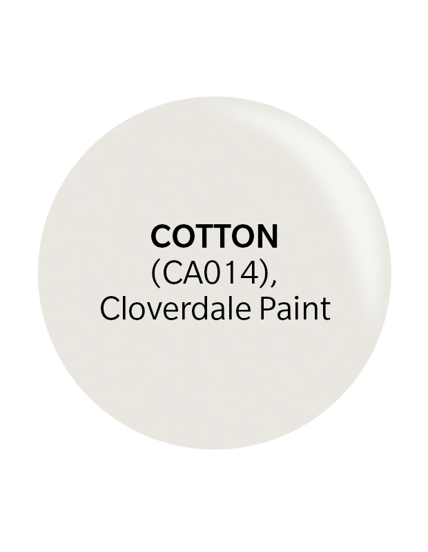
Cloverdale’s Cotton CA014
Why I like It: A very light greige color. White, but with depth.
Finally, don’t forget to sand and prime your walls and trim, and then sand between coats with very fine sand paper. This is how you get a professional finish!
Cloverdale