Before & After
Before & After: Shannon Cooper Transforms a Classic Home In The Beaches For A Young Family
Updated on July 4, 2025
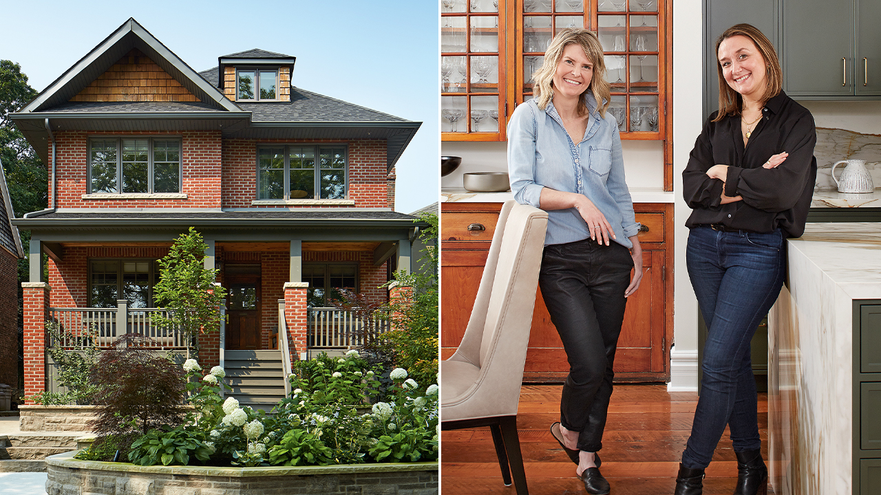
Viviana von Bertoldi and Sean Walters knew they needed a change when Covid-19 hit. Their once cozy semi in Toronto’s The Beaches neighborhood felt too small, so when a larger classic red-brick house came up nearby, they jumped on it. At 3,200 square feet with six bedrooms, the place had plenty of room, but the floor plan needed work. In 2021, neighbor and principal designer Shannon Cooper of East Design House was hired to create a more functional space. She redesigned the kitchen, reorganized the upstairs bedrooms and adapted the lower level to better suit the family’s lifestyle. Below, see inside this house transformation!
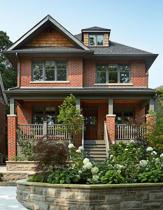
Shannon upgraded the exterior with new landscaping, raised garden beds and a widened driveway.
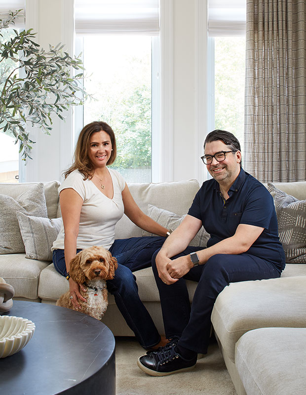
Homeowners Viviana von Bertoldi and Sean Walters with their cockapoo, Maverick.
House & Home: What prompted your renovation?
Viviana von Bertoldi: Though the house was only about seven years old, the design wasn’t functional. We hired Shannon to do the kitchen. We like having people over, so we wanted it to be the heart of the home. Once the contractors were here, we realized it made more sense to just keep renovating to create our forever home.
Sean Walters: We wanted the rooms to relate to each other and for there to be continuity in the design. Some parts of the renovation we planned and other things happened along the way.
H&H: How did you know Shannon would be right for the job?
VVB: We met Shannon a few years ago when she was doing staging for a real-estate agent. She later helped us with some projects in our old house, and we loved working with her.
SW: We’d also seen some of her design work, including her own house when it was up for sale, and we really liked her style. It felt like a good fit.
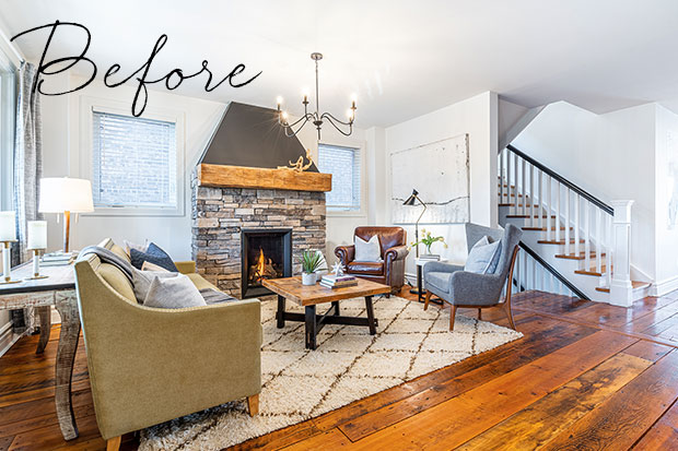
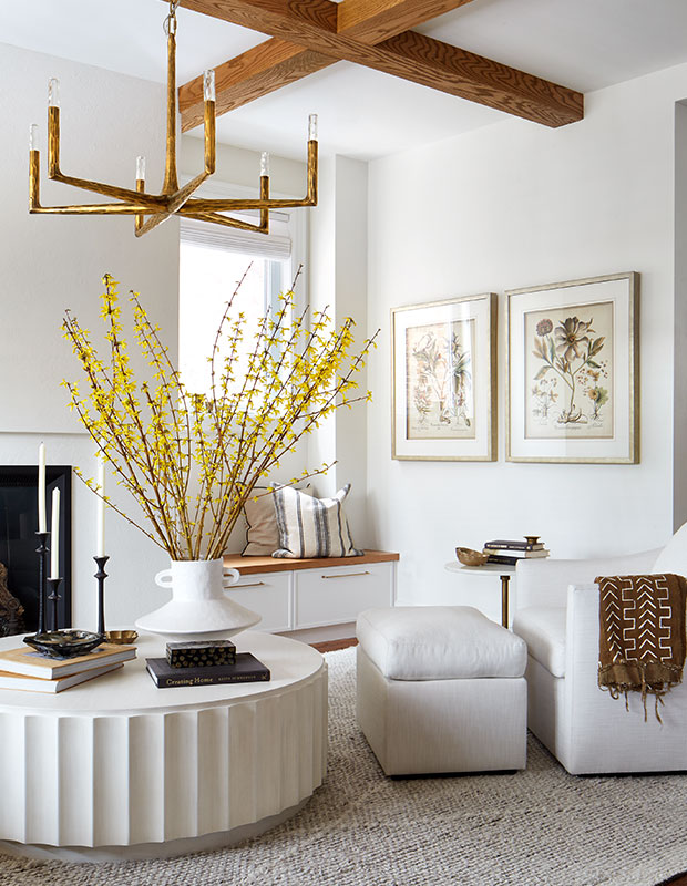
Before: The family room had a bulky stone chimney breast.
H&H What was your vision for the space?
VVB: We’d never renovated before so we didn’t know what to expect. Shannon had conversations with us about our lives, our feelings about things and our values and, somehow, those chats translated into coffered ceilings and a plaster chimney breast! Originally, we weren’t going to change the fireplace but, now, it’s one of the most dramatic transformations.
Shannon Cooper: I focused on transitioning the rooms to better fit the family’s vibe. Viviana and Sean are amazing hosts, so the space needed to be impressive, inviting and highly functional. The style I went for was relaxed elegance.
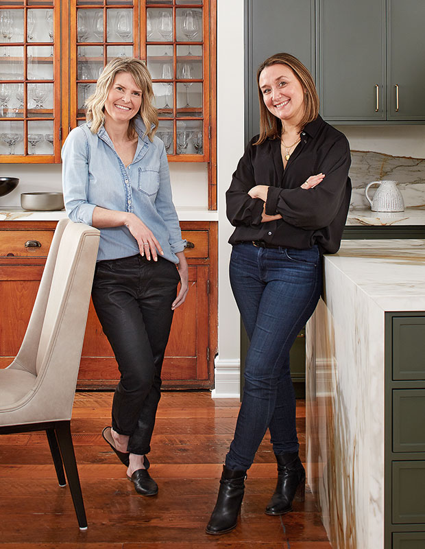
Principal designer Shannon Cooper (left) and designer Sharalee Mushore.
H&H: What are the key design elements?
SC: I felt passionately about having a rich, dark green kitchen. This was going to be the hub of the home, so I wanted something with impact. To add layers to the space, we showcased their art collection and pieces that were part of the family’s history. Viviana was born in Argentina and has beautiful collections and china. There’s a portrait of her dad we put near the entry and she had some gaucho tools that we had matted and framed. It was important that the space feel sophisticated and not too precious.
H&H: What was the biggest challenge?
SC: Supply chain delays! Viviana and Sean waited nearly 16 months for their dishwasher.
SW: We thought we’d be able to live in the house during the renovation, but when it became clear that it wouldn’t be possible, finding somewhere to stay that was still close to our son’s school was a real challenge.
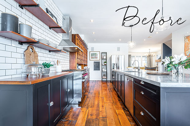
Before: The previous kitchen with blue-grey kitchen cabinets and a subway tile backsplash.
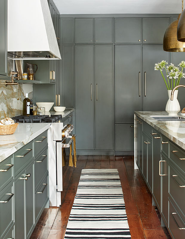
The new kitchen is packed with storage and has great flow.
H&H: Any design hesitations or regrets?
SC: Viviana and Sean were hesitant about the kitchen colour and would have preferred something more neutral, but I’m glad they trusted me to go ahead with my vision. What dream clients; they had so much trust in us!
VVB: No regrets. There were a lot of last minute decisions that I’m so glad we made. A lot of budget and effort were put into the kitchen. When the hutch was moved to the dining area, we had no cabinets, so new millwork was a major splurge, and the counters cost $13,000.
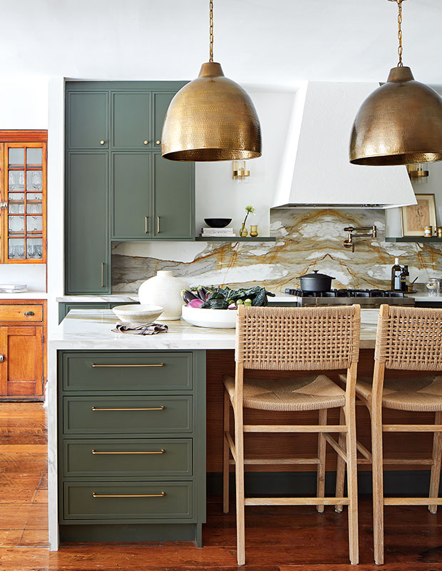
A brass finish on the pendants echoes the hardware.
H&H: What do you love most about the completed space?
SC: I love the layers of lighting. There are fixtures from different retailers in different finishes including metal, glass, stone and wood. Together, they create a collected vibe.
VVB: The kitchen! When kids come in, they know where the pantry is and how to find the garbage. Everything is very intuitive and feels comfortable.
SW: Totally. It’s where everyone gathers, and it’s the centre of the action. There’s great storage and lots of space to entertain.
Related: TOM Design Collective turns a Toronto kitchen into an inviting family hub
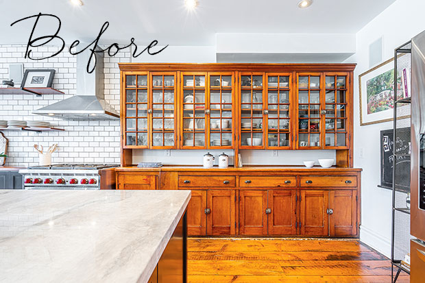
Before: The hutch before it was relocated to the dining room. “The previous owners were using a beautiful vintage hutch in place of cabinets and, the day we moved in, I put a plate in the cabinet and when I shut the door, the glass shattered,” says Viviana.
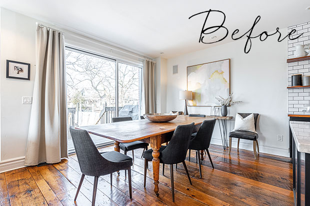
Before: The dining area lacked sufficient lighting and storage.
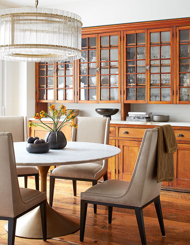
The vintage hutch was carefully reassembled in the dining room, where it holds china and glassware.
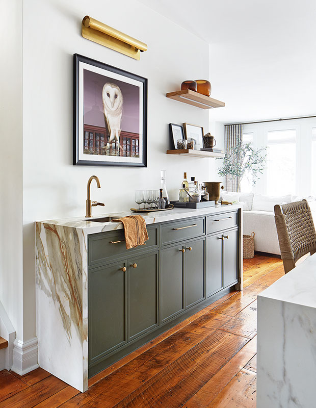
Viviana mixes her signature bourbon sours at the wet bar when entertaining.
H&H: Where did you save?
SW: Because the house was built less than a decade ago, we didn’t have to replace any electrical or upgrade the panel. We also decided to keep the vintage barnboard flooring, and Elite Construction and Renovations, our interior contractor, was good at salvaging boards when we moved walls — we didn’t have to buy extra flooring.
SC: We took a high-low approach to most things. Some of the sofas are from EQ3, while others are from RH. Designer Sharalee Mushore curated the art we brought in — a mix of more expensive original pieces and budget-friendly prints from Etsy, Minted and Celadon Art.
Read More: Inside a modern house with cool art, curvy furniture and statement lighting
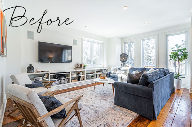
Before: The living room had a good layout but needed new furniture and accessories.
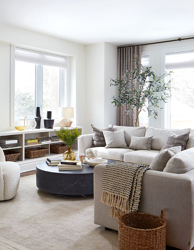
A neutral palette prevails in the bright yet cozy space.
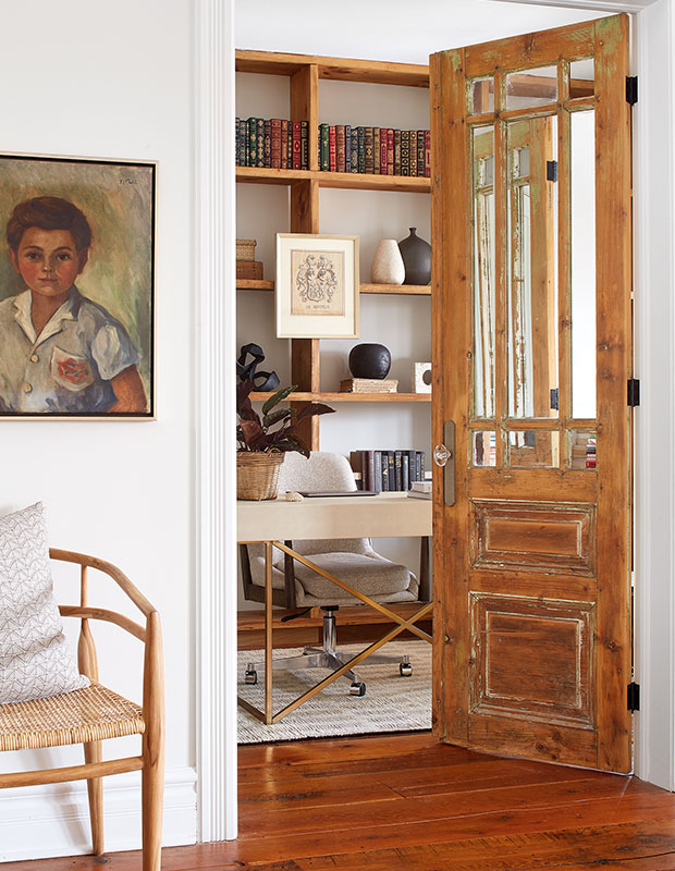
The vintage door and wood shelves in the office were existing when they bought the house. A framed illustration of the family crest hangs on the bookcase.
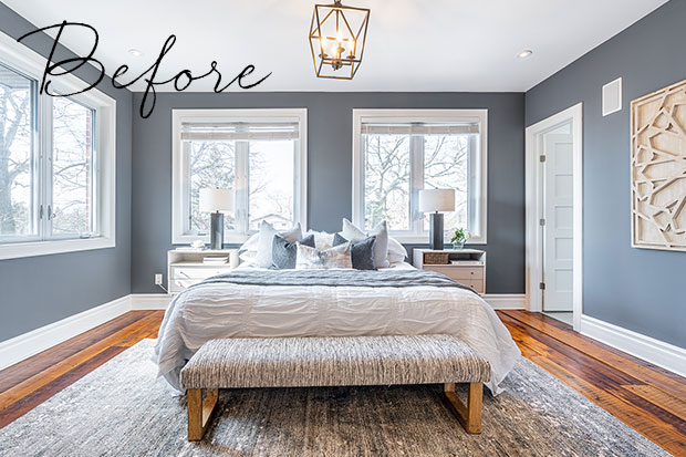
Before: The primary bedroom lacked the warmth the homeowners were looking for.
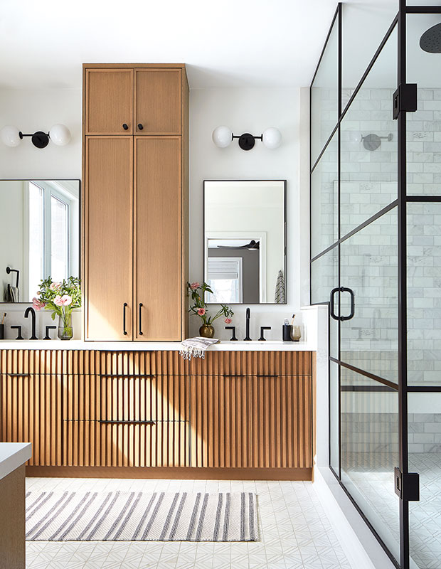
“This house can get a little chaotic with kids, Nerf guns and the dog running around. The ensuite is my zen place where I like to end the day. The aesthetic is calm and soothing — a perfect escape,” says Viviana of the principal suite.
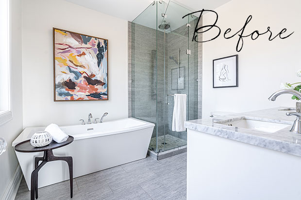
Before: The previous ensuite had grey flooring and a small shower.
H&H: What was the biggest splurge?
SC: We completely transformed the principal ensuite. Around $9,400 was spent on the vanity and around $3,000 on glass for the shower.
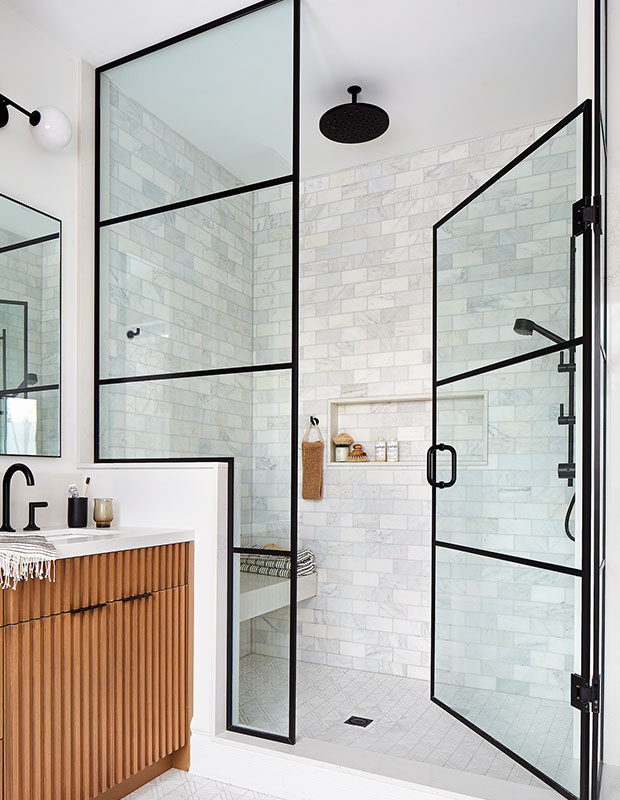
Sean’s one request for the ensuite was a nice, big shower.
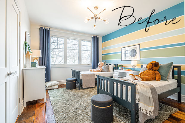
Before: One of the kids’ bedrooms had a striped feature wall.
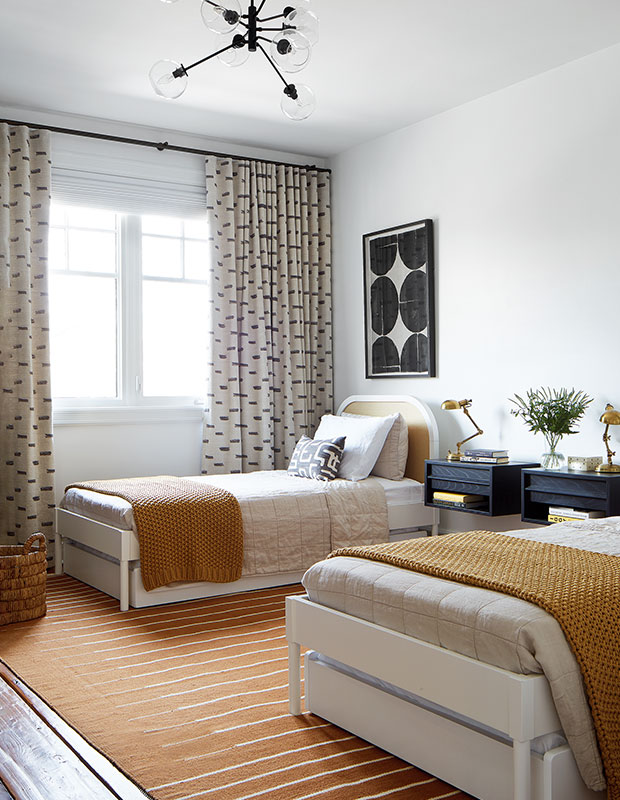
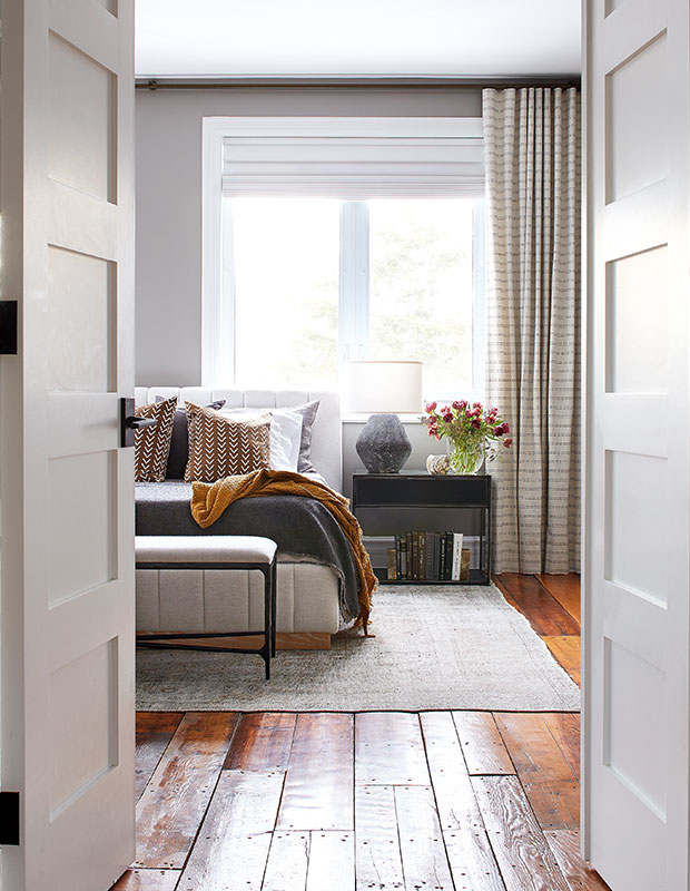
“There were too many bedrooms so the principal suite grew, a bedroom became an office and we created a cool sleepover room,” says Shannon. The sleepover room has two twin beds, each with a trundle, to accommodate guests.
Read More: Lynda Reeves explains the elements of this swoon-worthy bedroom
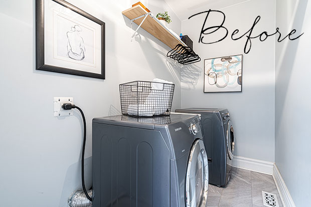
Before: The laundry room lacked storage and functional space.
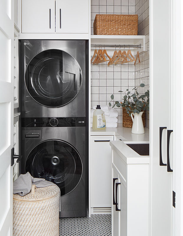
Now, the cool and compact laundry room has classic white cabinets and tile accents.
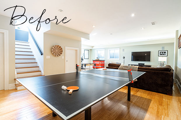
Before: The lower level had a games table and dated brown sectional.
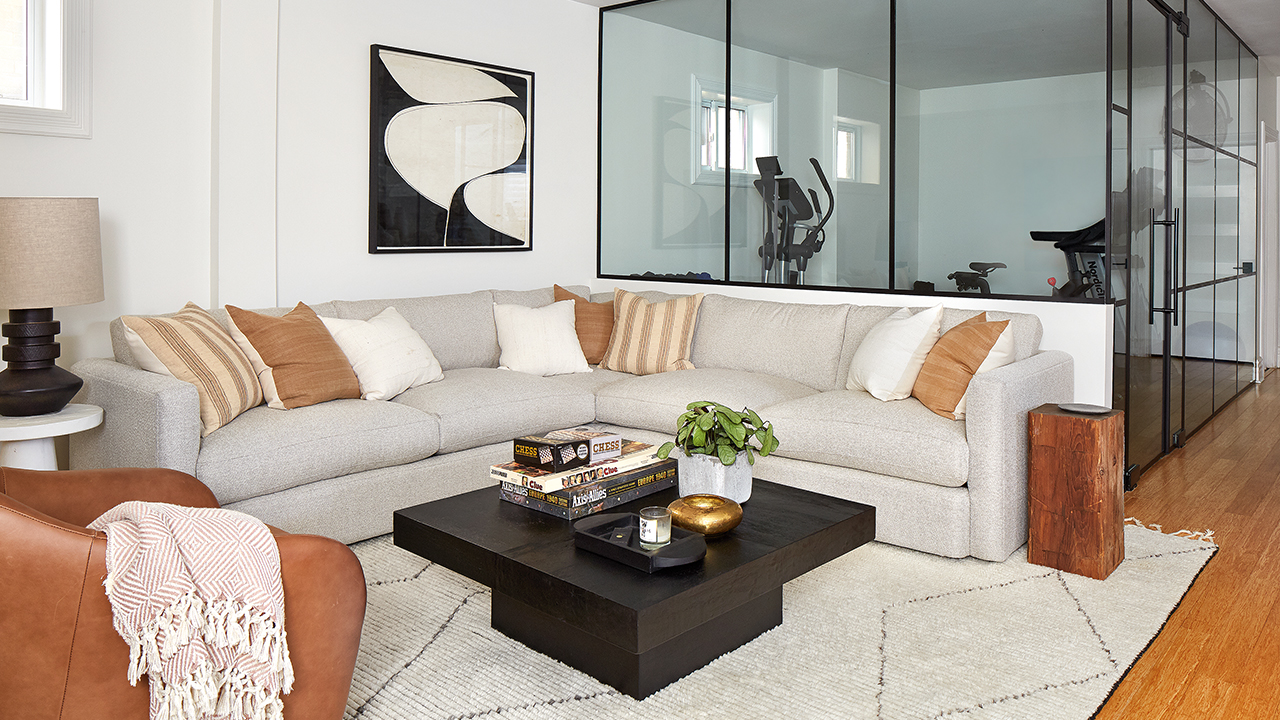
A new cozy sectional is the perfect place to relax or entertain. Glass walls around the gym muffle the sounds of music and machines from the rest of the lower level, but still allow light to flow through. “I love the gym; there’s so much natural light because of the glass walls, and it has great modern style,” says Sean.
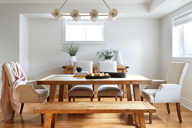
Shannon carved out space for a large table for playing games.
Donna Griffith
House & Home
East Design House


