9 Designer-Approved Colour Palettes To Help You Get The Look You Want
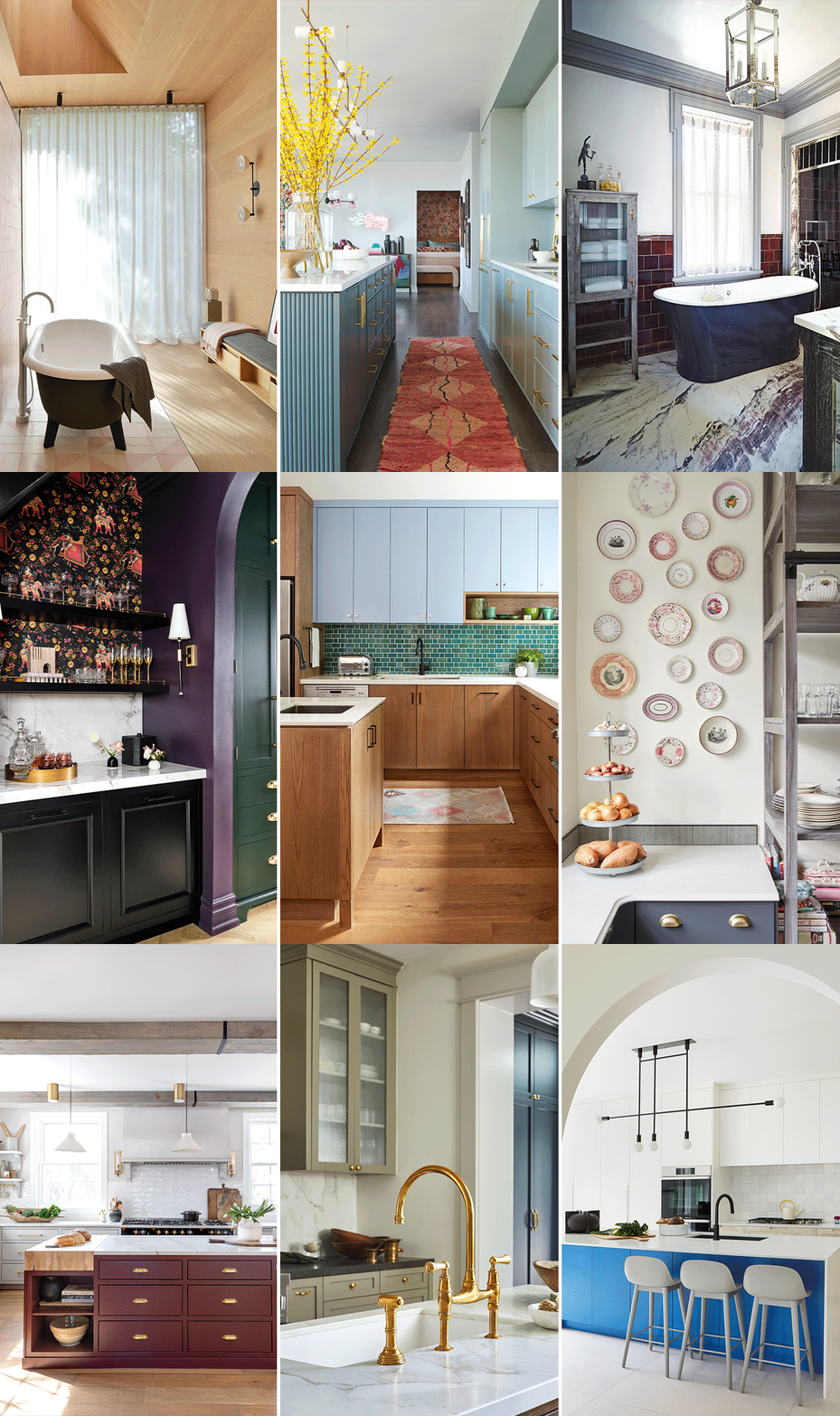
These designer-approved colour palettes — comprised of a key colour, a neutral and an accent — are the first step in capturing the look you want.
From classic combinations to pretty pastels, these heritage hues and soothing shades will provide the inspiration you need for your next kitchen or bathroom revamp. See our collection of winning designer colour palettes below.
Classic Combination
Designed to improve with age, this heritage-inspired kitchen fits perfectly into its 1900s farmhouse in rural Ontario. The maroon island contrasts beautifully with the bone-coloured cabinets.
Heritage Hues
A mix of muted historical colours including sage green and navy blue sets the tone in this English cottage–style kitchen. Wood accessories on the counters lend a soulful touch.
Serene & Soothing
Juxtaposing a dark hue like black against light, feminine neutrals can have a striking effect. In this bathroom, a wall of Moroccan tile faces white oak panelling and sets the stage for a bold clawfoot tub with a modern twist.
Fit For A Manor
With a backdrop of high-gloss burgundy tile, this midnight blue tub takes centre stage. Dove grey trim around the window, shower enclosure and ceiling complete the bespoke look.
Ocean Shades
This mid-century modern kitchen gets a fresh update with a shot of aqua blue and green. The multicoloured backsplash features two tile sizes, creating a lively visual effect.
Bold & Vivid
Dynamic cobalt blue on the island sends a lightning bolt of colour through this contemporary white kitchen. Punctuated with a bold black faucet and light fixture, the room is crisp and compelling.
Aqua Glow
When the clients requested “anything but white” for their space, designer Cori Halpern delivered this two-tone, teal blue kitchen. A bold runner in a complementary terracotta shade brings the room to life.
Jewel Tones
Emerald, amethyst and onyx come together in a bold way in this Victorian bar area just beyond the main kitchen. A richly detailed wallpaper ties the scheme together while a marble-look porcelain counter is an understated contrast.
Pretty Pastels
A blank space in a kitchen is the perfect place to show off a collection like this grouping of lustreware dishes. The soft grey open shelving and lower cabinets have an undertone of mauve, which works beautifully with the feminine pink and rose shades found in the plates.