
Jennifer Kominek Brings Low-Key Italian Glamour To This Toronto Victorian


With its vibrant mix of old and new, Keith and Michael Battista’s downtown Toronto home is proof that when opposites attract, design magic happens.
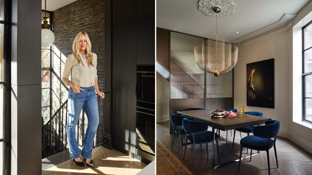
Every detail of their Victorian has been carefully considered, from the dining room’s wall panel with reeded glass to the laser-cut basement stair treads. It’s the handiwork of designer Jennifer Kominek and architect Gloria Apostolou of Post Architecture, who spearheaded a two-year-long renovation that gave the couple’s home of 20 years a new lease on life. From the outside, it’s a regular semidetached house; inside, contemporary details pop against old world panelling and Italian floors.

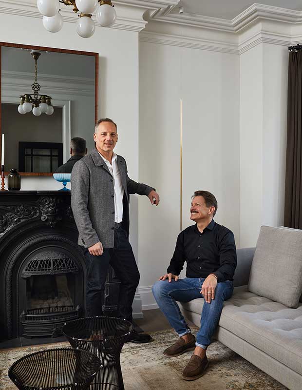
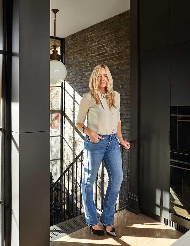
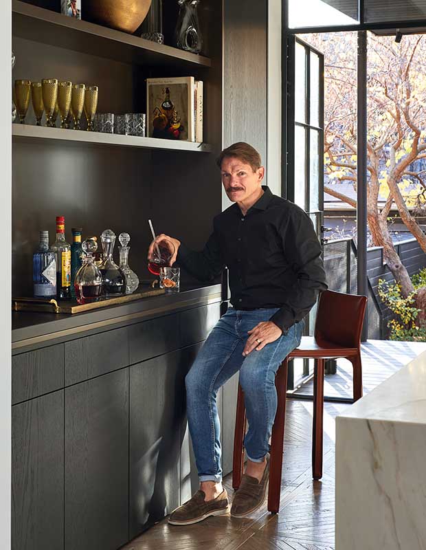
Together, the design elements are contrasting but complementary — a description that also fits the homeowners. In 2024, Michael (left) became a judge of the Federal Court of Canada. Prior to his appointment, he was founding counsel of a law firm specializing in immigration and the founding chair of Rainbow Railroad, an organization that helps LGBTQI+ individuals escape persecution. Michael’s husband, Keith (seated), is a retired firefighter who helped lobby for Canada’s first LGBTQI+ radio station. They’ve been together for 28 years and they have a teenage son, Dario. “Michael is the most humble, self-confident person you will ever meet,” says Keith. “As for me, I talk too much. You either love me or hate me.”

But it’s their shared interest in all things Italian and their deep appreciation of classic style that really shines through in their renovated house. “They’re both so unique — different yet perfect together,” says Jennifer. “From the moment we met, I knew it was going to be a special project.” We asked Michael, Keith and Jennifer to share the creative process behind the project.

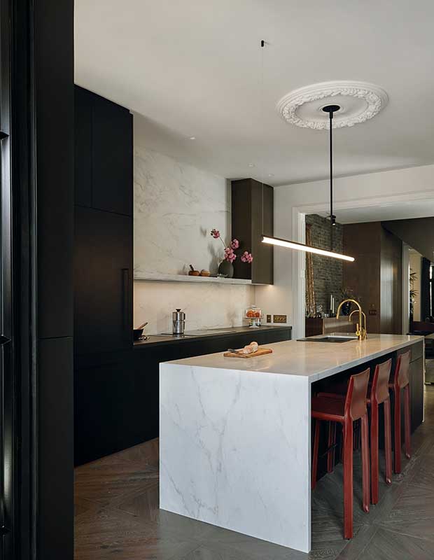
The kitchen’s modern light fixture contrasts with the ornate ceiling medallion, creating a perfect blend of old and new. Red leather counter stools and add Italian bistro style.
House & Home: What inspired you to renovate?
Michael Battista: We realized we had outgrown the space. As our son grew older, the lack of a mudroom became a problem and the kitchen was worn and cramped.
Keith Battista: By flipping the rooms around and changing the way we use them, we gained about 500 square feet — we needed space.

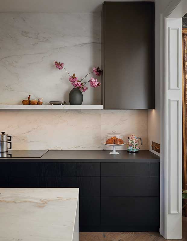
The kitchen has a minimalist feel, with custom, black-stained oak cabinets and a dark perimeter counter. A Cremo Delicato marble backsplash extends to the ceiling.

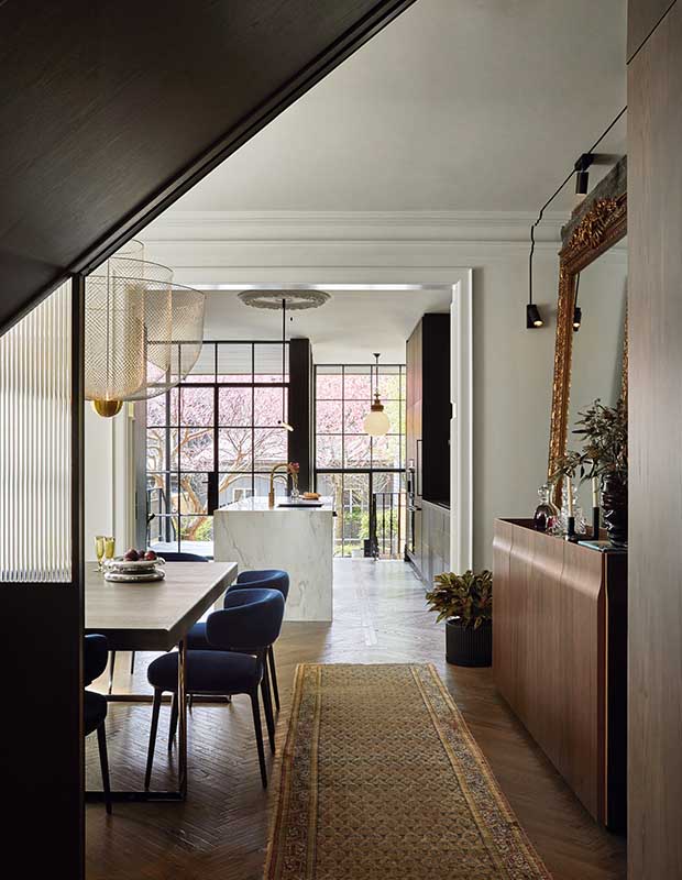
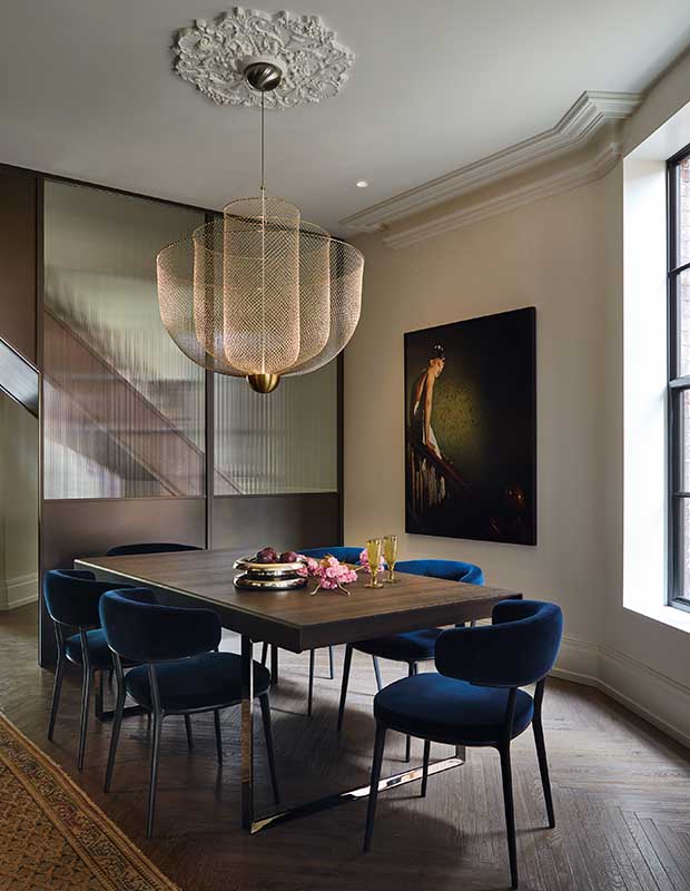
Thanks to floor-to-ceiling windows and glazed, black-framed doors, the kitchen and dining room are flooded with natural light.
H&H: How extensive was the project?
MB: At first, it was just the main floor, but we quickly recognized that we were ready for a more ambitious update. We were warned that the worst thing we could do was expand the scope of the project once the work had already begun, but that’s exactly what we did. The demolition crew returned to our place around five times.
Jennifer Kominek: Yes, it ended up being a complete gut and reno of all three storeys. We reclad the party wall, added flooring and embossed wallpaper panelling and reconfigured all the spaces. Now, it’s a very bespoke home.

A striking photograph hangs in the dining room. “At night, the piece is absolutely mesmerizing when the light hits it,” says designer Jennifer Kominek.
H&H: What was the design vision?
JK: The brief was “low-level lighting,” and I knew exactly what they meant. Intricate details and finishes offset the modern pieces and result in a low-key glamour. I learned partway into the project that anything Italian was an easy sell, so I used that to my advantage!
KB: We do love Italy. Michael is Italian, I’m half Italian and our son speaks Italian fluently. It’s all about the details: vintage lighting mixed with architectural elements, intricate parquet flooring mixed with modern furniture. That’s the Italian way!
MB: We wanted to preserve as much of the character of the original house as possible with design features that reminded us of our trips to Italy. And it needed to be masculine and modern, warm but not fussy.

Keith mixing a Friday night Negroni at the kitchen bar.
H&H: What was it like working with Jennifer?
MB: One big and important word: trust! Jennifer grasped our vision immediately and offered design choices that were perfectly aligned with us. And another word: fun! Keith and Jennifer were frequently perceived as a couple when they went sourcing together.

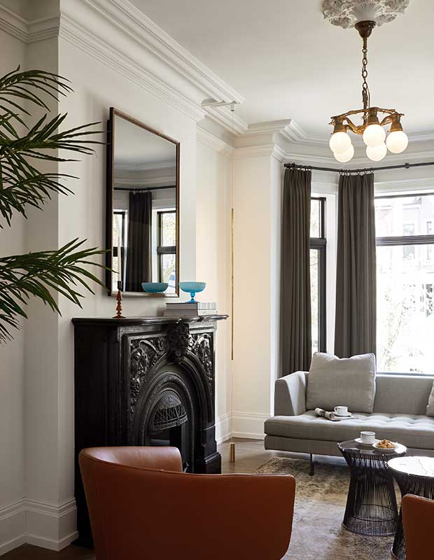
In the living room, a mirror television above the mantel is fitted with a vintage wood frame. The suspended linear light brings modern edge to the traditional chandelier.

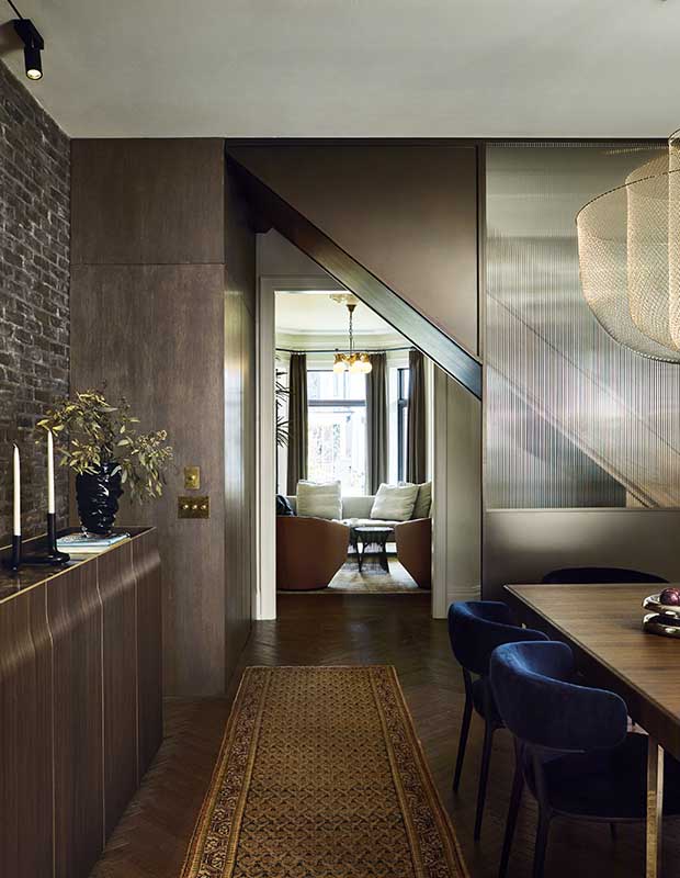
Reeded glass is used throughout the house, but it’s particularly effective in the panel that separates the dining room from the hallway.
H&H: What are the key design elements?
JK: Finishes that will age gracefully, ornate details, rich colours and natural materials. These are the elements that really tell the story. Added to that is carefully curated furniture, and there’s not a lot of “stuff” — that’s key to the look.

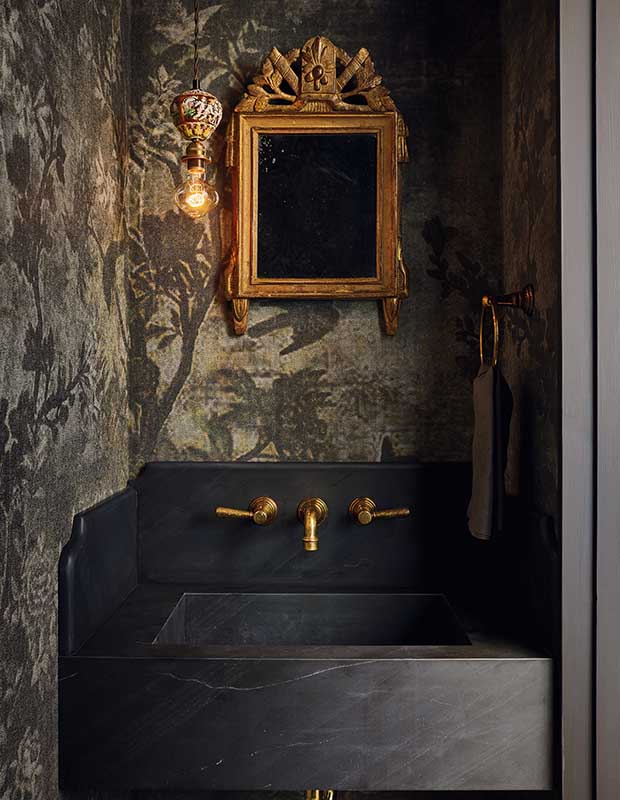
“The powder room is like a nightclub with the music on,” says Jennifer. “It’s dark and moody, and everyone looks great in it.”

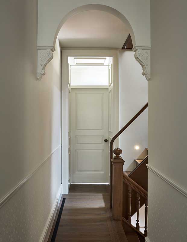
The main staircase was restored, then a modern glass railing and stairs were added up to the third floor. The archway, corbels and wallpaper are new but feel authentic to the house.

H&H: Were there any major challenges?
KB: Living across the street during the reno. I’ve designed homes for other people, so I have some construction knowledge. I watched eight men carry in our 10-foot marble slab backsplash. Being so close was good, but it was also bad.
JK: From a design perspective, it was ensuring that the new elements looked as though they had been here for years. Keith and Michael are classic and refined, and I wanted that to be reflected.

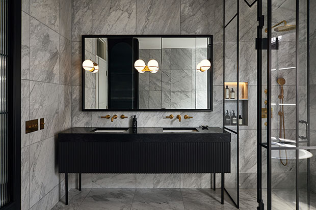
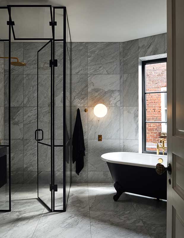
Unlacquered brass fixtures and Carrara marble give the principal ensuite a luxurious feel.

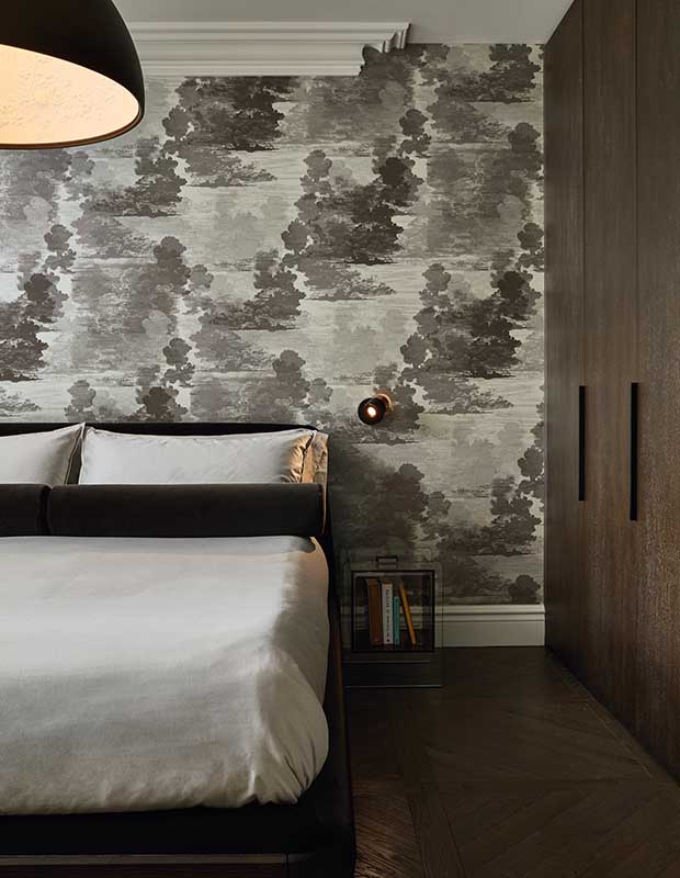
Whimsical Cloud Toile wallpaper is both serene and masculine in the principal bedroom.

Sea green tile and an Edison-style light are cool and contemporary in Dario’s ensuite.

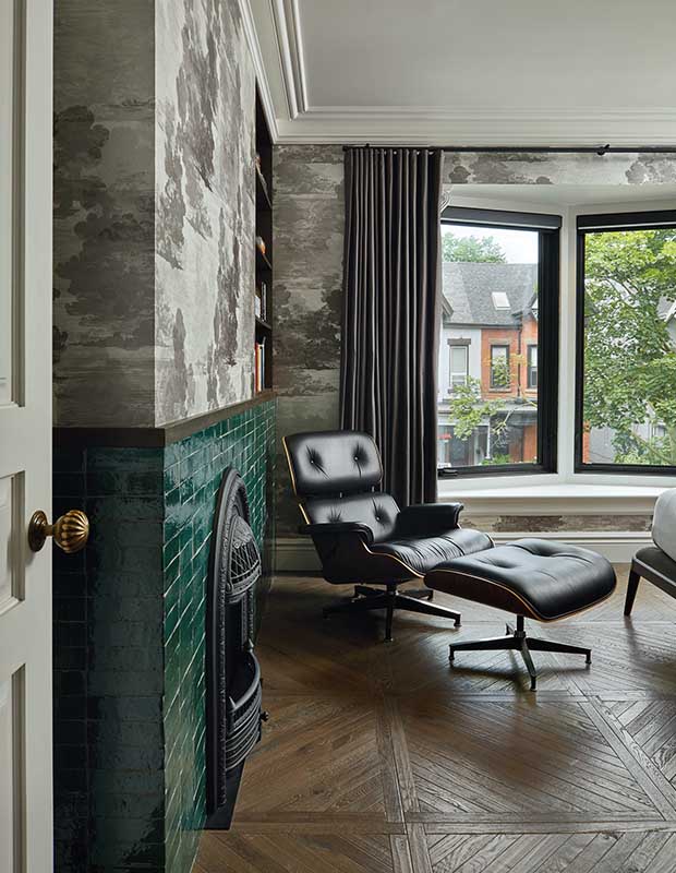
Italian hardwood flooring runs throughout the home in different patterns. The principal bedroom and kitchen both have a “quadro” pattern, with each piece cut and laid by hand. An Eames chair and ottoman are modern classics.
H&H: How has the reno changed the way you live?
MB: We’ve doubled our usable space. Prior to the renovation, we only used the main and second floors; the basement and third floor were dark and cold. Now, we truly use all floors — our son has a hangout space in the basement and we also have a workout area there, and the top floor is a warm, open office and guest room. During the project, we discovered 16 inches of extra ceiling space on the third floor. And what a difference to have a well-insulated home!
KB: Nothing looks like it’s out of place from how we’ve always lived — it just looks better. Friday night used to be family pizza night… now it’s date night for dads with a Negroni in the living room. Michael calls the new look Victoriana Italia; I call it The Keith and Michael Update.
- Photographer Niamh Barry
- Designer Jennifer Kominek (design)/ Post Architecture (architecture)